Moderator
M
Moderator
16:46, 28th Oct 2011
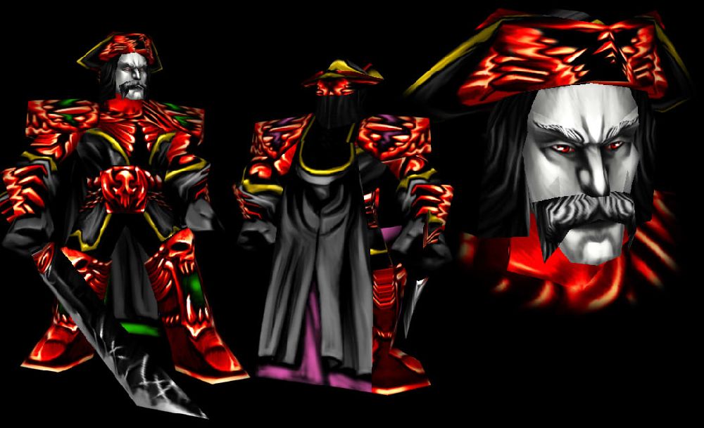
shiiK: I personally feel like the red is a bit overwhelming, and it clashes with the not-so-apparent team-colour as well as the slightly too green golden trims. Contrast is a bit high. Otherwise a really cool design and it works pretty good with the wrap. Not quite seeing the vampire apart from the desaturated face, though.
shiiK: I personally feel like the red is a bit overwhelming, and it clashes with the not-so-apparent team-colour as well as the slightly too green golden trims. Contrast is a bit high. Otherwise a really cool design and it works pretty good with the wrap. Not quite seeing the vampire apart from the desaturated face, though.


 Approved


