• Listen to a special audio message from Bill Roper to the Hive Workshop community (Bill is a former Vice President of Blizzard Entertainment, Producer, Designer, Musician, Voice Actor) 🔗Click here to hear his message!
  • Read Evilhog's interview with Gregory Alper, the original composer of the music for WarCraft: Orcs & Humans 🔗Click here to read the full interview.

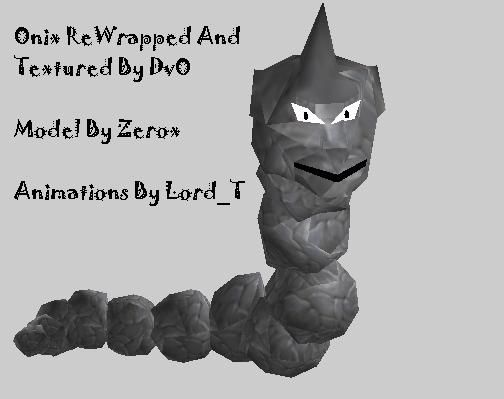
Onix

Onix By Zerox
Animations By Lord_T

For the model to perform at its best you should set these to these amounts in the object editor:

Animation - Walk speed should be about 250
Combat Damage Point - .330
Combat Backswing Point - .640

Finished, finalized, and works ingame. Enjoy!

Update: Now its Version 3 retexured to use ingame textures by DvO. And rewrapped by DvO. Enjoy.

Keywords:
Onix, Onyx, Zerox, Lord_T, Amazing, Snake, Rock, Pokemon, Ash, Brock, Misty
Contents

Onix (Model)

Reviews
18:14, 22nd Nov 2008 Pyritie: Yeah, it's better. You still reeaaally need to add some shading. And if you don't want to add shading, add some texture to those rocks so they aren't solid gray! Oh, and I'd make those dust particles Blend, not...

Moderator

M

Moderator

18:14, 22nd Nov 2008
Pyritie: Yeah, it's better. You still reeaaally need to add some shading. And if you don't want to add shading, add some texture to those rocks so they aren't solid gray!
Oh, and I'd make those dust particles Blend, not Additive. And make them brown.

9th Dec 2008
Pyritie: Changes (finally) made, resource approved.
 
Level 20
Joined
Jun 6, 2008
Messages
997
Okay the face needs fixing but what the heck does that mean? I think the face is fine. >.< If your talking about the line on his face on the upper pic of him that is just a shadow that looks weird at that angle. And come on not even one comment after a day about how beautiful the animations are? Lord_T did a beautiful job on them making this model a billion times better.
 
Level 20
Joined
Jun 6, 2008
Messages
997
what a massive polycount compared to what it is D:
also ... the texture is to monotone.
Show us some dirt on the rocks.
Oh and Pokemon phails :3

Uh 840 isn't that much dude. The limit is something like 2000 besides your only going to have like 1 or 2 of these things in most cases so its not an issue in the slightest. For the texture to remain extremely small in size as it is currently the rock texture will stay somewhat bland. Besides if you look at Onix in other things such as

Pokemon Stadium: *woops* It was a tripod image. I'll get a new one.

A regular picture by nintendo:
567229-onix_large.jpg


And a Pokemon Card:
5c6b_1.JPG


he has always been simple in coloring. I don't intend to change that any because that isn't how onix is.

gotta rape em alll.

Perverted = phail. T.T
 
Last edited:
Level 14
Joined
Oct 27, 2007
Messages
1,395
Okay the face needs fixing but what the heck does that mean? I think the face is fine. >.< If your talking about the line on his face on the upper pic of him that is just a shadow that looks weird at that angle. And come on not even one comment after a day about how beautiful the animations are? Lord_T did a beautiful job on them making this model a billion times better.

Didn't mean to offend you Zerox :p Of course Lord_T did an awesome job, he's Lord_T :D I didn't think it needed to be said.

Anyway, the face needs fixing in this: It doesn't look like Onix. The face/snout is too elongated. Onix has a "short" snout and your model has a long one.

Also, the horn is tilted to the front too much. Onix's horn is pointed straight up. But I don't find that to be as big a deal as the long head.

That's what I think is wrong with the face.

The texture is too light (or bright) for my liking, but that's not that big of a deal to me.

I pity you that you would know of such a disturbing thing. Its sad what the world has come to these days. Is nothing sacred?

Apparently not :p
 
finding something sacred outside of a relgious place is like...finding a virgin.

no, i am not a pokemon fan.

be good =3

~Misha~

EDIT: his head really looks weird Zerox xD That could use some shrinking and shortening of the snout, also aren't the eyes a bit sideways in original? =3
 
Last edited by a moderator:
Level 22
Joined
Jun 23, 2007
Messages
3,242
ok time to get serious.
i lol'd at TDB's comment. tats pretty much what onix is.
anyways... is it just me or is there this tiny slit of open space in the first screenshot between the beak and his head?
his head looks awfully smooth to me...
and um...yah.
 
The flat unshaded style on the custom texture. And the color looks more plastic metal rather than rock-esque (I could swear that Onix were more gray-brown in cartoons, and you could still see some details despite the plain colors).
I still think the model would do better with ingame textures. The golem rock tile would be a perfect choice imo, it keeps the cartoonish feeling but with more definition and details.
 
Level 31
Joined
Feb 23, 2008
Messages
1,711
Bad points:

1. Massive poly count for a regular unit. Or a hero really.

2. Texture is very bad.

Good points:

1. It's a first.

Overall: 1/5 'Unacceptable' When I give this rating: I am sorry I had to give this rating, I mean no offense.

Bob's additional notes:

You seem to be learning a lot about modeling all the time. But, this model has some very bad traits that I must point out. The texture needs loads of work. And please, reduce the poly count. I cannot except this model. Therefore, it is Unacceptable, or 1/5.

True, also in anims the body sometimes separates 8/ Also...... naga anims? well exept the head it looks good. 3.50/5 >8)
 
Level 20
Joined
Jun 6, 2008
Messages
997
True, also in anims the body sometimes separates 8/ Also...... naga anims? well exept the head it looks good. 3.50/5 >8)

Um the body doesn't separate when its animating. I've never seen it. I'm curious what you mean take a screenshot and show me.

And no its not Naga animations or any wc3 animations for that matter. ALL the animations were custom made by Lord_T.
 
Um the body doesn't separate when its animating. I've never seen it. I'm curious what you mean take a screenshot and show me.

And no its not Naga animations or any wc3 animations for that matter. ALL the animations were custom made by Lord_T.

it does separate around the first two geospheres on the ground, resizing one should fix that fine =3 Anims soo look like naga myrmidon anims xD (Grats to Lord_T for making such fine anims) just the head is messed up, quite. and so much pollies for head is not necesary =3

I'm debating if i could do some tweaks like on varsaigen's hive hammer....... but i kinda need a lot go get going xD Like we all xD
 
Level 9
Joined
May 17, 2008
Messages
320
its a fine model though i cant help but fell hes not long enough (and lol you still play with pokemon cards zerox? =P)

anyway +rep
 
Top