• Listen to a special audio message from Bill Roper to the Hive Workshop community (Bill is a former Vice President of Blizzard Entertainment, Producer, Designer, Musician, Voice Actor) 🔗Click here to hear his message!
  • Read Evilhog's interview with Gregory Alper, the original composer of the music for WarCraft: Orcs & Humans 🔗Click here to read the full interview.

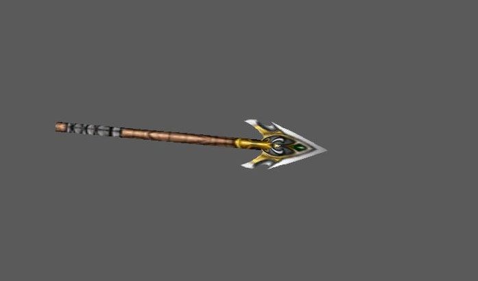
NightelfOwlRangerMissile

This is just the fitting missile for my Nightelf Owl Ranger model. Check out the original model for a detailed discription. It differs a bit from the usual (Reign of Chaos) ballista missile, so i thought a custom one would be better.

Feel free to use it in any way you want! Have fun with it! :wink:

EDIT 1: just had a little spelling mistake in its name. Fixed it now. There was no technical change in the mode, just the name corrected. :wink:

EDIT 2: fixed the issue with the death disappearing. Now it works properly. :wink:

Keywords:
Night elf missile, missile, nightelf spear, nightelf thrown, nightelf thrown spear, spear, thrown spear,
Contents

NightelfOwlRangerMissile (Model)

Reviews
21:41, 7th Apr 2013 Misha: make it disappear in the death animation.. otherwise it leaves a whole crazy bunch of them spinning in the air at the point of impact, spamming a lot if the attacked unit moves coolio, approved

Moderator

M

Moderator

21:41, 7th Apr 2013
Misha: make it disappear in the death animation.. otherwise it leaves a whole crazy bunch of them spinning in the air at the point of impact, spamming a lot if the attacked unit moves

coolio, approved
 
Hey man. I noticed most of your model's screenshot has a lot of blank spaces. Im not trying to change the way you work, Im just trying to help you attract people to your models. Like this one, if you cropped all the gray spaces, the arrow would appear larger.

I myself as a part mapper, I am very lazy to click every single model I searched just to take a closer look. I'd only click the model if the screenshot is very eye pleasing to me. Im pretty sure some of the mappers have the attitude like me too, so just giving you a clue of mappers thought.

Another good example would be your HaradrimWatchTower. You know from current screenshot, it looks like 3 pile of wood attached to an inverted umbrella. Very weird. But then I opened the model in Magos, and I found that the model and the screenshot are like two seperate models, something like a low poly version (screenshot) and high poly one (actual model).

Errr... so yeah... Get my point? Pardon my poor english.
Why? I get your point. Thanks for the advise. Well, i guess i should make different screenies in the future. What you say sounds pretty true to me now. :wink: Well, my models always have a big preview avialable. :wink:
Your english isn't poor, buddy. In fact it's pretty good and very easy to understand. :thumbs_up:
 
Top