Community
Maps
Tutorials
Gallery
Support Us
Install the app
-
Listen to a special audio message from Bill Roper to the Hive Workshop community (Bill is a former Vice President of Blizzard Entertainment, Producer, Designer, Musician, Voice Actor) 🔗Click here to hear his message!
-
Read Evilhog's interview with Gregory Alper, the original composer of the music for WarCraft: Orcs & Humans 🔗Click here to read the full interview.
You are using an out of date browser. It may not display this or other websites correctly.
You should upgrade or use an alternative browser.
You should upgrade or use an alternative browser.
New works
- Status
- Not open for further replies.
- Joined
- Jan 12, 2010
- Messages
- 1,770
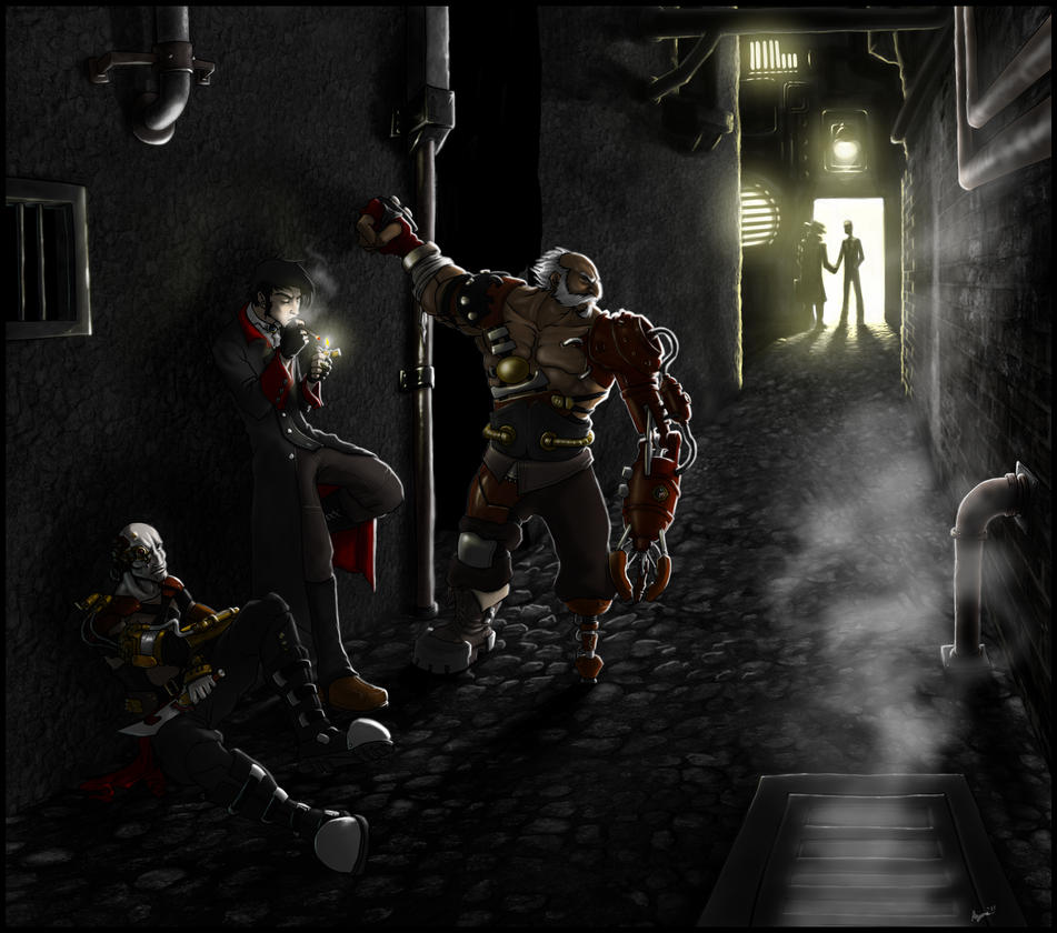
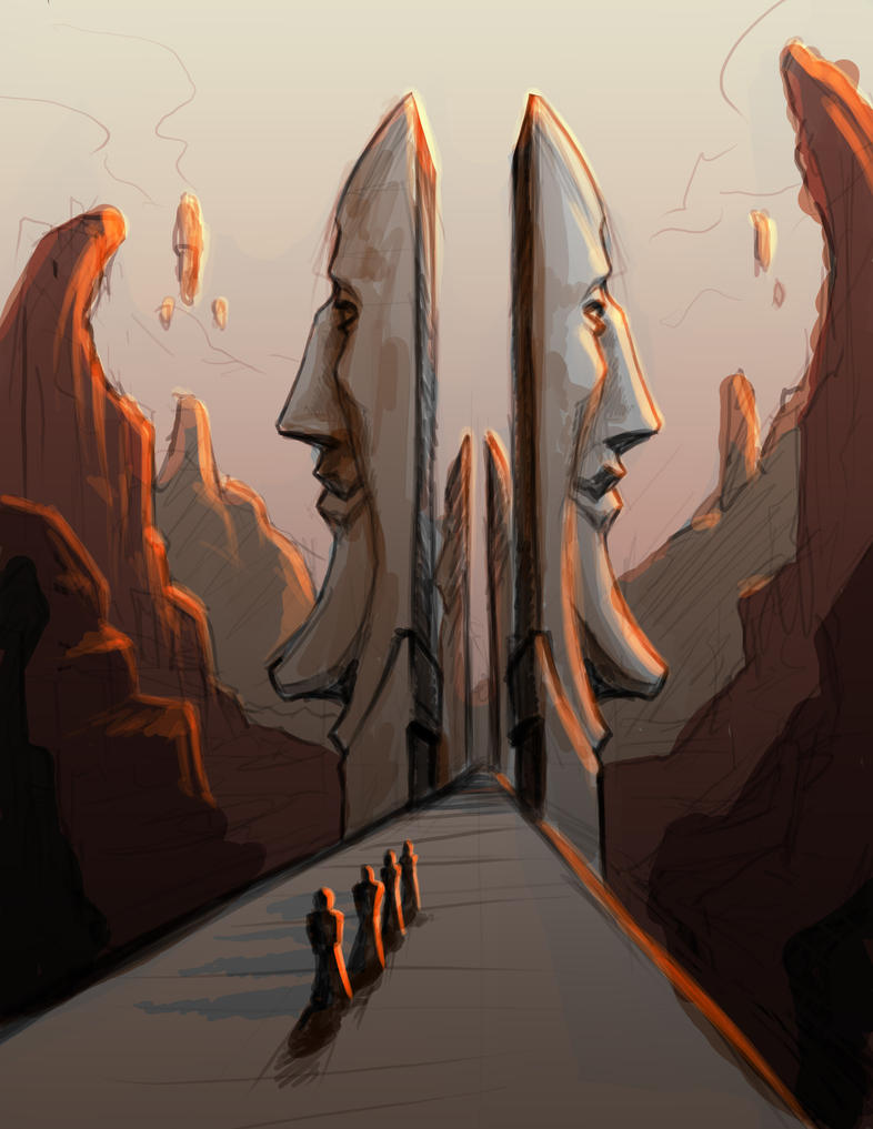
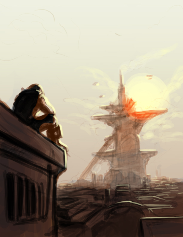
few realy great items here, surely 
Deleted member 157129
D
Deleted member 157129
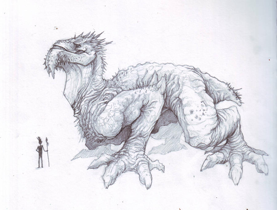
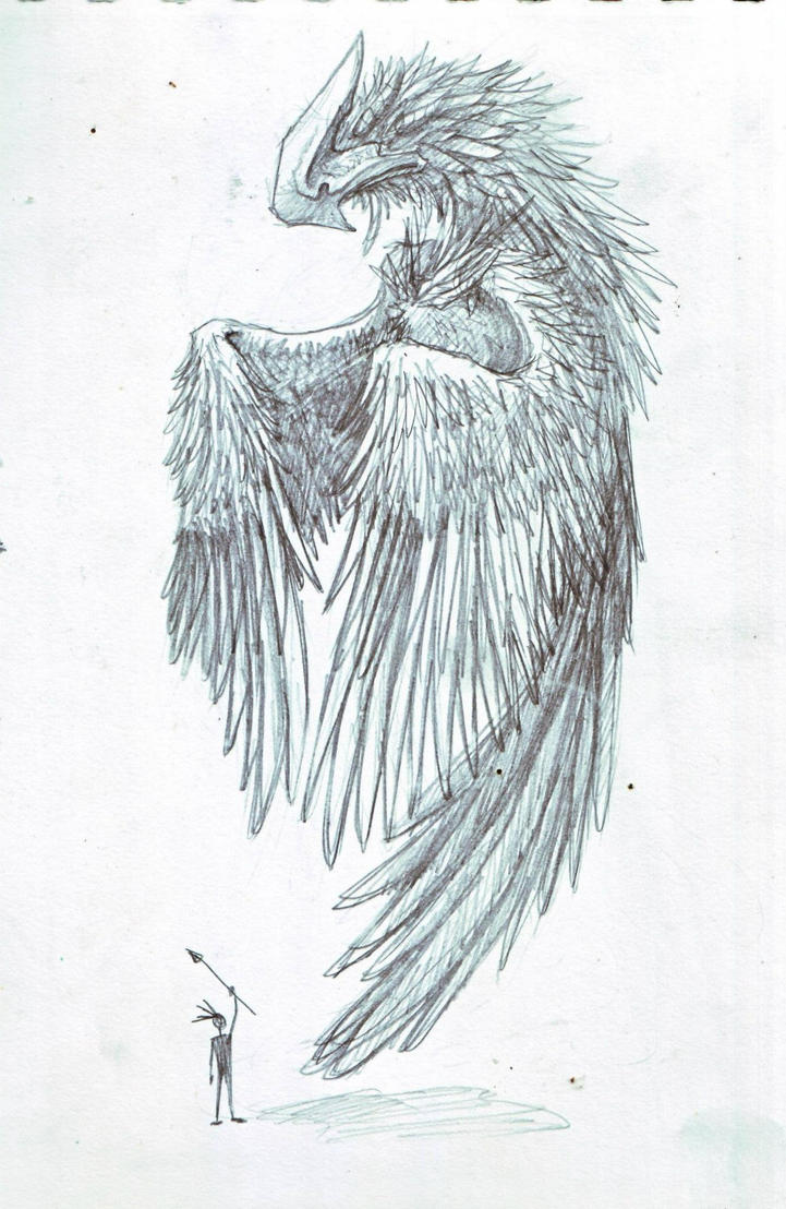
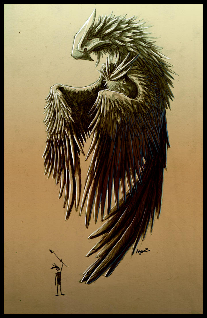
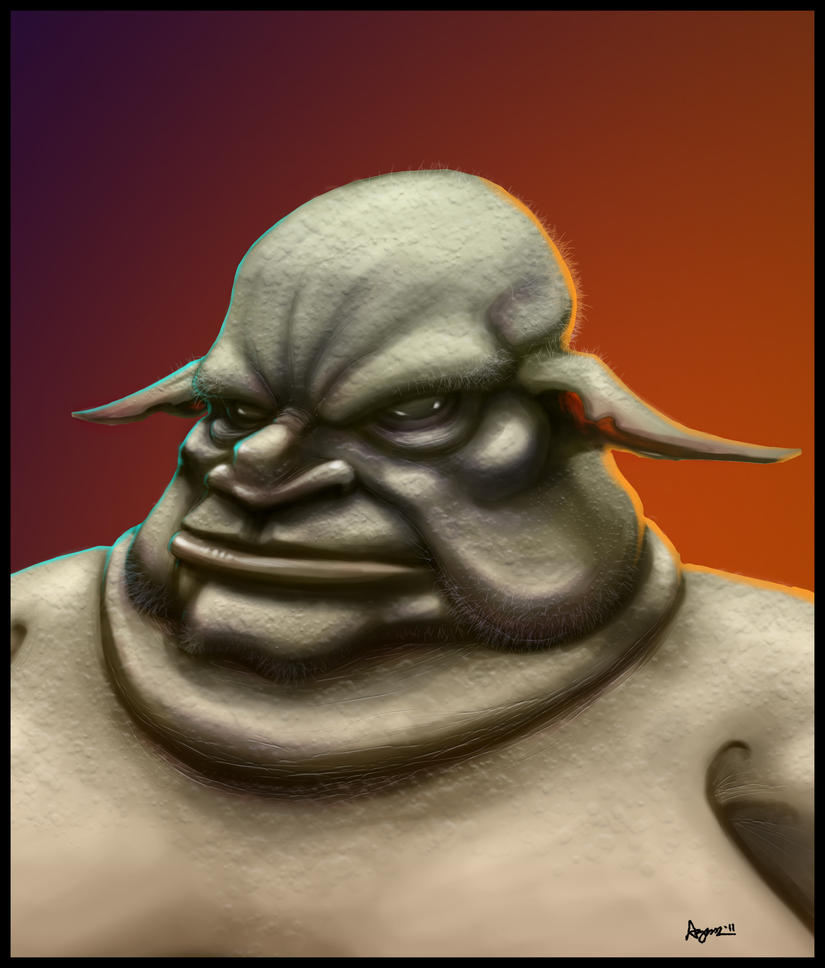
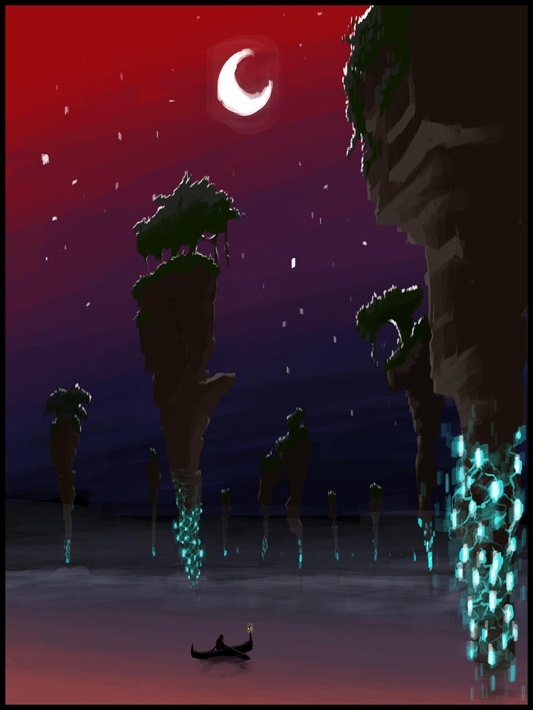
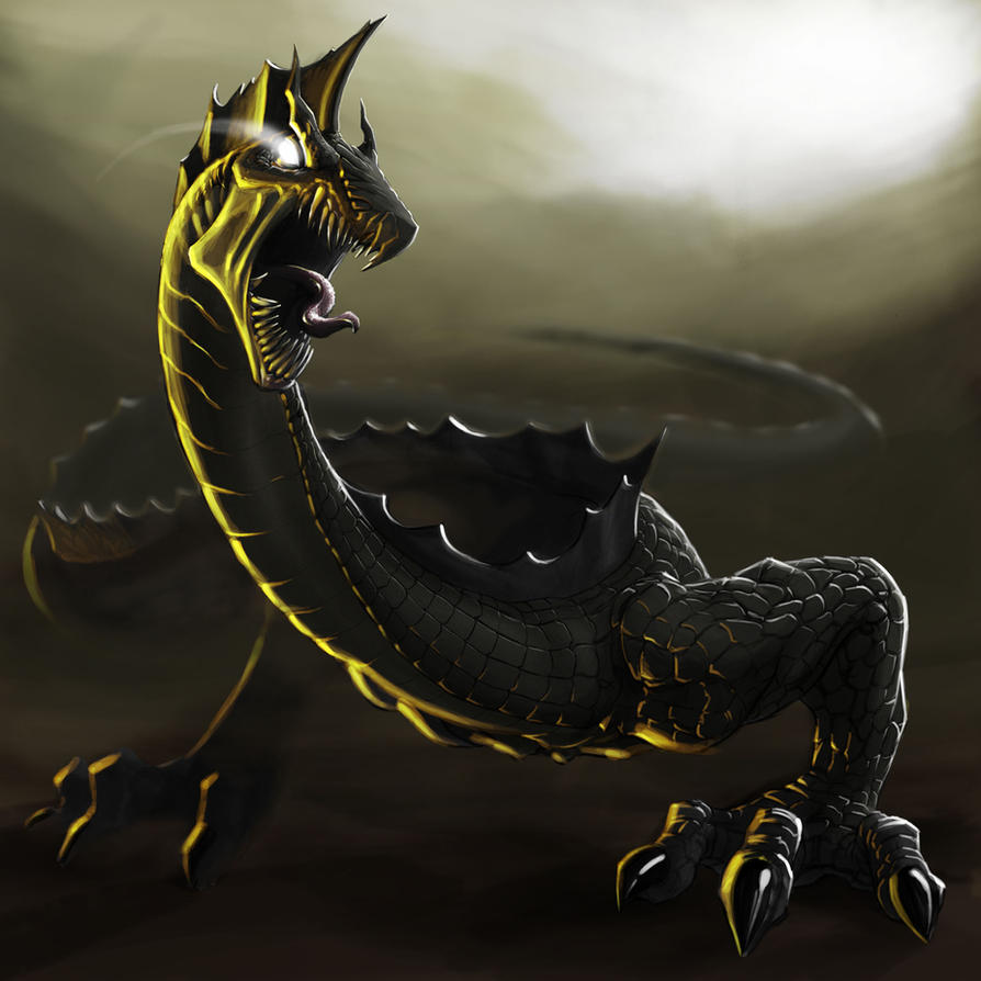
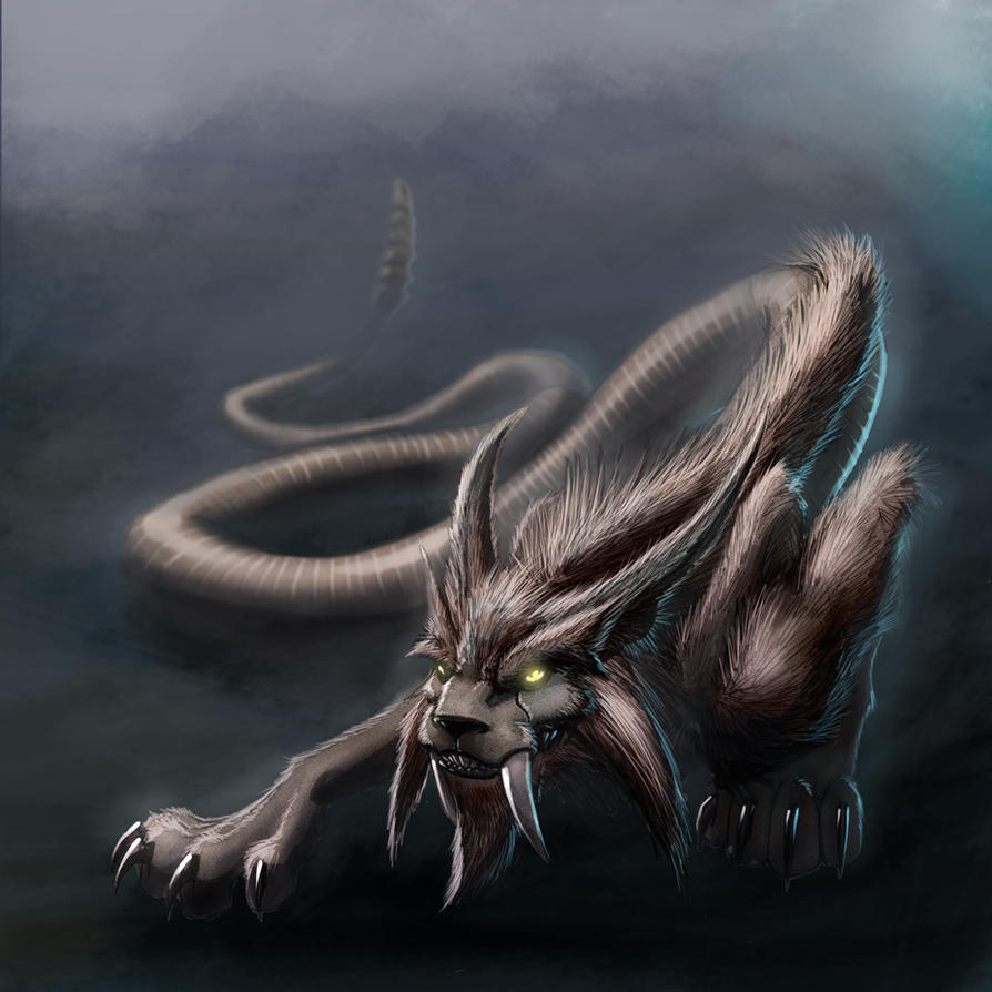
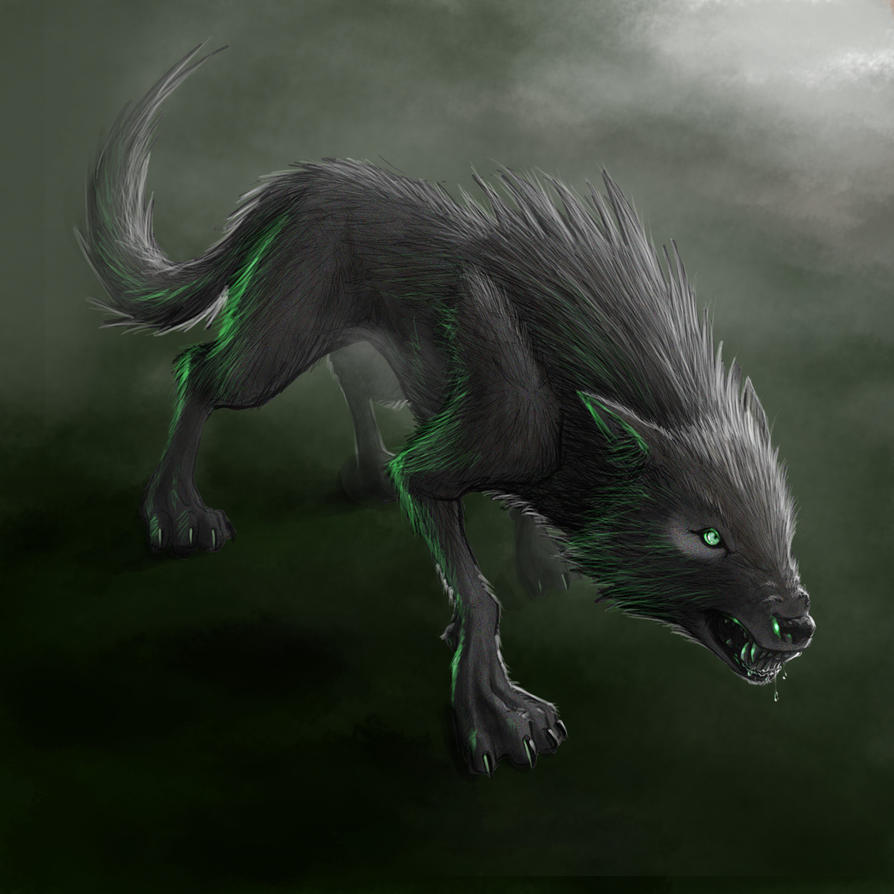
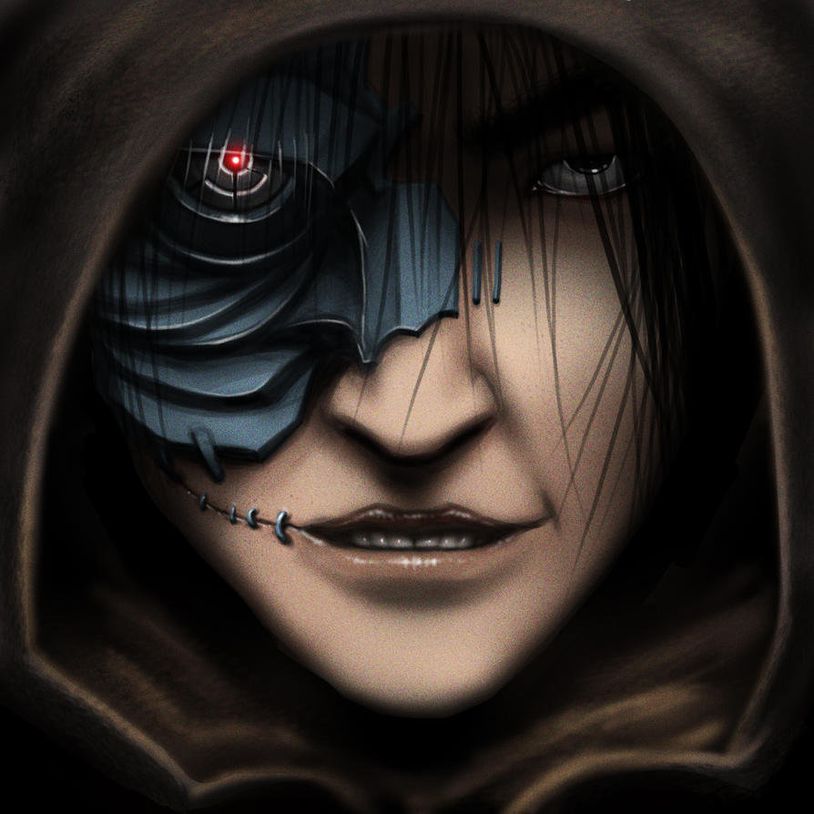
Now that's quite fancy. Do stick around for the concept art contest that should be starting soon, please. The more contestants the merrier. 
Now that's quite fancy. Do stick around for the concept art contest that should be starting soon, please. The more contestants the merrier.
Will do.

- Joined
- Jun 13, 2011
- Messages
- 740
Very nice work here ! 
- Joined
- Jan 17, 2010
- Messages
- 6,110
Awesome really 
- Joined
- Jul 7, 2009
- Messages
- 1,030
Beautiful. Now that's talent.
- Joined
- Mar 5, 2008
- Messages
- 3,887
give me a sec my jaw just fell off... : D
This is just awesome, can't find words to describe it.
This is just awesome, can't find words to describe it.
Your drawings are amazing
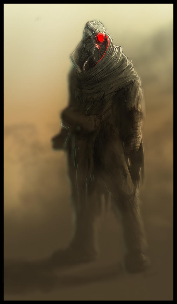
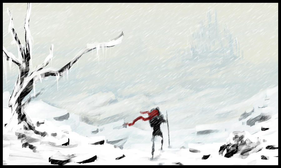
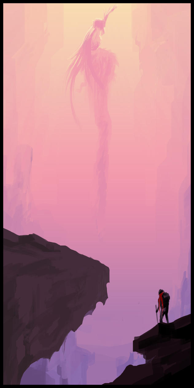
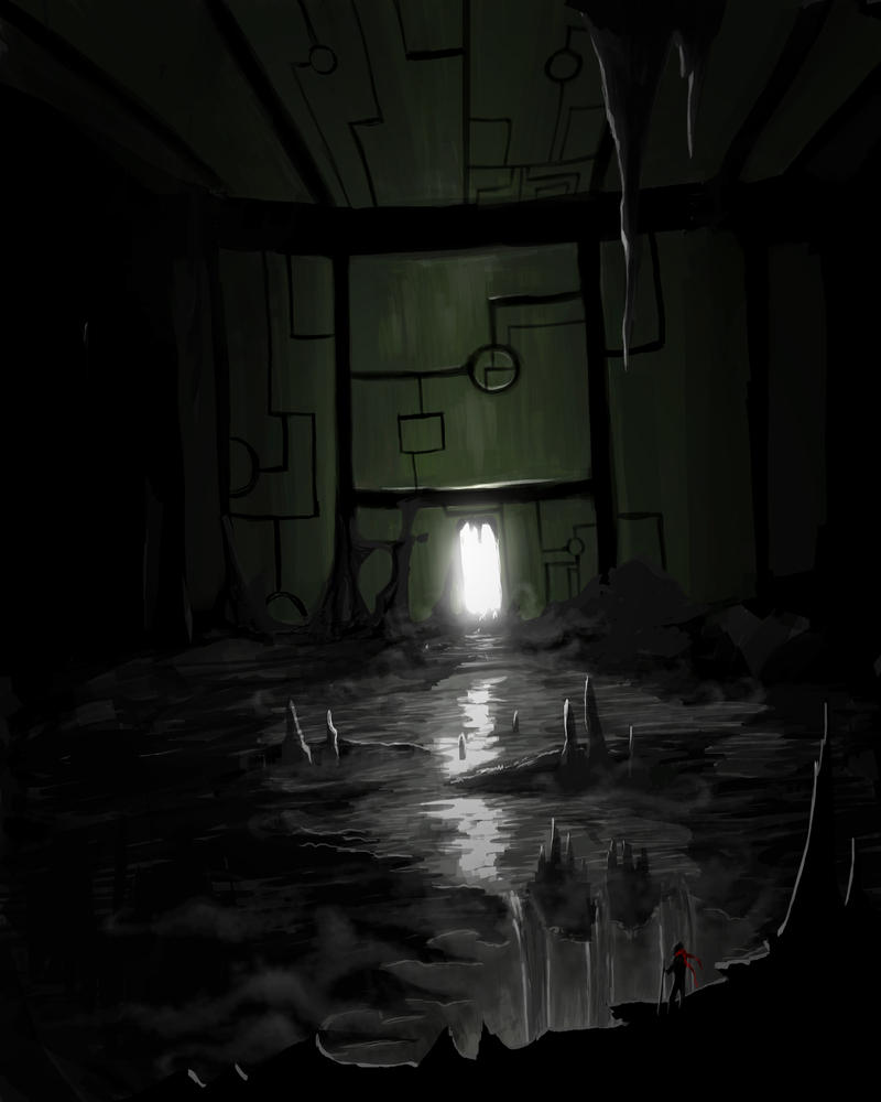
And man that red scarfed dude had quite a journey
haha thanks man. Oh the places he will go. XD
- Joined
- Mar 5, 2008
- Messages
- 3,887
One does not simply shit bricks... but i just did 
Nice work dizzt, too bad you don't have any lineart now, because i totaly wanted to color something
Nice work dizzt, too bad you don't have any lineart now, because i totaly wanted to color something
- Joined
- Jan 12, 2010
- Messages
- 1,770
Goood. Very good.
But, well, has some parts that can be improved.
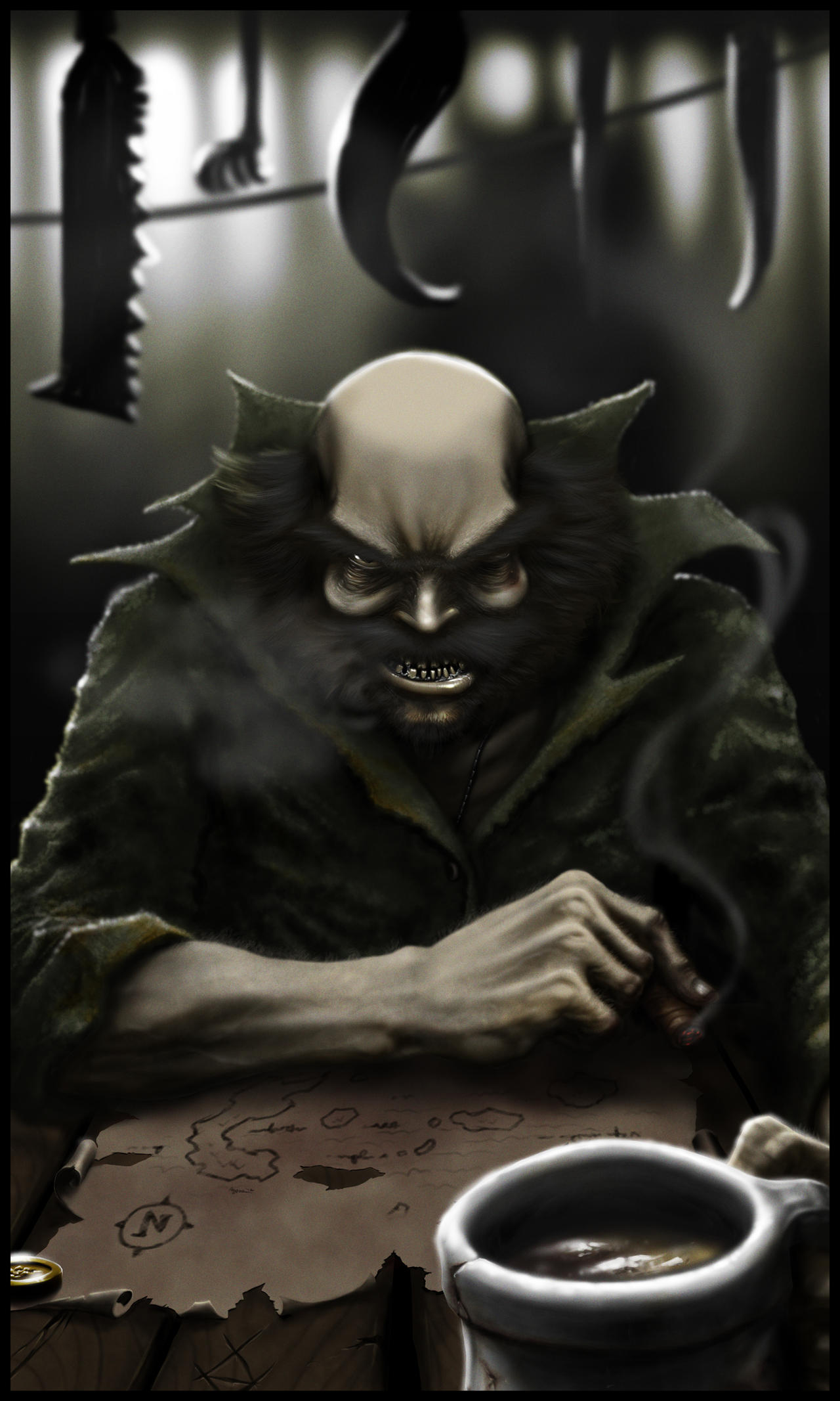
1. Smoke in front of face. It looks flat and way too blurry, according on the moment that its inside of focused zone.
2. Map. For old cracked on edges map its too clear. Adding some rum drops and splats, sigar burns will make correct sense of an old pirate map and will fits well a pirate theme (also captain's rough concept)
3. Focus. Somewhere are minor focus misstakes, i mean parts, where a paper stay in focus, but jacket sleeves are unfocused.
4. Light. Well, again not big misstake, that light comes from different sources. If a basic light source is a window behind a pirate, then his face shouldn't be lighted. If there is more few light sources (light reflex on lips and eye shows this), then its misstake on a head shadows, which is dark on the parts, that should reflex some light too.
Well, basically, cause of this problem with light image overall looks lil strange and overall great work looks less natural (with naturalistic render and cinematic-looking style).
Well, one more minor mistake - waves inside of cup (that should be circular)
- Status
- Not open for further replies.
Similar threads
- Replies
- 0
- Views
- 793

