Community
Maps
Tutorials
Gallery
Support Us
Install the app
-
Listen to a special audio message from Bill Roper to the Hive Workshop community (Bill is a former Vice President of Blizzard Entertainment, Producer, Designer, Musician, Voice Actor) 🔗Click here to hear his message!
-
Read Evilhog's interview with Gregory Alper, the original composer of the music for WarCraft: Orcs & Humans 🔗Click here to read the full interview.
You are using an out of date browser. It may not display this or other websites correctly.
You should upgrade or use an alternative browser.
You should upgrade or use an alternative browser.
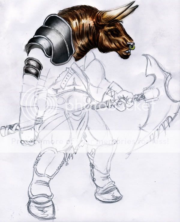
*New* Tauren Guard
- Status
- Not open for further replies.
- Joined
- Jun 3, 2005
- Messages
- 6,982
i thought i commented on this...
oh well.
great stuff.. just hes right hands too small and some slight porpotional probs and some slight errors, apart from those its great.
PS: try not to use dodge too much dodge or dodge at all, and...that avatar..heh.:/
oh well.
great stuff.. just hes right hands too small and some slight porpotional probs and some slight errors, apart from those its great.
PS: try not to use dodge too much dodge or dodge at all, and...that avatar..heh.:/
- Joined
- Jun 3, 2005
- Messages
- 6,982
Dont expect many comments here.. (hopes there will be more) this forum section is very quiet, and due to that i was very happy you posted here  but your art would still make me happy.
- Joined
- Sep 26, 2004
- Messages
- 1,543
you have some pretty extreme proportional and anatomical errors there. Take his left arm, for example, which is incredibly large compared to his right arm. I don't know if that's intentional though, but I can't imagine a use of such disproportional huge arm, it would ruin his balance and other things.
The fingers of the right arm are very messed up, they're what I like to call sausage fingers.
The perspective of the belly is wrong, because you see all the muscles from the front when the actual body is seen from semi-profile. Also the belt is in wrong perspective, the left button shouldn't be seen from the front like that.
Your line stile is kinda boring at the moment, because it consists of multiple small lines instead of a well placed clean single line, it lacks expressiveness (try to modulate it, make variations in the width and contrast of the line in key places like corners or apexes of curves and also make the things closer to the viewer thicker than the ones further away; you made in some areas the line thicker, but it's completely unjustified).
As for the coloring, the fur looks pretty good, the pauldron not so much (too clean and has no ambient reflections), but the main thing is that you focused on detail first, like finishing the head and the pauldron, and left the other areas untouched, which is a very wrong thing to do because you don't have an overall view of the colors of the image and how it will look at the end. First thing to do is to block in the main colors and values, and then start detailing multiple parts at the same time, don't focus on one thing then move on to the other. The image must come to life all at once.
Cheers and keep practicing, you're on the pretty right path for now.
- Joined
- Feb 10, 2007
- Messages
- 182
Its not bad ... Actualy its preety good cept the right arm being smaller ten the left 1 its very good...Keep up the good work
- Joined
- Jun 3, 2005
- Messages
- 6,982
o.0 this is an old topic...
But since its a showcase image and the art section isnt very active and the threads arnt regularly posted in and such i guess its okay but dont do it again please.
But since its a showcase image and the art section isnt very active and the threads arnt regularly posted in and such i guess its okay but dont do it again please.
- Joined
- Sep 24, 2006
- Messages
- 4,981
Any other comments?
y .. how u draw these kind of things .. on paper .. or with a program?
- Joined
- Dec 29, 2006
- Messages
- 365
looks very good  but yeah the right arm is really small compared to the other one. i would really like to see this finished
- Joined
- Apr 29, 2005
- Messages
- 999
I really like the design. I hate the wc3 minos. The axe has a sweet design too. I like that the lower part of the blade is bent forward. Insperation from the Diablo 2 Hellslayer? Makes me want to make a model of it. With pretty vray materials. 
- Status
- Not open for further replies.


