• Listen to a special audio message from Bill Roper to the Hive Workshop community (Bill is a former Vice President of Blizzard Entertainment, Producer, Designer, Musician, Voice Actor) 🔗Click here to hear his message!
  • Read Evilhog's interview with Gregory Alper, the original composer of the music for WarCraft: Orcs & Humans 🔗Click here to read the full interview.

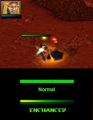
[N]EnchancedHPBar.blp

Changes Health Bar and Mana Bar of your units to kinda 3D-liked.

Trying to remain old WarCraft 3 liked hp bar but more 3D. xD
Enjoy!

Looks better in game.

Keywords:
HP BAR, health bar, bar model, another bar model, bar system, ui, interface, StarCraft, 3D, Enchanced, 1rfan1, mana, bar, mana bar, Squared, Arch, day
Contents

Healthbar Enchanced (Texture)

Reviews
19:54, 11th Oct 2013 Kwaliti: Useful.
Not really sure what the point is on having it slowly get darker. It just makes it a lot harder to see when you're running low on health. Instead maybe just have a darker bottom and a lighter top, indicating a light source from the top angle rather than from a left side angle?
That is why the bar is getting lighter to the left, so you will see when your HP is going down. And it kinda looks fancy :D
But yeah maybe you could make the top right of the bar a little bit brighter?
 
Level 3
Joined
Sep 25, 2021
Messages
30
I think there is reason to put the gradient darker on the green part, because these are seen easier than a red and short stack. It could be even more extreme, darker and whiter on the ends. Simple and nice enough bar.
 
Top