• 🏆 Texturing Contest #33 is OPEN! Contestants must re-texture a SD unit model found in-game (Warcraft 3 Classic), recreating the unit into a peaceful NPC version. 🔗Click here to enter!
  • It's time for the first HD Modeling Contest of 2024. Join the theme discussion for Hive's HD Modeling Contest #6! Click here to post your idea!

Misty Spring

This bundle is marked as useful / simple. Simplicity is bliss, low effort and/or may contain minor bugs.
「Misty Spring」

By Daffa the Mage

Gameplay
[tr][/tr]
[tr]
A Normal Melee Map with Wind Effect.

Features
[tr][/tr]
[tr]
4 Gold Mines
3 Fountain of Health
2 Goblin Merchant
4 Way Gates

Credits
[tr][/tr]
[tr]
Moyack
SonofJay
-Kobas-

Changelog
[tr][/tr]
[tr]
1.1 : Major Terrain and Overall Improvements
1.0 : Uploaded to Hive
Map Description Generator 「By Vengeancekael」

Keywords:
Misty, Spring, Daffa, Mage, Magic, Orc, Human, Undead, Night Elves[/tr][/tr][/tr][/tr]


more-map-png.290508
Contents

Misty Spring (Map)

Reviews
10:58, 9th Aug 2013 Orcnet: working board
Level 30
Joined
Jul 31, 2010
Messages
5,246
8ef.gif
The map right now is uh, well....

Alright, since I'm back maybe I should hand you out some ticks here:

-Expand the map more, adjust it in at least medium size that way you can fill more neutral buildings, creep camps, and enough space to hide and seek with the poseable players on game.

-The idea of height tooling is very repetitive right now, maybe do some work by doing some varieties such as a mountain like regions(replacement of cliffs) and so on.

-Tile variations, this are key factors if you don't want to spam the map with doodads, if I would recall a misty spring, village/village fall tile set is more fitting that lordaeron X/X/X

-Neutral buildings(except tavern) will always have creep camps guarding it, though it depends of the play style you want to role but really right now a free goblin lab is too much of an overpowering state(not to mention shredders in early game)

Right now there is too many things to work on this right now, for me it looks like a WIP try to read out -Kobas- map melee tutorial and so fort.
 
-Expand the map more, adjust it in at least medium size that way you can fill more neutral buildings, creep camps, and enough space to hide and seek with the poseable players on game.
I don't want to re-adjust the positions :/

-The idea of height tooling is very repetitive right now, maybe do some work by doing some varieties such as a mountain like regions(replacement of cliffs) and so on.
Bleh, I got a new idea rolling thanks to this one :D

-Tile variations, this are key factors if you don't want to spam the map with doodads, if I would recall a misty spring, village/village fall tile set is more fitting that lordaeron X/X/X
Okay, it's shouldn't be hard to re manipulate the terrain.

-Neutral buildings(except tavern) will always have creep camps guarding it, though it depends of the play style you want to role but really right now a free goblin lab is too much of an overpowering state(not to mention shredders in early game)
Okay, the old idea was to give all players ability to attack the isolated islands in late games, but I guess I'll see what I can do.
 
Last edited:
Level 5
Joined
Jul 8, 2013
Messages
489
Well well daffa?New map :p
Here is my review (like it or not :p):

Good Things

-Nice looking terrian
-64x64 very good for a 1v1
-i like the waygates,good for ambush and siege
-LoL its your 2nd map so just good work :p
Bad things

-Terrian is a bit boring.....
-Too much neutral buildings for a 1v1 map
-Uh.. the map way..terrian is a bit confusing...
-waygates make a single path only to attack the enemy
What to improve?

-First the terrian.Try conecting the 2 factions whit normal ways and not just with portals(my opinion)
-Secondly removing a couple of neutrals will be better
-i like your doodads but arent they too much?
Note:I will play it and tell you in 5 mints about any changes to my review
For now a Grand total of 3/5 is your rank :p

Needs really more work daffa..Terrian is really too rought and try removing 10-15 trees from starting locations cause the space is too small.
 
-Terrian is a bit boring.....
I'm sucks in Terraining, but I'll try to improve it :)

-waygates make a single path only to attack the enemy
I'll guess I'll add a different way for players as well I think.

-Uh.. the map way..terrian is a bit confusing...
Okay, I think you need to get used to no direct path maps :D
Seriously, I think it's not confusing, except that it confuses much when it comes to the attacking other player, since you rely on one path which is a long road.

-First the terrian.Try conecting the 2 factions whit normal ways and not just with portals(my opinion)
I prefer use Zeppelin (Goblin Lab) instead :p
But I can think of it :)

Needs really more work daffa..Terrian is really too rought and try removing 10-15 trees from starting locations cause the space is too small.
That was mess, I was in a hurry before I go to my course =/
I'll clean some once I'm home :)

-LoL its your 2nd map so just good work :p
Second Map I uploaded here :p
 
Review of Misty Spring
By Legal_Ease
Overview
Ok, so this is a melee map with a campaign-ish type feel. Each player starts in his own village like area and
must travel over many bridges to meet the enemy in battle. There is some non-blizzard type terrain features.

The Pros
-Nice misty feel and spring time ambience
-Interesting map pathing design - narrow passes - maze like set up
-Nice colors in tiles and doodads
-WAYGATES!!! Awesome!!!

Suggested Improvements
-Strange pointy things in the middle don't really look like anything.
-Each opening or play area seems a bit square and could be rounded out to look more natural.
-Edges of bridges have water coming under them (fix this for sure).
-The top of your description is off center try adding a [table] over the whole thing, that should clean that up nicely.

Rating & Final Thoughts
3/5, +rep, I suggest reading the water tutorial for this very wet and misty creation, also some alpha tiled reflection
would rock. Without something to go BANG, this map doesn't really do much. I agree with orcnet too, its a bit small.

Links just for you!
how-create-dynamic-water-levels

Reflections in Terrain

Advanced Water tutorial

 
Level 20
Joined
Jun 27, 2011
Messages
1,864
* Map is symmetric.
* Smooth shores.

* The spikes in the middle looks ugly.
* The lightning in the middle does not match with the map theme imo.
* Those winds does not really look good at all.
* Some creeps are not facing the same angle as the surrounding creeps does.
* The spikes in the middle looks ugly.
* Floating bridges. CTRL + Page Up to raise it from the ground, or CTRL + Page Down to lower it down.
* Use more doodads. Preferably environmental one.

Daffa, I knew you could do better, please try to improve atleast the terrain.
1.5/5, voting for Rejection (sorry).

@Legal_Ease, the Reflection tutorial you gave is for unplayable maps only.
 
Last edited:
Level 30
Joined
Nov 29, 2012
Messages
6,637
Misty Spring Review

Introduction

As promised Daffa, I have found a time to review this so here is it. Sadly, I have to agree with those negative feedbacks. This is not ready for an approval and needs such improveents for a melee map.


Unexpected tab 1

[tab][tabheader]Good Points:[/tabheader]
  • Terrain looks fine but do remember fine does not meet that its good. Terrain is quite flat if you will notice and doodads are improperly placed and some blocks units and pathways. Also, the cliffs in the middle are too much noised up. I do suggest retain its original form which looks like just a cliff.
  • Map looks ok and symmetric though the view in the minimap is not pleasing.
    Creeps are balanced.
[/tab]

[tab][tabheader]Bad Points:[/tabheader]
  • The spaces in the player's start locs are really small and needs to be widen. This also applies to the expansion areas. Too small.
  • The expansion areas also lacks places to gather lumber.
[/tab]

[tab][tabheader]Suggestions:[/tabheader]
  • I suggest for terrain improvements. Do some tile mixing, you are just using one kind of a tile which is not really creative, the noised cliffs in the middle is really disturbing which loses its quality so much, and doodads are not properly putted and some even blocks ways a little but is still enterable.
  • Widen the spaces for the payer start loc to enable players to have more spaces for building and also this applies for the expansion areas. Expansion areas also lacks trees to lumber. There are only trees there. Most likely, your best solution is tho remade this in a bigger map. As what SonofJay said to me, do not worry you'll gain more rather losing. It might mean that you will have to work again but trust me, its worth it!
[/tab]

Comment

Overall, do take suggestions into consideration and it will pay well and will award you an Approval but for now, imprve the map. Good luck Daffa and happy mapmaking :cgrin:

Rating: 3/5
Vote: Pending
 

Remixer

Map Reviewer
Level 31
Joined
Feb 19, 2011
Messages
1,954
Remixer's Review
Terrain
Firstly I think that terrain is very poor there is many reasons for that but overall the map looks very roughly done and it is not pleasant to eyes.
• Bases are too small and players do not have enough place to build.
• The edge of the playable map is very out of place, you should edit that.
• The bridges are not placed nicely and they look currently very ugly. There is a few tricks to make bridges look nice in maps. The tricks are:
1. Make the cliff/ground properly heighted for the bridge, terrain should be at the same height at both ends of the bridge, do not forget that the terrain directly touching the walkable bridge musn't be too smooth.
2. Height the bridge correctly. Not many people height any doodads or destructibles in their maps you can do this by holding down [Control] and pressing [Page Up] to move the object upwards or pressing [Page Down] to move the object downwards. The Page Up/Down keys can be found above arrow keys. The bridges are heighted properly when there is no rought change in the unit's height when it steps on the bridges edge.
3. Use correct bridges. Many map makers does not notice how ugly some bridges are for some location. For example you have placed Stone Bridges. You should have gone with Natural Bridges or Wooden bridges they would look a lot more natural for this map.
• There is not enough environmental doodads. I see you have added doodads to the map which is good however you should add environmental doodads also to make it look more natural. Specially the shores looks very plain.
• Tile using. The tile using is very boring you have used mostly just grass. If you think it is ugly to place dirt or such things around you can add more grass ground tiles to the map. For example Ashenvale's Lumpy Grass and Sunken Ruins' Rough Grass is very good looking. However you should add some dirt to the shores to make them look.
• The lightnings in the middle of the map looks ugly, I suggest to remove them. Also there is those super terrain spikes. I wonder what you tried there but they are looking weird and you can still walk on them. I suggest to reset the height there.
• Water is looking very plain. You should move the decoration ships more to the deep water, they lay on the shore now.
• I also doubt that all races can build their Headquarters at the extentions it is just too small area for example for orcs.
• On the South-East side below the Blue Waygate you can cut the trees to make an additional path. Is this intented?


Creeps
Overall you have tried to include too much in too small map. Why you have three fountains of life? It is just too much. I suggest you to place only 1 fountain in the middle and replace the two other fountains with Goblin Merchants and remove the old ones and extend the base area to their old locations. Also it is not necessary to have those Way Gates there. If I were you I would remove the cliffs around them and make it walkable to the middle.
• The creep camps are very unbalanced. Near the merchant if you attack another of those creep camps both of them will attack you. Also the creep camp guarding the merchant has 1 level 8 Wizard and 2 level 5 Wizards. That is insane as a third creep camp you will kill. Reduce the difficulty.
• Overall the Item Drops of harder camps are too small and way too random. You should add less random creep camps (Add class to the item drop.)
• The creep camps are not placed nicely. The first creep camp is removed at the start since it is too close to the starting location. Also most of the creep camps are on the way to enemy base. You can not avoid them attacking you anyway! That is not nice. You need to neither add wider areas to move on or remove some creep camps. I suggest you to just select a bigger map since you are not that advanced at melee map making.
• Make sure creep camps are balanced. Did you guys by the way notice that the Extention Creep camp in the north has 1 Stone Golem and 3 Mud Golems and in the South it has 1 Stone Golem and 2 Mud Golems. Racist...


Generally
Generally the lay out is pretty unique, however it is also pretty booring and simple. Only 1 way to attack to your opponents base and you can not really build any kind of defenses to your own extention since enemy will enter from a Way Gate. I also think that AI will get raped in this map since the creep camp guarding the merchant is too powerful as it tries to clear the green creep camp next to it. The map does not have enough lumber in it and it needs more building place.

Rating
Terrain: 2/5
Comment:
You have tried and I like some things but you just need to improve them more or less. Take all hints and tips you can get from other map makers.
Creep Camps: 1/5
Comment:
They are poorly placed and unbalanced. However as I've been noobie by myself also I know it is not the easiest thing to do.
Generally: 2/5
Comment:
Generally the map is very basic and it does not give the player special experience when playing it. The layout and general things needs to be improved.
Total scores: 5/15
 
Level 30
Joined
Jul 31, 2010
Messages
5,246
So I comeback once again to make a review, I don't really understand why others is giving out fair rated reviews, I'm sorry to disappoint you daffa but here are my final results:

- the spike height tiles is bad looking, why not just use the spike doodads of ashenvale or sunken ruins?

-lordaeron summer is not a fitting theme for a misty spring like area, village, ashenvale, or sunken ruins hit the spot

-lightning bolts do not serve any purpose for a spring, a spring is someplace where positive energy surrounds the place, so why add lightning?

-Instead of using the weather: Wind(Heavy) [and again a spring is a haven, not a royal rumble], use the weather: Dungeon White Fog(Light) its much more calm.

-doodads are lacking, physical involvement around the map is not a good idea, let's make it natural so it means there should be grass, rocks, cliffs, and any environmental doodad in place, speaking of environmental, creeps should not be humanoid, they should be either elementals or little type of monsters such as wolf, spider, murlocs

-reduce the usage of neutral buildings, the map is small so the spoon feeding should be small, really a waygate is too much for just a tiny space, strategic-wise the map doesn't really need waygates, it would be a pain if a huge force started entering one the expansions that has been taken by the other player.

-speaking of expansions, all expansions are so near the main player bases this ends up to be disastrous(e.g air units, siege units, bloodmage flame strike, FR earthquake) move them somewhere out of player reach that player's need to reach

-the bridges doesn't look natural, I would suggest you just make a shallow water path and remove them, this give more atmosphere for a spring

To my conclusion, you need more handwork than waiting for feed backs, feed backs is random they either just say this to please you but they distract you from taking out your own advantage of working your self-idealism. So for now I'll leave this in 'NEEDS FIX' this way you get more time working on what needs to be done.


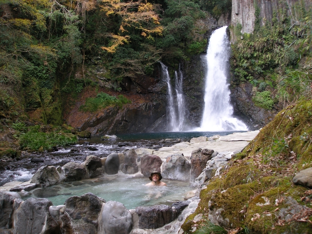
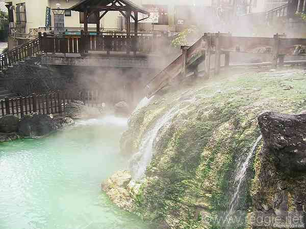
EDIT: I think your referring your map into one of asian type of springs so here are some real-life view concepts you might need to work this map:
71_o.jpg

url19.jpg

onsen320.jpg
3909005-600.jpg
 
Don't sell yourself short, the terraining is good.
There's beauty in simplicity & I actually really like this map.
Heck, I made a video of me playing the map & losing against a mere (Computer Normal) AI:

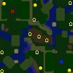
Thanks for the praise, though it has rooms for improvements. I am more of a trigger person, so terrain is not my forte.
I appreciate the video, thanks.
 
Top