• Check out the results of the Techtree Contest #19!
  • Listen to a special audio message from Bill Roper to the Hive Workshop community (Bill is a former Vice President of Blizzard Entertainment, Producer, Designer, Musician, Voice Actor) 🔗Click here to hear his message!
  • Read Evilhog's interview with Gregory Alper, the original composer of the music for WarCraft: Orcs & Humans 🔗Click here to read the full interview.
  • Create a void inspired texture for Warcraft 3 and enter Hive's 34th Texturing Contest: Void! Click here to enter!
  • The Hive's 22nd Icon Contest: Creep Abilities is now concluded, time to vote for your favourite set of icons! Click here to vote!

Lost Town

Status
Not open for further replies.
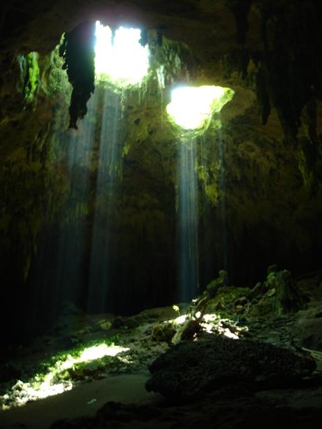
2 hours ago I opened WE!
2 min ago I uploaded image!
2 sec ago I clicked on Submit New Thread button!

EDIT:

Thanks to all that posted below!
I know that I fucked up with lightning (just like I now fucked with trees :sad:), but I was tired and bored already!
So I played with doodads a little more today!
And here is result!

EDIT:

Again thanks to all that posted below!
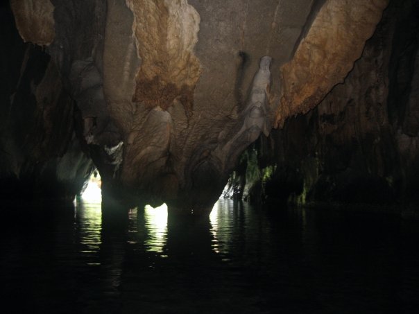
I fixed trees and added/edited few things...


185870-albums3014-picture37740.jpg


Any suggestions and critics are welcome!
 
Last edited:
Yes inside cave...
I thought so, it had that kind of ring to it. I believe it's an excellent idea, however it should be a whole lot darker. Try working with the black glow model.
Perhaps you could clarify that it's a cave by adding for example stalagmites and stalactites. Additionally, I would give it a more foggy appearance.
Some other tricks might also work. Perhaps give it small light sources, as seen in this example: https://www.hiveworkshop.com/forums...4331397-my-terrain-showcase-morgen-kammer.jpg
 
You miss the fog, it looks boring now, except the right side of the picture with the waterfall. Try making it gloomy, a strong white fog, if you've seen in movies when pirate ships come out of a fog/mist. Some ships or a ship would also be nice, it would also explain the appearance of people in the city. Also, the house on the big rock looks really weird, you should fix it somehow. Make it look more soft, and add a road from the town to the house rather then paling up rocks.
 
You miss the fog, it looks boring now, except the right side of the picture with the waterfall. Try making it gloomy, a strong white fog, if you've seen in movies when pirate ships come out of a fog/mist. Some ships or a ship would also be nice, it would also explain the appearance of people in the city. Also, the house on the big rock looks really weird, you should fix it somehow. Make it look more soft, and add a road from the town to the house rather then paling up rocks.
I'd say a completely black terrain fog with slightly light blue fog models neatly placed would be more appealing.
 
The glowing torches are ugly IMO
Underground lightning isn't really yellow...

Lol_Tun_Caves_Yucatan_Mexico.JPG

inside-underground.jpg

images


also some white fog at the shore would look really awesome, try using glow doodads or Eeire fog.
I used fog near waterfall
Also, remove the rock spam around the Town's wall.
Well whole city and lace was build on rock!
That is my idea, now I guess I created it wrong :D

Thanks for reply once again!
 
Well about that "underground lightnign isn't really yellow". Well taht depends on the kind of lightning. Your pictures are all from sunrays, while the light source you use in the picture is from a torch (fire). And I've never seen white fire on a torch before!

Try making the rock walls from rockS instead of 1 big stretched rock. Use multiple doodads and make well... a real wall instead of just 1 doodad. With some brown shrubs or vegetation/mushrooms in it it might look much better.

And tbh your first picture was better then your second! But still I like what you've come up with! Good job:D
 
Looks much better already. The only torchlights I really disapprove of is the two located top right.
The lighting at the shore by that birch is as correct as can be, well done.
The darker atmosphere is generally much better than your first attempt.
Waterfall could do with a different color. Try your best to match the water model's tinting.
There are still some bruises to tend to, however the update had a much better appearance than its predecessor.
+rep
 
Well add more white fog near the shore! It will look more natural.
Look really bad!
For now I fixed few other things, will search for different models!
I like the inprovement although the fog at the torches looks a little bit strange and im still not veyr happy about that waterfall but hey still +rep for you xD
Damn few min faster than update :D, anyway thank you!
 
xD checked update the torches look better now imo and about the waterfall hmmm i think it looks a bit better now but still not perfect but i wouldn't know myself how to make it better so nevermind that xD once again +rep (prolly gona get -rep soon from a mod for giving you +3 rep on 1 day xD)

Edit: figured out i gave to much rep in 24 hours so after 24 hours +rep
 
Status
Not open for further replies.
Back
Top