• Listen to a special audio message from Bill Roper to the Hive Workshop community (Bill is a former Vice President of Blizzard Entertainment, Producer, Designer, Musician, Voice Actor) 🔗Click here to hear his message!
  • Read Evilhog's interview with Gregory Alper, the original composer of the music for WarCraft: Orcs & Humans 🔗Click here to read the full interview.

Human Mage, tips please :)

Status
Not open for further replies.
Level 2
Joined
Aug 18, 2010
Messages
6
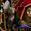
Hey there guys, here for round two. Spent the last few day's re-skinning the Druid of the talon, would appreciate some feedback if you get the chance.

You'll notice that i didn't touch the staff, i tried alpha'ing it out, didnt seem to work due to the player colors. I know this isn't a place for requests but if someone could get in touch with me regarding perhaps removing it - would be awesome.

Thanks, Parks. :)
 

Attachments

  • Human Mage.jpg
    Human Mage.jpg
    56.6 KB · Views: 162
  • ScreenshotMage.jpg
    ScreenshotMage.jpg
    93 KB · Views: 163
Last edited:

Deleted member 157129

D

Deleted member 157129

Get rid of the stupid effects and whatnot in the screenshot so we can see what it looks like.

I think you're mixing a bit too many colours; they don't go well together. You should also try to go for a cleaner style with much more definition. Right now it looks very bland.
 
Level 2
Joined
Aug 18, 2010
Messages
6
Get rid of the stupid effects and whatnot in the screenshot so we can see what it looks like.

I think you're mixing a bit too many colours; they don't go well together. You should also try to go for a cleaner style with much more definition. Right now it looks very bland.

Updated, no more effects. Also provided a few more screenshots. Work on my definition, thanks.
 
Level 2
Joined
Aug 18, 2010
Messages
6
It looks pretty good, but you really need to work on your technique to draw clothes.
I suggest you look at this tutorial(By Mr.Goblin).

Thanks for the tips mate - yeah i did wing it mostly with the clothes. I'll have a gander at Mr. Goblins' textures. Thankyou very much.
 
1. dont double post.
2. I believe i had said this before to you, but your highlights and shading are far too jagged, making it end up with quite a messy result. shiiK also brings up a very good point. It looks incredibly bland. and yet even still, using the method of shading that you are using, you end up loosing definition rather than gaining it. And it ends up with this result. You need to work on smoothing out your style to gain better definition and a much better result. And the tutorial mentioned above can actually help you with that.
 
Status
Not open for further replies.
Top