• 🏆 Texturing Contest #33 is OPEN! Contestants must re-texture a SD unit model found in-game (Warcraft 3 Classic), recreating the unit into a peaceful NPC version. 🔗Click here to enter!
  • It's time for the first HD Modeling Contest of 2024. Join the theme discussion for Hive's HD Modeling Contest #6! Click here to post your idea!

Hollow Hearted

Status
Not open for further replies.
Level 36
Joined
Nov 24, 2007
Messages
4,379
Here comes another terrain based on the fan-fiction I'm writing,
this time it's a scene portraying the aftermath of what happened
between Zaragov and Harthal in his "room-of-command." I'm not
necessarily completely satisfied with it, so suggestions for
improvement would be immensely welcomed :)

“Roses have thorns, violets are cruel. Death is silent, and so are you.”
- Zaragov's final words to his former commander, as he leaves him crucified on his own cross.
 

Attachments

  • Hollow Hearted.png
    Hollow Hearted.png
    1.9 MB · Views: 1,227
Last edited:
Level 36
Joined
Nov 24, 2007
Messages
4,379
You don't need to be a Moderator to voice your opinion, and nor do I need
to be one to object. What a dull forum this'd be if that was the case.

Anyway, I don't know that I agree about the opening, I like it as is.
And the ink bottle is affected, that can be seen on the quill, but the
color of the ink is rather dark, compared to the doodads around it.
That might be what makes you think so, but I don't think it's too
much of a distraction, and besides, for concept reasons, that ink
bottle needs to stay.
 
Level 17
Joined
Jan 18, 2010
Messages
1,122
I think the flask is indeed unfogged, the quill is a different blending mode but the bottle is probably one of the modes that does not behave well in fog.
That being said I didn't find it disruptive, in fact I didn't notice it until Heinvers pointed it out.
The opening does distract a tiny bit, funnily enough I don't think it is a bad thing. It would look dull if it was too symmetric IMO.
Generally it is very nice and I actually like the holes a lot.

One thing I noticed though is the pic is artifacting a lot. Would a png be too big ?
 
Level 36
Joined
Nov 24, 2007
Messages
4,379
I guess with "artifacting" you're referring to the "jagged" edges, and no, it's not
impossible to save it as .png, it's just more of a bother. I'll do it, though, for you :p
- However, it doesn't seem like it fixes the problem >.>

I did some investigating, and right you are, the ink part of the bottle isn't
affected by the fog, but as you say, I don't think it's too big of an issue.
 
Level 17
Joined
Jan 18, 2010
Messages
1,122
Not as much about the jaggies as it is about the pixels getting blurry and "bleeding" into each other like in youtube videos, the png is indeed a lot better.

As for the rest, can't say much else. I'd leave further critique to the terraining dudes :p
Though I'd also praise the faint orange/beige in combination with the blue glow, good complementary choice.
 
That is an awesome terrain. I really like the use of lighting--the darker edges bring your eyes to the focal point, and the colors were well chosen. The details with the rubble, webs, branches, etc. all really bring the picture together. Nice job.

You may not be completely satisfied with it, but it is one of the best terrains I've seen. :D
 
Level 36
Joined
Nov 24, 2007
Messages
4,379
You may not be completely satisfied with it, but it is one of the best terrains I've seen. :D

Ha, thanks. I'm not sure this piece deserves that kind of recognition, considering
how quickly it was made. But then, I really appreciate that you like it :)

Also, a slight update, added some minor details, like a statue in front of the preacher pedestal,
some swords and shields among the skeletons to indicate there's been a battle, and I remade
the window on the right-hand side, so that there's no glass, it's probably not too apparent,
but I wanted to have a branch sticking in there :p

I also slightly touched up the shadows, they're more smooth-like now. I'm still a little bothered
by the benches on either side, but I'm at a loss for ideas on how to vary them any more than
I've currently done... >.>
 
Level 10
Joined
Nov 23, 2006
Messages
592
The table looks like it is still being used. Bottle with ink still in it and that cross, which I guess wouldn't last there since the building looks abandoned for quite a while. Someone would probably steal it a long time ago since it has gold on it.

But those are just details. I really like it otherwise.
 
Level 36
Joined
Nov 24, 2007
Messages
4,379
Well, for lack of good looking half-rotten or not rotting at all corpses, I chose to go with skeletons. So, while it
might "seem" like this scene has been untouched for quite some time, that's not really the message. And besides,
how many robbers would you suppose stalk the ruins of Tiristfal Glades? >.>
 
Level 15
Joined
Jul 19, 2008
Messages
1,791
I actually really like this one. Indoor terrains are generally pretty hard to pull off. But this one looks pretty good.
The only thing I have against this is more so a simple matter of opinion - so don't take this as negative - and that would be the floor. Just not a huge fan of the large gaps in between the blocks. Especially in comparison to the size of the skeleton's foot, I can only imagine how easy it would be to step wrong and twist your foot in one of the cracks. I like the block flooring. I just feel like there should be some sort of cement to fill in those spaces. What I've done in the past while trying to make that kind of floor was to take a flat block and lower it one or two click below the floor to look like cement, or the fill in between the blocks.

Also, I spy with my little eyes, two white grid lines poking out in between the block floor.

That is all. This style of terrain would make for a pretty great cinematic. I like the model choices and great lighting. Chaos. approves of this terrain. ;)
 

fladdermasken

Off-Topic Moderator
Level 39
Joined
Dec 27, 2006
Messages
3,688
I second Chaos. on the block floor. Also I kinda wish there was a decent rugged carpet model for this kind of setting.

Aside from that, the window top left should probably leak some sort of light, albeit not as bright as in the background. It kinda looks like the panes are made of thick stained plastic right now. Some glow model setup should fix that right up.
 
Level 36
Joined
Nov 24, 2007
Messages
4,379
Hmm, I'm not sure a glow would look good in that regard, though, I'll give it a go.
- And yeah, I totally agree about carpets, trust me, I did some research and didn't
find a single good one, sadly.

I'll look into filling those gaps, too.

Also, I spy with my little eyes, two white grid lines poking out in between the block floor.

Oh, fuck me, you're right.
 
Level 36
Joined
Nov 24, 2007
Messages
4,379
Update, yo.

Added the carpet Heinver suggested, you may dislike it as much as you want; it stays.
Also, you don't get fillings in the bricks, cause it looked like shit when I tried it out, and I
fixed the window on the left side.
 
Level 16
Joined
Sep 19, 2011
Messages
829
Holy FK! This is indeed nice, makes me want to catch up with your writing even sooner. Don't think I'm trying to be nice, I just don't have time to read and I do it because I enjoyed it + No time <===. There's nothing constructive or even destructive to say, I like it the way it is and to lazy to do it (comment it). The blue and orange glows are indeed nicely blended. Considering the fact that it's fast work, it's a cool Pic. Not going to say anything about light and all that bla, bla of mine but I would like to test this for lighting instead.

Good Job!
 
Level 16
Joined
Sep 19, 2011
Messages
829
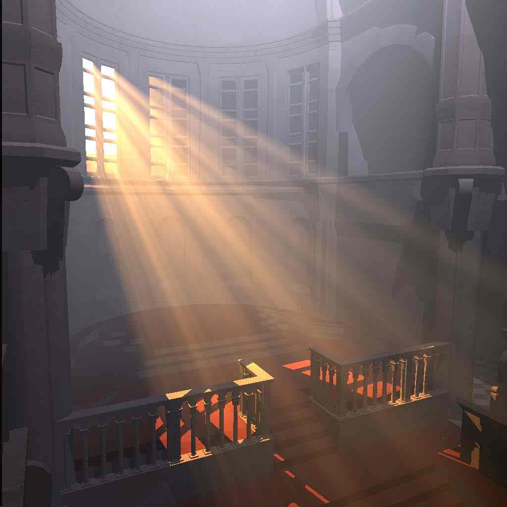
I'm saying that you can enhance that volumetric light a bit, and ad more to it, I feel that the skeleton needs to stand out a bit more but that depends more on your personal choice. Something like this perhaps...

210613-albums6274-picture80704.jpg


(I won't and am not suggesting to change the colors, just add more light rays behind the cross!)

I am also at the same impression as Chaos regarding the floor.
What I've done in the past while trying to make that kind of floor was to take a flat block and lower it one or two click below the floor to look like cement, or the fill in between the blocks.
I would do the same!
 

Attachments

  • bigstockphoto_Rays_Of_The_Sun_73840.jpg
    bigstockphoto_Rays_Of_The_Sun_73840.jpg
    75.5 KB · Views: 199
  • images.jpeg
    images.jpeg
    4 KB · Views: 114
  • Mental_Ray_Volumetric_Lighting_Abandoned_Room.jpg
    Mental_Ray_Volumetric_Lighting_Abandoned_Room.jpg
    161.3 KB · Views: 317
  • sibenik-our.png
    sibenik-our.png
    420.8 KB · Views: 127
Level 36
Joined
Nov 24, 2007
Messages
4,379
Perhaps you could experiment with glow.mdx, stretched and rotated?

I'm nearly offended you actually don't think I've already tried that :p
- I have, and anything I do with the glow model in that regard always turn shit.

Also, Talavaj, those models are sexy, tried them and the attachment is the result.

I really like it, really, but somehow they produce these awkward vertical lines on
dark surfaces, like the benches, so I'm not sure I'm completely happy with using
them for this terrain... >.>
 

Attachments

  • WIP.png
    WIP.png
    1.8 MB · Views: 185
Level 17
Joined
Jan 18, 2010
Messages
1,122
Lol, you must've made them reeally huge then.
They are pretty dense, but when you make them quite large the clipping starts to show.
One way to alleviate the issue could be making them less bright (about 25 value in tinting color) and stack multiples shifting each instance a centimeter to each side.
Though the problem there may occur that multiple rays of low intensity stacked on top of each other will start affecting textures seen through them in unusual way.

Anyway, feel free to experiment. They are very much work-in-progress now. I already noticed the pivot being haywire when you scale them large shifting the entire thing upwards for god knows what reason.
 
Level 36
Joined
Nov 24, 2007
Messages
4,379
Lol, you must've made them reeally huge then.

Not really, but you were right, lowering the tinting values and using more than one, with minor shifts to either side kind of fixed the problem, sort of. I'm still not sure
about it, though, might be I've just got to experiment a little more.

And, thanks, readytoeat :)
 
Level 36
Joined
Nov 24, 2007
Messages
4,379
Thank you, Knight :)

Also, final update, I've tweaked the lighting to what I consider perfection for this piece.
- Now it better enhances the cross, and looks more natural. (I've also managed to remove
the jagged edges by the trick Toby told me about with Nvidia setting <3)
 
Level 22
Joined
Sep 7, 2013
Messages
235
Hi Keiji,

The only thing I don't like in your picture is the floor.
As others said before, it doesn't look realistic at all, mostly because it's too blocky and not flat enough.

Raising terrain to fill the seams could be an idea, but you already said the result were bad. Maybe try with a flat black plane?
Another option would be to decrease Z scale of the blocks to flatten the floor.
Or change blocks to a flat textured surface like your walls.

Apart from that your work is very impressive and i hope you will be able to perfect it even more!
 
Status
Not open for further replies.
Top