• Listen to a special audio message from Bill Roper to the Hive Workshop community (Bill is a former Vice President of Blizzard Entertainment, Producer, Designer, Musician, Voice Actor) 🔗Click here to hear his message!
  • Read Evilhog's interview with Gregory Alper, the original composer of the music for WarCraft: Orcs & Humans 🔗Click here to read the full interview.

Grey Mountains

Status
Not open for further replies.
I'm stuck to terraining lol..

Hope ya like!
 

Attachments

  • Grey Mountains.png
    Grey Mountains.png
    1.5 MB · Views: 515
Hey, looking good there but I might just be able to help you a little.
The sun flare isn't doing its justice, I recommend using the ordinary round glow, the star like shape isn't realistic enough.
Furthermore I am feeling a bit of a dis-balance in the picture, on the right side behind the house, you should try and add something to fill the negative space, something that is darker because the picture is overall too bright. You could always put some lighting through the windows or a warm tone from the inside (make those windows open and add some details inside). Also try adding a roof on top, it might do the trick with some vines hanging.

Hope that helped! :)

Edit: Just noticed that shrub on the left next to the tree, it looks very random, maybe add some lanterns instead? And the fence in the foreground looks weird, does it even have a purpose?

I would also move the waterfall to the right, to align with the sun more, composition wise.
 
Level 37
Joined
Nov 24, 2007
Messages
4,420
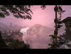
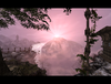
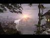
Like Oziris said, that sun needs work, its certainly a step in the right direction from the first one, but you should try to do what he said.

I also agree that the structure on the right seems very unfinished, although I must say that I abaolutely love the curly silhouette of the vine going along that pillar. Nice artistic touch right there.

The overall tone of the terrain seems... Confusing to me. On the one hand it seems like you were going for a misty, mystical, lonely reflection kind of vibe, while on the other hand the pinkish red hue gives off a warm and comforting sensation. I don't feel like these sensations blend very well they way you did it, I think maybe you should try to go with a colder, slightly grayish, fog color and let the more yellowish tint of the sun give warmth. Or something along those lines.

Otherwise I like it very much, nice angle, good doodad placements for the most part and lovely framing.
 
Status
Not open for further replies.
Top