• Listen to a special audio message from Bill Roper to the Hive Workshop community (Bill is a former Vice President of Blizzard Entertainment, Producer, Designer, Musician, Voice Actor) 🔗Click here to hear his message!
  • Read Evilhog's interview with Gregory Alper, the original composer of the music for WarCraft: Orcs & Humans 🔗Click here to read the full interview.

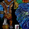
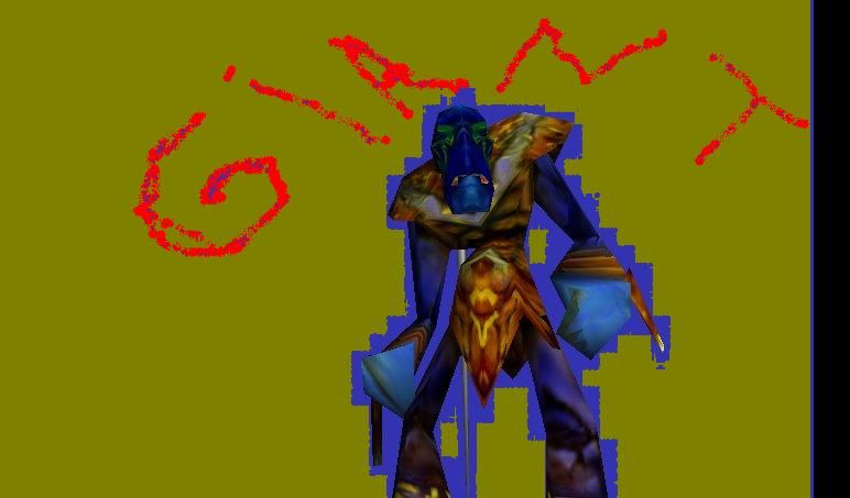
Giant Beta-Finish2.blp

This bundle is marked as useful / simple. Simplicity is bliss, low effort and/or may contain minor bugs.
  • Like
Reactions: Titan_to_aoe
I have to remake the skin eight times.
But finaly i have the fealing that its ready for uploading.

Keywords:
Giant,Blue,Ancent,Ice
Contents

Giant (Texture)

Reviews
13:18, 21st Jun 2011 shiiK: Look, each individual part looks pretty neat and all, but together, they make a mess. Besides, there's so many seemingly random details not resembling anything. People like to recognize what they are seeing. Use the thread...

Moderator

M

Moderator

13:18, 21st Jun 2011
shiiK: Look, each individual part looks pretty neat and all, but together, they make a mess. Besides, there's so many seemingly random details not resembling anything. People like to recognize what they are seeing. Use the thread you made for updates like these and wait for a qualified texturer to give you the green light before updating the resource again. Another tiny update and I'll just reject this permanently.

shiiK: Didn't you read Dentothor's and my comment in the thread you made?

http://www.hiveworkshop.com/forums/texturing-surfacing-274/my-skin-196611/#post1931960
 
Its still incredibly messy. in comparison to the old one, its an improvement, but this is still a little ways away from being approved. I know you have this kind of fear of the skin looking monotone, but we dont want a rainbow (and honestly i think you have all 7 colours of the whole damn rainbow).
dont pick colours from the opposite ends of the spectrum where it doesnt compliment the skin. Like the eyes. the green can compliment the blue, but with that colour of clothing, its a very conflicting colour.you need to focus on what looks good, and not just what works.
adding texture to differentiate skin from cloth is good too.you dont need to have an opposite colour to represent the clothing. Just a good texture difference :p. Other than that, yes its an improvement. Is it approvable, Not at all at this point. but continue trying.

~Dentothor
 
Level 1
Joined
Aug 9, 2009
Messages
275
Well, i can't really say what this looks like, but to be honest, that's really nice, as you can say that it's whatever you feel like :)

But this is definately a major improvement to the old skin, way to go dude :D
A few cons though, the nose looks kinda messed up, the muscles on the left arm looks kinda weird, and what is that in his mouth? :D
 
you didn't change a thing. people have tried giving suggestions before but you don't listen so im going to be completely blunt now. Get better at skinning, follow peoples advice, and stop reposting this bullshit. You yourself as a skinner cant apply anyone else's advice to your skin, making you absolutely juvenile and therefore causing the skin to be completely awful and horrendous.
 
Level 49
Joined
Jan 20, 2010
Messages
3,032
and don't bother telling us that there are approved skins worse than this one. it was a long time ago when hive's standards are not as high as it is now.
and follow people's advice like what Dentothor said. it helped me improve too and i'm a much better skinner now unlike before.
 
Top