• 🏆 Texturing Contest #33 is OPEN! Contestants must re-texture a SD unit model found in-game (Warcraft 3 Classic), recreating the unit into a peaceful NPC version. 🔗Click here to enter!
  • It's time for the first HD Modeling Contest of 2024. Join the theme discussion for Hive's HD Modeling Contest #6! Click here to post your idea!

General Icon Process Tutorial

Level 45
Joined
Jun 3, 2005
Messages
6,982
Kimberley's/Werewulf's General Icon Process Tutorial
(Does not cover converting the icon to BLP and testing ingame, but merely the drawing process.)

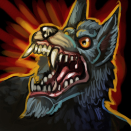
Hi there, here I will show you the current process I am using to create my icons (I use many different types depending on how experimental I feel). There is no true and valid way of making an icon, this one here is merely to give you an idea of how it is done :)

It is a VERY LONG tutorial, so please bare with me. Some basic drawing and shading knowledge it required before hand, please note :eek:....


Levels


  • Difficulty:Medium=6/10
  • Time: 15mins -1hr (depending on your knowledge of drawing, your reading and your drawing speed)
  • Picking up:Medium-Hard=7/10
  • Effort: Easy=4/10

Required Programs


  • A Drawing Program (Photoshop was used)
    • Photoshop
    • GIMP
    • Paintshop Pro
    • Open Canvas
  • A Graphics Tablet (but capable with mouse)
  • A Conversion Program that Supports TGA>BLP Conversion
  • Wc3 to test ingame

16.jpg

BTNWorgenCommand.jpg
ATCWorgenCommand.jpg
PASWorgenCommand.jpg
DISBTNWorgenCommand.jpg


DOWNLOAD LINK FOR ICONS HERE:
Click
DOWNLOAD LINK FOR PSD (Photoshop cs4 file) HERE:
Click!


Step 1-Let's Start

First we are going to start off with a blank/white canvas, this will be known as the background layer :)
You want white canvas at 72 dpi (300 if you are planning on printing) with either 512x512 pixels or 1024x1024 pixels. Your icon will be re-sized to 64x64, so keep than in mind! :eek:
attachment.php

Step 2-The Sketch

Smiley face? :D...Remember to use layers every time you start a new step! have a rough idea of what you want to draw, and proceed to draw the basic shape on a layout and perspective/angle of your choice.
attachment.php

Step 3-Drawing the lineart

Keep in mind, this does not have to be perfect, as you work along, you will be fiddling around with the lineart and drawing over it on most parts.

Make a new layer, we will then use the base sketch to draw over using a black brush, once you have finished the lineart, delete or hide the sketch layer.
attachment.php
Step 4-Black Backdrop/base

Here we will create the black basis of the icon. Simply create a new layer, fill it black and set it between the white background/canvas layer and the lineart.
Set the opacity to the black backdrop layer to at least 90%, just so the lineart is slightly visible.
attachment.php
Step 5-Basic Glow/Aura

I will constantly remind you to make new layers from here forth, as it is IMPORTANT. Almost all warcraft icons use some sort of glow/aura or backdrop/background to make the icons pop. Here we will start off with a basic outline, the lines at the mouth coming outwards represent an energy coming from that part of the icon.

Use your brain to think where auras/glows could be use to make the icon more dynamic! :)
attachment.php

Step 6-A more interesting Aura

MAKE A NEW LAYER. This process will make the glow really pop. Usually you would choose a colour with a cooler or more vibrant palette/hue, eg Blue inside>green outside, Pink inside>purple outside, in this case....Orange/yellow inside>Red outside.
attachment.php
Step 7-Fill in the base colour

MAKE A NEW LAYER.We want to fill in the lineart with a soft/grey variation of what the most vibrant/brightest colour would be when it is completed, use the brush tool or if your lineart has no gaps, then the fill bucket tool.

This process allows a smooth fade and a sense of foreground once we start to layer different tonal values ontop.
attachment.php
[box-Step 8-Overlaying Tonal Values]
MAKE A NEW LAYER. Just grab your gradient tool and set it to one colour and as a radial gradient. (if you don't have this tool, use a big blurry brush).

Apply it to areas that would have the most light bouncing on them.

(sphere or a shape online or in real life as examples to know where light bounces and hits on a certain angle)
attachment.php

[/box]
Step 9-Colour fills

MAKE A NEW LAYER. Get your brush, and start colouring in spots where colour is needed or in variation, don't forget to switch to and from soft brushes and hard brushes depending on which area you are colouring.

Generally, bellies, snouts and ears have a fade/blur in colour where you then draw over it.
attachment.php

Step 10-Basic Shading

MAKE A NEW LAYER. We will then start with shading, use a dark grey or a dark colour similar to the base of the icons figure/overall value. Then proceed to shade in appropriate areas, such as fur, mouth and ears.

Make note to shade in areas that fade to the bottom, fade off to the side or cast shadows, if you do not know how to do this, then I recommend you study up on shading/lighting tutorials online.
attachment.php

Step 11-Midtones

MAKE A NEW LAYER. This step is for the middle/base tonal values will be created, these are called "Mid tones". Worgens are slightly blue yeah? Well, then pick a soft grey blue, not too bright and not too dark, just a nice value abit above what is currently on your icons main feature.

Proceed to draw strokes of fur or areas where light would hit in a mid zone. It is perfectly fine to draw over the shaded areas, this gives a better sense of blending and overlaying, creating much realistic fur and tonal value :)
attachment.php
Step 12-Highlights

MAKE A NEW LAYER. Here we will create the highlights of the icon. Highlights are obviously one of the highest tonal values you can do before the image looks too sharp or contrasted. Doing highlights allows your icon to POP! to life.

The Eye:
I had done some extra touches too, like the eyes, which were done through a red circle, yellow middle, 50% opacity on the top part to simulate eyebrow shadow, the pupil and then a white dot to make it pop and reflect.

The Tongue/Teeth/Nose:
Don't forget, tongues and noses are shiny, don't forget to add abit of white on the tongue and the teeth too, but this also depends on the direction of where your light is coming from and the shape of your figure/item.
attachment.php
Step 13-Reflective Lights+Adding more Aura glow

MAKE A NEW LAYER. Another interesting thing in icons is reflective lights. To dumb it down, a simple way to do it is, draw along the edge in one direction, and then do so again in a different colour in one direction along the edge. Follow the contours of the shape of the figure or item, dont do too much otherwise it will look like a mess.
You should follow colours that complement each other, or either a brown/yellow on the right for a more reflective look.
In this case, I chose red/yellow, cause thats because of the glow being a light source. And also light blue, as an unseen light source, but not too bright!! :eek:

Now that the icon is nearly finished, we can see a reason to adjust the glow and make it more dynamic! Redraw the outline glow if you wish or go back to the glow layer and make it more interesting with fades and strokes.
attachment.php
Step 14-Quick Adjustments and draw overs

Perhaps you see some errors in your work? Don't feel bad to redraw the fixes on a new single layer or back on the older layers, icons need to look good when they are done :) I adjusted the mouth and the shoulders.
attachment.php
Step 15-Colour Overlays

This step is done via layers. Basically, get a new top layer and apply a one part/tone gradient or draw it on via a blurry/soft brush with different colours over certain parts of the icon (not too harsh!!).

Then to that layer apply the "Overlay" or "Lighten" layer and see what whacky and lovely effects you can come up with, it always makes icons more interesting.

If you want the overlay to only effect the shape of your figure or item, then select the lineart or fill shape (preferably fill shape) layer with a magic wand too, selecting the outside, invert your selection, go back to the overlay layer and delete the selection. Presto, you have cleared all the overlay colours around your shape/item.
attachment.php
Step 16-FINALLY!!!

After much thought, and it's never wrong to do, is that I had seen that the bottom jaw was too far out. Now, you can either merge your layers (of the worgen) and select the jaw and transform/move it, or you can simply redraw over it on a new layer. Otherwise the harder option is to work back on the older layers, which I don't recommend.

But for now, it is finished once fixed up, and the patches drawn over.
attachment.php


TA-DA!!! :D

I hope you enjoyed the guide/tutorial and learnt something from it. It is a long one though... :eek:..


I will answer pretty much any question you have, and compile a FAQ once I have gathered a enough response for this tutorial/guide. Cheers! :)


Attachments

  • 1.jpg
    1.jpg
    16.5 KB · Views: 1,491
  • 2.jpg
    2.jpg
    50.8 KB · Views: 1,161
  • 3.jpg
    3.jpg
    48.9 KB · Views: 1,244
  • 4.jpg
    4.jpg
    28.4 KB · Views: 1,099
  • 5.jpg
    5.jpg
    46.2 KB · Views: 1,168
  • 6.jpg
    6.jpg
    53.8 KB · Views: 1,144
  • 7.jpg
    7.jpg
    52.2 KB · Views: 1,106
  • 8.jpg
    8.jpg
    59.1 KB · Views: 1,128
  • 9.jpg
    9.jpg
    64.7 KB · Views: 1,096
  • 10.jpg
    10.jpg
    65.2 KB · Views: 1,212
  • 11.jpg
    11.jpg
    71.4 KB · Views: 1,101
  • 12.jpg
    12.jpg
    78 KB · Views: 1,118
  • 13.jpg
    13.jpg
    86.8 KB · Views: 1,119
  • 14.jpg
    14.jpg
    87 KB · Views: 1,071
  • 15.jpg
    15.jpg
    88 KB · Views: 1,081
  • 16.jpg
    16.jpg
    87.7 KB · Views: 1,096
Last edited by a moderator:

Roland

R

Roland

Great Job! I really like the Execution of this Tutorial! Nice work, amigo!
 
Top