• 🏆 Texturing Contest #33 is OPEN! Contestants must re-texture a SD unit model found in-game (Warcraft 3 Classic), recreating the unit into a peaceful NPC version. 🔗Click here to enter!
  • ✅ The POLL for Hive's Texturing Contest #33 is OPEN! Vote for the TOP 3 SKINS! 🔗Click here to cast your vote!

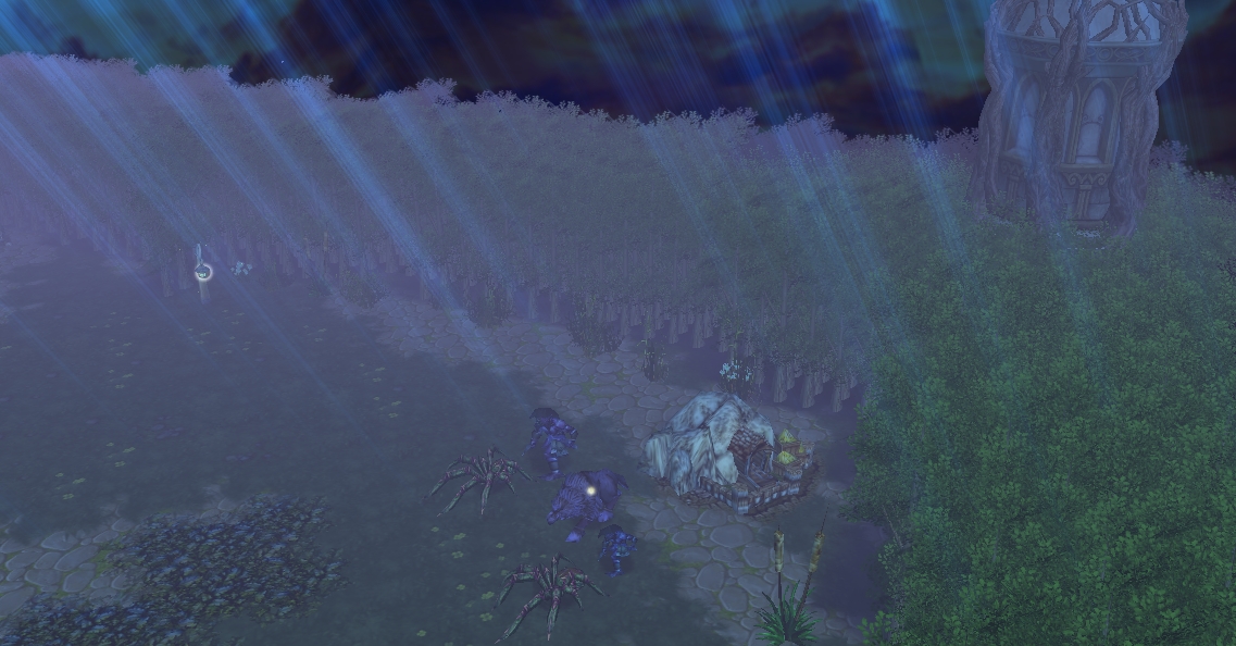
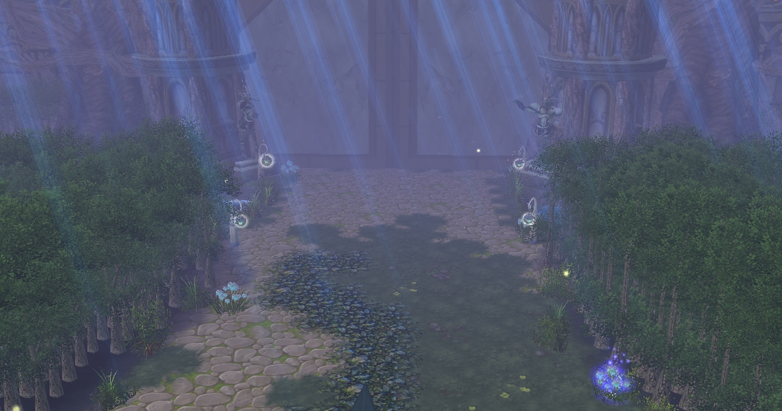
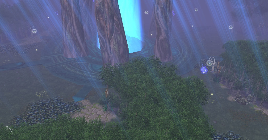
Gates of Elun'dris

Gates of Elun'dris

This is my 2nd melee map ,I got nothing else to say and I hope you enjoy the map.


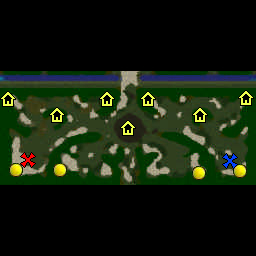
Buildings:
-2 Goblin Merchant
-2 Goblin Laboratory
-2 Mercenary Camp
-1 Tavern
-2 Expansion Goldmine

Creeps:
-6 Green Camps
-12 Orange Camps

full


full


full


Credits for the models:
Carrington2k
kellym0
Goblin Academy
Finglolfin
Elenai
Wow

Update log:

Gates of Elun'dris 1.0 (25/2/18)
-Uploaded
-Changed creep positioning
-Changed terrain doodads
-Added critter and Made the tree wall look more natural


Check out my other resources: Templates

Template Version Released: Elun'dris

Update Log:
-Reskinned Cliff 27/06/18
Contents

Gates of Elun'dris (Map)

Reviews
twojstaryjakcie
While I admire the amount of effort put into the visual design of the map, I'm afraid that certain doodads have negative effects on the overall gameplay experience and should be either removed or changed in some way in order to not obstruct player's...
WolfFarkas
well many things I was going to said were already said by twojstaryjakcie 1) these two areas seems empty there could be a low level orange looting level 2 items, because level 2 items are not used (permanents and charged) 2) Remove that big trees...
Level 8
Joined
Feb 4, 2017
Messages
111
While I admire the amount of effort put into the visual design of the map, I'm afraid that certain doodads have negative effects on the overall gameplay experience and should be either removed or changed in some way in order to not obstruct player's vision and hinder the process of unit selection/micro.

One thing you must know: players can't see the map from all angles and therefore, can't admire the map's full beauty. Undoubtedly, Gates of Elundris is a beautiful map when it can be viewed from various camera angles in the editor. However, once in-game, many of the maps doodads lose their charm as players are only able to see only part of them. I'm referring to the large building doodads placed throughout the map, especially the one located right on the Tavern. During combat, I find the necessity of maneouvering my camera around in order to see my units quite annoying. Same goes for the huge buildings near Goblin Merchants and Mercenary Camps. It's all pretty until it blocks your view completely. I suggest either moving the large building further into the forests or reducing their size greatly, so that it's possible to see in spite of their presence. As for the building in the middle, I'm afraid that the most reasonable thing to do would be removing it completely since the vines make it really difficult to see anything.

I think you should seriously consider increasing the amount of space in some creep camps. Below I attached a picture of a Blademaster being able to creep a level 6 wolf and run away while being hit by only the other wolf. This goes to show lack of space can be detrimental to pathing and lead to things as ludicrous as a Blademaster soloing level 6 creeps at level 1 if positioned correctly. Same goes for Goblin Merchant Camp and Mercenary camps.
upload_2018-2-25_13-11-8.png

The trees at the starting location are very far away from the base and their perfectly straight placement make the area look squarish and unappealing. (Edit: Also, such distance to the tree line makes it difficult to wall off, making the base very vulnerable to harass.)

I'm not a big fan of the huge empty area next to the expansion. Such huge space could accommodate an additional creep camp, for example, instead of storing yet another huge building that obstructs vision.

While the creeps are quite balanced, the vision obstruction is holding the map back. I really think such huge doodads would play their role better in a cinematic rather than melee. Here, in spite of how good they look, they're pretty much just a hindrance.

Edit: Forgot to say - it'd be much appreciated if you put a few neutral critters near the starting location so that Undead can utilize their Rod of Necromancy efficiently (maps usually do have a sheep or two in order to encourage creeping instead of simply harassing the opponent with Death Knight).

Edit 2: The map plays really well after the changes and definitely deserves approval.
 
Last edited:
While I admire the amount of effort put into the visual design of the map, I'm afraid that certain doodads have negative effects on the overall gameplay experience and should be either removed or changed in some way in order to not obstruct player's vision and hinder the process of unit selection/micro.

One thing you must know: players can't see the map from all angles and therefore, can't admire the map's full beauty. Undoubtedly, Gates of Elundris is a beautiful map when it can be viewed from various camera angles in the editor. However, once in-game, many of the maps doodads lose their charm as players are only able to see only part of them. I'm referring to the large building doodads placed throughout the map, especially the one located right on the Tavern. During combat, I find the necessity of maneouvering my camera around in order to see my units quite annoying. Same goes for the huge buildings near Goblin Merchants and Mercenary Camps. It's all pretty until it blocks your view completely. I suggest either moving the large building further into the forests or reducing their size greatly, so that it's possible to see in spite of their presence. As for the building in the middle, I'm afraid that the most reasonable thing to do would be removing it completely since the vines make it really difficult to see anything.

I think you should seriously consider increasing the amount of space in some creep camps. Below I attached a picture of a Blademaster being able to creep a level 6 wolf and run away while being hit by only the other wolf. This goes to show lack of space can be detrimental to pathing and lead to things as ludicrous as a Blademaster soloing level 6 creeps at level 1 if positioned correctly. Same goes for Goblin Merchant Camp and Mercenary camps.
View attachment 292689

The trees at the starting location are very far away from the base and their perfectly straight placement make the area look squarish and unappealing.

I'm not a big fan of the huge empty area next to the expansion. Such huge space could accommodate an additional creep camp, for example, instead of storing yet another huge building that obstructs vision.

While the creeps are quite balanced, the vision obstruction is holding the map back. I really think such huge doodads would play their role better in a cinematic rather than melee. Here, in spite of how good they look, they're pretty much just a hindrance.
ok changes will be made, thank you for the review.
 
Level 29
Joined
May 21, 2013
Messages
1,636
well many things I was going to said were already said by twojstaryjakcie

upload_2018-2-25_11-9-13.png


1) these two areas seems empty there could be a low level orange looting level 2 items, because level 2 items are not used (permanents and charged)
2) Remove that big trees because is really hard to play the game while you have large and tall wood bloking your sight to the ground you already done it
3) path narrow you already done it
4) path narrow and buildings bloking sight , make them smaller like with the size of structure doodad or a common farm or race buildings. you already done it
5) on map there is no 5, terrain seems flat it could have more work up and down tool, tile mix is great
6) goldmine positions, read this

Snowy Waste

, there you will see how goldmine positions affect the game, and why I sugest to change a goldmine to the north area. I would sugest to lower the creep level from 16 to 14, delete the level 2 troll.

just numbers 1 5 and 6

Rating 4/5, just need to fix a bit of this and a bit of that but the general work is quite good.
(you can reach the 5/5 of me after fixing things)

changes made
I like that the expantions are now more near the base, that helps human race.

5/5

 
Last edited by a moderator:
A lot of effort to make a melee map look good. But it sill feels like you could have done a bit more. Thing like shrub, weeds and exc. The smaller things are important too. But again, it's visually nice. The play-style of it is fine, does not feel weird. It's the perfect map if you would want to win early.

4/5
Id personally like to make a melee map soon. But id like to put effort into it the way you've done, however with my style of doing it. Keep it up, I'll look forward to your future work.
 
Top