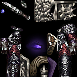
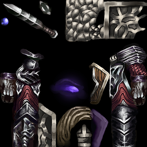
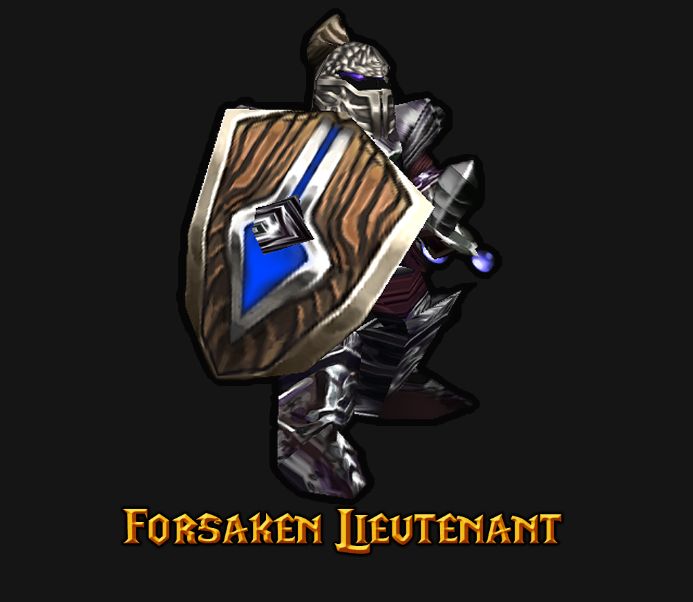
It looks much better now. But still here's some points (since you given up on updating this
")
) for your future works.
* The shield looks much better now versus the previous version which is very random and weird. A minor error is that the trim on the upper part is cut off.
* Remember that light comes from above. The golden trim's highlights suggests that there are multiple light sources which is weird.
* The boots are mushy, it could be fix by smoothing it. It looks very messy at the moment. For references of what i mean of messy try to visit my Royal Mage skin
(it looks messy XD)
* Not a fan of having both the shoulder pads and biceps has the same horizontal lines design. Would love some contrast with designs.
* Team color is very flat, you can shade the alpha channel fyi. But it is understandable as you're just starting out.
* I love the helm, the color seems to be pretty not matched with the armor
* Loved also that you've added another color.
* Also:
Import path(s):
Changes the following object(s):
All in all, I loved that you've followed some advices (not all). But in your future skin (if there would be) please keep in mind this points. I am granting this an approval. Congratulations! Looking forward for your next.


 Approved


