-
Listen to a special audio message from Bill Roper to the Hive Workshop community (Bill is a former Vice President of Blizzard Entertainment, Producer, Designer, Musician, Voice Actor) 🔗Click here to hear his message!
-
Read Evilhog's interview with Gregory Alper, the original composer of the music for WarCraft: Orcs & Humans 🔗Click here to read the full interview.
-
🏆 HD Modeling Contest #7 POLL is live! ✅ Vote for the TOP 3 MODELS! ❗️Poll closes April 28, 2025. 🎬Watch the entries on our YouTube channel! 🔗 Click here to cast your vote!
Fallout Red Button Template
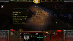
A red button template that I'm using for the interface of the upcoming Fallout mod (WIP), I made it myself from a scratch. Since I've just started learning the basics of 2D images, I'm not sure about the lighting/shadow positioning, if it's correct or not.
Feel free to use anywhere. I made it with this interface in mind. Combined, it looks OK.
I'm too lazy to draw text each time I use this button for another purpose, so I just add the fitting font on top of it.
Higher res screenshot included.
Feel free to use anywhere. I made it with this interface in mind. Combined, it looks OK.
I'm too lazy to draw text each time I use this button for another purpose, so I just add the fitting font on top of it.
Higher res screenshot included.
Contents


 Approved


