• Listen to a special audio message from Bill Roper to the Hive Workshop community (Bill is a former Vice President of Blizzard Entertainment, Producer, Designer, Musician, Voice Actor) 🔗Click here to hear his message!
  • Read Evilhog's interview with Gregory Alper, the original composer of the music for WarCraft: Orcs & Humans 🔗Click here to read the full interview.

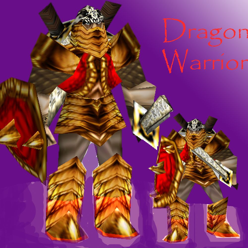
DragonWarrior(TheSlayer)

Still another try in modeling.
updates
Update
1. New texture for the armor
2. Added a weapon at the model's back.
3. Helmet fixed .
4. Changed the Name to DragonWarrior(TheSlayer)
New Updates
1. Adds the portrait model
2. Some edits on event objects specially on the death sound

CREDIT
Credit goes to rysnt11 and Misha for their cool comment why the model goes like what it is now.

Keywords:
dragon, dragonWarrior, slayer, dragon slayer
Contents

DragonWarrior(TheSlayer) (Model)

Reviews
12:14, 13th Oct 2011 DonDustin: you have some nice ideas there, but this model really does not catch the hero feel. You should seriously develop your concept further and give him some different armor(texture) tec. DonDustin: much bettter now. You...

Moderator

M

Moderator

12:14, 13th Oct 2011
DonDustin: you have some nice ideas there, but this model really does not catch the hero feel. You should seriously develop your concept further and give him some different armor(texture) tec.

DonDustin: much bettter now. You can finally see that this is supposted to be a hero and the chosen texture fits aswell, but there are still 2 tiny things that you should consider to change and 1 mistake that has to be changed:
1. personally I'd change the texture of those blades on his back. A wood sword does not really fit to him as a dragon slayer or something.
2. I like the concept of the helm, but you might want to furthher that concept a tiny bit more. Why don't you add a dragon skull/head as the top of the helm instead of putting a dragon face on top of it?? Might make it even more awesome. The wrap could also need some small touches.

3. you have to change the material type of the face. CHange it from blend to none

DonDustin: this model really developted a lot since it's first WiP. Good job :)
 
Level 4
Joined
Mar 7, 2010
Messages
116
I personally dont like the texture of the shield and in my opinion the spikes on his head are way too big.
Other then that its acceptable.
 
@ Misha
What doesn't make sense.

these helmet spikes for an example, i'm not sure what you tried, but the spikes just look alien to the helm, also the.. whatever he's wearing, i can't really figure what it's made of, perhaps you could draw out the wrap so it gives more details from that dragon texture, like scales.. or maybe new texture, dunno..

legs.. don't make sense due to the bad wrap on 'em, maybe you could take another go at 'em?

as for weapons.. why is he having two different ones? shouldn't all be like the one he's carrying?

shield could use somewhat an edge at the "upper" part of the shield (which faces to front on unanimated view)

..helpful? Oo
 
Level 49
Joined
Jan 20, 2010
Messages
3,032
these helmet spikes for an example, i'm not sure what you tried, but the spikes just look alien to the helm, also the.. whatever he's wearing, i can't really figure what it's made of, perhaps you could draw out the wrap so it gives more details from that dragon texture, like scales.. or maybe new texture, dunno..

legs.. don't make sense due to the bad wrap on 'em, maybe you could take another go at 'em?

as for weapons.. why is he having two different ones? shouldn't all be like the one he's carrying?

shield could use somewhat an edge at the "upper" part of the shield (which faces to front on unanimated view)

..helpful? Oo

this. do it
 
Level 2
Joined
Feb 17, 2011
Messages
32
Looks pretty good so far from the screenshot but maybe just a teeny bit more work. I don't really like how the legs aren't gold-ish like the rest of his armor.
 
Level 12
Joined
Jun 10, 2008
Messages
1,043
In my opinion, I liked the prevoius model better. I liked how the silver blended with the gold - it looked better that way imo

This one is still good though, 3/5.
 
Level 7
Joined
Sep 2, 2011
Messages
349
The concept is good but the outcome is the one I really dislike.
Based on the screenshot, the shield is not that great. As it doesn't seem
to protect the hero.
 
groovy, just one more thing though.. =3 the back of his helm looks rather.. weird, pulling away from the coolness you achieved so far.. can you try rewraping that somewhere else on the frostwyrm to it matches the skull part better? :3

Model updated with your help. thanks.
 
Top