- Joined
- Jun 25, 2008
- Messages
- 2,349
Direct Size Icon Making Tutorial (Paint.Net)
Making an icon in direct size is quite tricky; it has it's own rules but overall has a lot of advantages over a big size image. A big image has to be reduced in size, which means that the shadows will be recalculated and the shape might get too sharp, too blurry, or just way too weird. This doesn't mean it won't look good, but it means you will have to be extra careful. Working in direct size offers some advantages that you might consider:
It will greatly speed up your work.
You can take a quick look at how your icon is going to look in-game.
You can create beautiful effects just by playing with the alpha of your brush.
Easy shaping and shadowing. Creating highlights is easier.
You can easily create icons with defined shapes.
You are able to use in-game blp materials as a base. You can then use recoloring, alpha channel editing, free-hand work, reshaping, and shadowing to create new icons.
Your icons will look more wc3-ish.
Basics
Alpha Channel:
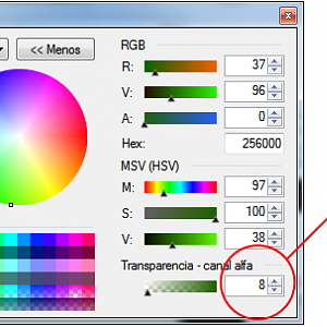
As you see this is the alpha channel tool within the color palette (mine is in Spanish –oops!-). This will allow you to create shapes what will not have pixelated borders, something which is crucial in an icon, since it will be reduced in size to the video game settings (again). Why is this crucial? Because an icon with hard defined shapes looks horrible in-game. The other thing about the alpha channel is that it will allow you to create soft and hard shadings quite quickly and beautifully:
- 2 Alpha: very soft shading, it will only serve for shading most of the time since lights require at least a 6-8 alpha minimum. With this alpha amount you can keep the color structure without succumbing to blackness or changing the main color too much.
- 4 Alpha: can be drastically different than the 2 alpha. It will allow you to make quicker transitions and values.
- 6 Alpha: Almost the same as before, so I rarely use it.
- 8 Alpha: Can allow you to create hard light sources, shapes and shading. I use this one a lot, especially when using the ERASER because this allows a sufficient and soft border erasing.
- 12 Alpha: Hard shapes, good lights, shades, and colors. Great for creating lines with a 1 pixel brush.
- 30 Alpha: Good and quick lines.
- 70 Alpha: Shaping really quick with soft borders. Avoid going beyond the 90 alpha.
ZOOM:
Always have this in mind. Paint.net has a feature that will cause the zoom options to range between 5000 and 1%. I recommend to work with a zoom of 300-400% which will allow you to work on detail and use a better hand-pulse. Also, paint.net shows the 100% size version of your work in the corner. This is really important, your icon has to look good and make sense at a 66% zoom, because of the WC3 in-game view. Always keep this in mind--even if your icon looks great at a 100% view, it might not make sense in the in-game view, especially for icon standards, which might require a 50% zoom to see if it fits correctly into the standard.
With that said, let's go with the main deal:
When Creating an Icon From Scratch:
1. You might want to create a background based on raw black on the first layer like this:

2. Create a layer above the raw black. Try to find the standard BTN border within your files, or use this one (and erase the white area):
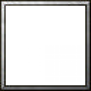
3. Create a layer in the middle of the BTN border and the raw black. On it you will draw your shape. I recommend using a 1-4 pixel BRUSH, with an alpha channel that might range from 8 to 70, these values have a reason that I'll explain later.
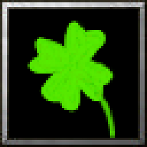
In this case, I've done the shape in a raw color, fully filled. As you see it does not have pixelated borders. This is due the alpha channel I used in the brush (70 alpha, which I consider a hard alpha).
As you see there are some parts of the clover that have a strange color which is not raw green. This is due to the alpha layer which processes color differently than it would if it was merged within the black background. If this happens consider on merging it if you have completely finished your shape (as I did).
4. Start your shading with a 2-8 alpha channel in the areas you consider the shading should be:
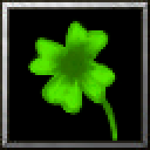
As you see the center has a shading which is too strong. If this happens, pick the base color again and use a 2-6 alpha to do soft shading with good transitions. In this part you will want to consider the size of the brush you are using to create details with the shading. A 1 pixel size is ideal, the rest will lay over the alpha amount you use.
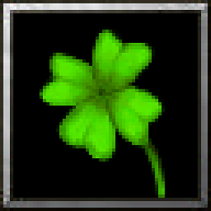
I've erased the overextension of the shading with the base color and added details to the clover with the shading. At this phase it looks decent, but it needs lights and even like this it needs a softer transition in some areas.
5. Start to add light. Use a 2-12 alpha depending on how hard the light is and try to use a lower brush size, like this. The lights will have a detailed quality. Consider whether you are going to use hard white or a lighter version of your base color (I normally use a mixture of both).
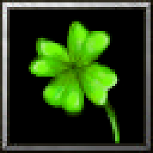
6. Play with layers, copy your image and overlay it. Play with effects and distortions and see if you can add a glow or some cute effect. If you don't like how a glow looks or if the effect grows over your shape then use the eraser. Remember to always do your effects on separate layers, in case you mess up.
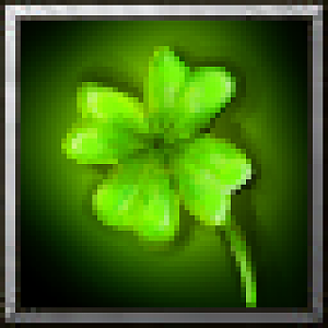
As you see here, I added a glow and used the eraser to add some shading on it, so that it doesn't overlap the shape.
7. Finally! Go wild on the effects, use hard alpha to add dots and effects; it will look amazing.
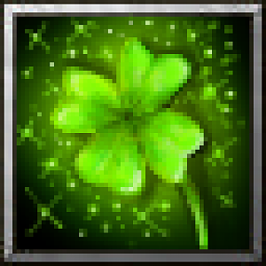
Now, the effects look too saturated/monochrome, and I do not like it, so I'd better go with less saturated effects, done free hand with layers and some color changes:
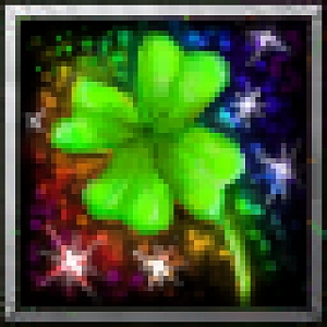
Now I like how it looks, but how does it look at a 66% zoom (in-game view)?
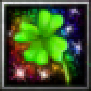
Good, then all I have to do is use the button manager to save it as a BLP and use it in a map.
If you have any questions you can PM or VM me.
Last edited by a moderator:


