• 🏆 Texturing Contest #33 is OPEN! Contestants must re-texture a SD unit model found in-game (Warcraft 3 Classic), recreating the unit into a peaceful NPC version. 🔗Click here to enter!
  • It's time for the first HD Modeling Contest of 2024. Join the theme discussion for Hive's HD Modeling Contest #6! Click here to post your idea!

Dalaran Encounter and Burning Legion Invasion

Status
Not open for further replies.
Level 4
Joined
Feb 3, 2008
Messages
60
Hey guys. I've been bored so I worked on 2 simple terrain images for people to comment on. First time publitizing my work here so just so you know it's not my best work and it involves no custom models which I could've used to make it much better.

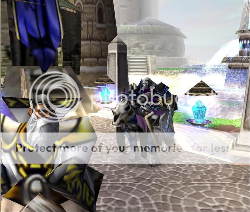
1. Dalaran Encounter- Archmage and Death Knight meet each other in Dalaran prepared to fight.

DalaranFaceOff.jpg


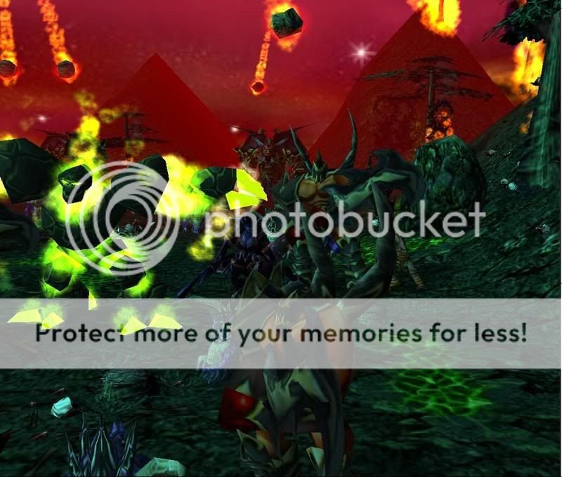
2. Burning Legion Invasion- Burning Legions sets a foothold in Felwood damaging and killing everything in their way.

BurningLegion.jpg


Hoping to get some comments and suggestions.
 
Level 34
Joined
Sep 6, 2006
Messages
8,873
If this is for terrain "art", I suggest you remove the units. Units are ugly die to the low polys.

I want to see your better work, as this is not very good at all. It looks like you seem to be a decent terrainer, but you used units, and the screen is just zoomed on them.
 
Level 4
Joined
Feb 3, 2008
Messages
60
It actually does look similar to a cinematic scene lol. Here is a little pic of something I recently made. Also no customs used.

The-Helper-Cin-Teaser-2.jpg


Edit: Thanks for the heads up Gilles will keep it in mind for my next pic.
Double Edit: The sky got messed up for some reason in my picture unfortunately :(
Don't know why it happened but hoping to prevent such a mistfortune from occuring in my next pic.
 
Level 4
Joined
Feb 10, 2008
Messages
110
Screen #1:
Don't have the units so close to the camera, units can add to a terrain to be sure, but only in moderation and not so obviously. And one can see the wall through the banner and also see right in between the roof and the wall

Screen #2:
Same thing with the units, but not so much as in the first one, and the sky and fog go well together but neither really goes with the tileset in my opinion. For this one add more doodads, zoom the camera out and work on the background, you might go over the mountains with smooth a bit and add small trees (modify the size in Unit Editor).

Screen #3: (This one is my favourite)
I see floating rocks on the sides of the mound in front of the castle (lower them with CTRL+PG DN), and speaking of that, WHY is there a mound right in front of the gate? o_O 
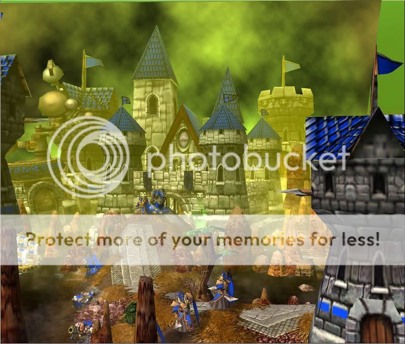
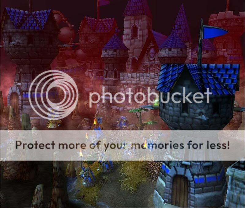
Also change the fog, I don't think the green suits it. It sucks that the sky was having troubles :/ It would look so much better with a sky, but it's still pretty well done. :D
 
Level 34
Joined
Sep 6, 2006
Messages
8,873
That road looks a lot better now! :)

That red fog starts too abruptly. Try making it start closer to the screen.
 
Level 7
Joined
Aug 10, 2004
Messages
185
Very good improvement in the last screen, though I think that ship should be a lot bigger to be scaled correctly. The first screenshot should have more buildings in the background, I don't think realistically unless a garden that Dalaran would just have empty spaces like that. The second screen's mountains are too straight and pointy as well. Other than that. Good job. =)
 
Level 25
Joined
Mar 25, 2004
Messages
4,880
Very good improvement on the fourth screenshot. The first screenshot also looks nice. However, the second one looks bad mainly because of the bad unit placement, pointy hills/mountains, and the hill on the right looks bad. The tile variation and placement isn't very good either. Adding environmental doodads might not hurt in that terrain, if you place them well.

~Craka_J
 
Status
Not open for further replies.
Top