• 🏆 Texturing Contest #33 is OPEN! Contestants must re-texture a SD unit model found in-game (Warcraft 3 Classic), recreating the unit into a peaceful NPC version. 🔗Click here to enter!
  • ✅ The POLL for Hive's Texturing Contest #33 is OPEN! Vote for the TOP 3 SKINS! 🔗Click here to cast your vote!

CrusaderReal copy copy.blp

This bundle is marked as useful / simple. Simplicity is bliss, low effort and/or may contain minor bugs.
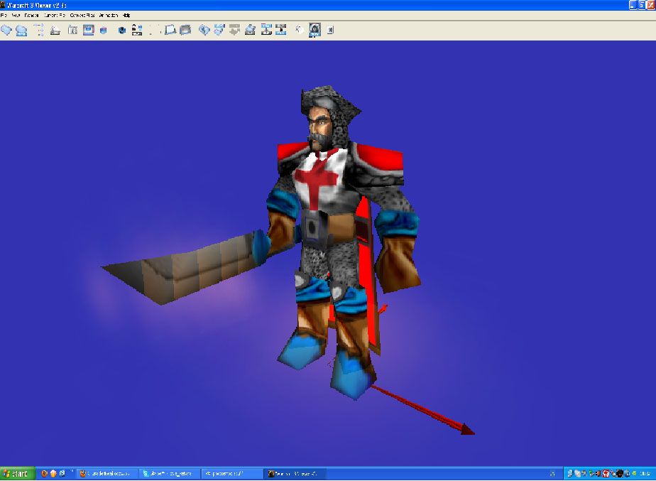
A Crusader skin,made for the Proudmoore model.This is my first skin ever,so comment and suggest how to improve it.I dont want to see comments like "this is so ugly.I dont like it." Almost everything is freehand except the head.
*Check the first post for the latest updates.

Keywords:
crusader,proudmoore,human,knight,paladin,hero,freehand.
Contents

Crusader (Texture)

Reviews
10:23, 16th Dec 2009 THE_END: Bad, very bad freehand, barely any shading, you need alot more work on this

Moderator

M

Moderator

10:23, 16th Dec 2009
THE_END: Bad, very bad freehand, barely any shading, you need alot more work on this
 
Level 6
Joined
Apr 3, 2009
Messages
113
NEWEST UPDATE:Added even more shading to the shirt.Reduced the color intensity to all red crosses,the belt etc.Changed the color of the sword.Made a helmet out of his hat and hear (hope it looks good).Added shading to the cloak.Added a minor shading to the sword.
 
Last edited:
Level 11
Joined
Jun 28, 2008
Messages
2,361
Crusaders didn't had mark on the forehead. They had it in left side of the torso, where the heart is...

All in all, its good.
 
ok i like the concept. but some things might need to be changed before this gets approved. first off, some of the plate armor looks very awkward. (especially on the lower legs.) Since he is a real crusader and not a cyborg, possibly try giving him some leather boots instead of random plate metal all over his feet. same for the hands. some leather gloves wouldn't hurt. ;P

The chainmail looks good for a start, but it needs MORE HIGHLIGHTS. it looks very dull and plain right now.
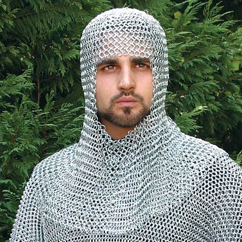
chain_mail_56.jpg

as you can see on this example, the chainmail is brightly coloured and shiny :)

The chest plate looks like he's wearing suspenders xD if its a shirt and not plate metal, try adding some shading and details to make it look like a shirt. (ex. a shirt is never flat, it always has SOME kind of wrinkle in it when it is being worn. Personally, i think it might
look better with plate armor and the cross engraved in it. but thats just me.

The cross on the head, as some people may have said, is very weird. It is probably best if you got rid of it. The hat, i see you made blue. Not a good idea since it clashes with the TC (Team Colour). and i really think the blue along the rest of the skin looks a bit unneeded. (Bright blue sword, bright blue belt.) try to find a different colour that doesnt look awfully different from this skins tone.

1.7/5 Lacking
This skin has a good idea. i like the concept but the execution needs a bit more work. But keep trying. Try reading some good tutorials to improve your skills further. Good Luck!

~Dentothor
 
Level 16
Joined
Jul 16, 2007
Messages
1,372
why does he have a blue dildo as weapon?
Really man, it looks ridiculous.. change IT! ASAP!
Also the whole skin needs highlights and shading, the cross, and the white leather for example.
also u might consider changing the blue parts to something more darker, it looks a bit cartoonish IMO.

Not bad for a first though ;), keep it updated!
 
Fixed:Added more shading to the shirt.Changed his sword.He no longer has dipers,but chainmail,fixed some bugs with the cloak,changed the color of his belt.

First: Don't doublepost, it's a ban call.
edit.gif
button is there for a reason

Second: Reverse the colors on sword.

Aaaand.. you could rework the hat and hair into a helm?
 
Level 38
Joined
Jan 10, 2009
Messages
854
Interesting idea, but this skin needs a lot more work. One of the biggest problems with it is the intensity of the colors, the red is to red, the blues to blue, and the browns are to red and orange. Turning the saturation down on the entire skin would be an improvement (except maybe on the face). The skin could use more shading as well, especially on the shirt and cape. You might want to see if you can set your brush to a saturation or color mode, it could allow you to lower the saturation of the overpowering colors with more accuracy. Also, take the blue off the sword; the last place it should be is the business part of the blade.

I dont see how i could make the hair and hat into a helmet.It wont look good :confused:

A chainmail coif would be a good type of helmet to turn it into (or headgear, not sure if helmet could apply to it). It shouldn't be to hard to accomplish with the hair. If you don't know what a coif is just google image search it ;)
 
Level 6
Joined
Apr 3, 2009
Messages
113
I'll start working right on it.Thanks for your post 67chrome :thumbs_up:

NEWEST UPDATE:Added even more shading to the shirt.Reduced the color intensity to all red crosses,the belt etc.Changed the color of the sword.Made a helmet out of his hat and hear (hope it looks good).Added shading to the cloak.Added a minor shading to the sword.
 
Last edited:
Level 38
Joined
Jan 10, 2009
Messages
854
The crosses look much better, the browns in the skin could stand to be grayer and worked on some more, the shading and highlights seems off in the boots, and wraps a little funny.

Also, see if you can alpha out the pirate hat entirely, the shape just doesn't fit the concept of the skin at all (The chainmail hair seems to work). Also, a lot of the chainmail looks like it could use some more work, it also looks not entirely like chainmail. I seem to remember a decent tutorial on making chainmail, and you could always check out how other artists represent chainmail in there skins. It's fun to see how differently it is represented, I tried emulating my favorite chainmail technique for my scarlet crusader skin :)
 
Level 38
Joined
Jan 10, 2009
Messages
854
Alpha channels offer a huge amount of freedom in skinning, make sure you know what they are and how to manipulate them, they are crucial for pulling this skin off as well.

probly hole in the head, you dont expect blizzard to finish his head if they can cover the hole with the hat do you?

That's not necessarily a trademark of blizzard, it's just a way of conserving the amount of polygons the computer has to use, which is nifty for any RTS. I'm pretty sure Proudmore is Arthas with a few small modifications though, and considering the hat isn't even visible on the portrait file I'm optimistic that it won't leave a hole in he head.
 
Top