- Joined
- Mar 18, 2014
- Messages
- 707
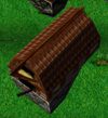
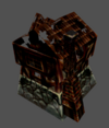
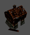
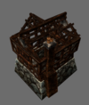
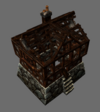
Cant wait for unburned ones too lolSince I now use scorched village atlas for Decay animations, I decided I could as well burn down some buildings (sorry, villagers). Proportions are almost identical but I nudged some debris that would otherwise float in the air if the structure was on a slope.