• 🏆 Texturing Contest #33 is OPEN! Contestants must re-texture a SD unit model found in-game (Warcraft 3 Classic), recreating the unit into a peaceful NPC version. 🔗Click here to enter!
  • It's time for the first HD Modeling Contest of 2024. Join the theme discussion for Hive's HD Modeling Contest #6! Click here to post your idea!

BTNTribalTridentofThunder

This bundle is marked as useful / simple. Simplicity is bliss, low effort and/or may contain minor bugs.
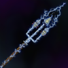
This is the Tribal Trident of Thunder. I decided to name it Tribal, because there are two skulls on the side prongs that have been run through. As well, the middle prong is forged of bone. It's a bit unorthodox, but I think it came out nicely with the lightning effect added. I'll be adding fire in the future, and will eventually upload the original without an element after finishing the elemental series. Hope you like it! It's my first ;)

It is 110% Freehand :D

Update 1: "Zoomed in" the image.

Update 2: Changed the background and diluted the lightning.

Keywords:
Tribal,Trident,Thunder,Lightning,Elemental,Skulls,Bone,Wood,Metal
Contents

BTNTribalTridentofThunder (Icon)

Reviews
11:14, 24th Feb 2010 Pyramidhe@d: Well all the details are really too small to make out properly.Zoom in and make the details more obvious. 26 Feb 2010 Pyramidhe@d: No changes made

Moderator

M

Moderator

11:14, 24th Feb 2010
Pyramidhe@d: Well all the details are really too small to make out properly.Zoom in and make the details more obvious.

26 Feb 2010
Pyramidhe@d: No changes made
 
Level 15
Joined
Jan 25, 2008
Messages
450
the main emphasis at this stage is actually the background, the the trident and lightning just seem to be a little bit in the way. MAKE THEM the focus, make them more in-your-face, crop it up and let the background be just something to lighten the mood. then work from there.
 
Level 13
Joined
Jul 26, 2008
Messages
1,009
I zoomed it in :D I'm still working on it atm, based on a friend's suggestion. I should have a better version in a day, give or take.

I did my friend's suggestion. It looks great on the large version, but as you can see by the button example by it, not so good as an icon. I may have to leave this icon as is for now, until I get some more suggestions.

I'm thinking of redoing the lightning, and making it less condensed. I think it's overwhelming the picture. Lightning seems far too static to be in this mass of quantity.
 

Attachments

  • Tribal Trident of Thunder Variant.png
    Tribal Trident of Thunder Variant.png
    62.4 KB · Views: 98
Last edited:
Level 11
Joined
Feb 2, 2010
Messages
487
Hmm... Lightning could be used often in two colours... Yellow N Blue...
In this case when the trident is also blue they kinda smelth toghether and it's hard to see what it is...
I dont think you should use so simulair colours...
Zoom in and more details mate. Kind of good anyway.
 
Level 13
Joined
Jul 26, 2008
Messages
1,009
I diluted the lightning in the big picture and changed the background to be a bit subtler. (Review the picture a post or two back)

I'm taking into consideration redoing the lightning with a new color based on the suggestion of 13l4m3. It's a pretty good suggestion.

Dunno when I'll get to it though because I'm going back to programming for a little bit, so I can finish this map I'm creating.
 
Level 13
Joined
Jul 26, 2008
Messages
1,009
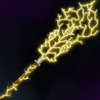
This is a (Very Ugly) rough draft of it with yellow lightning. It's of course not done, but I figured I'd give a light preview and show what it would look like under this condition.

Another option for lightning color would be purple as well, which may or may not happen. Do you think the yellow will work better?
 

Attachments

  • Tribal Trident of Thunder Yellow.png
    Tribal Trident of Thunder Yellow.png
    67.4 KB · Views: 66
Level 11
Joined
Feb 2, 2010
Messages
487
Hmm that icon.... ( AWESOME ).
Still can't see why you're using the same :d...
I'd choose the trident to be some metal colour with some yellow lightning at the 3 spikes connected with that wirweling lightning infront.
Well i'd use that icon instead... great job :eek:!
 
Level 6
Joined
Jul 24, 2008
Messages
180
I think its looks great, but might be better if you fix some things.

a) The lightning jumping away from the trident is unrealistic and contributes to the "blur" once you shrink it.

b) The lightning is way too overused to see detail in 64x64. Try to jump away from the trident more than follow it. It would help difuse the brightness and use the background better.

c) The yellow looks nice, but I would suggest a shade of purple. Yellow seems kind of bright.

Other than that it looks great. :p
 
Top