Listen to a special audio message from Bill Roper to the Hive Workshop community (Bill is a former Vice President of Blizzard Entertainment, Producer, Designer, Musician, Voice Actor) 🔗Click here to hear his message!
I3lackDeath
Awaiting UpdateDate: 2012/Nov/26 15:34:12
Reasons:This needs definition.
You also use too few shades of one color, which adds up to the overall blurred look.
[TR]Staff Contact Submission Rules
Hmm yes nice indeed. Awesome idea... but Praytic, use more contrast... if you use more contrast you'll get rid of that blurriness :\
I really like your ideas just... use more contrast... +rep... gonna rate it a 5/5
Add: Oh and, I guess that you should fill that empty black spot with some light atmosphere... like green or... no red is too aggressive... maybe yellow would be nice.
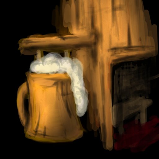
First of all, judging from that big picture you posted, you draw pretty messy, leaving many brush strokes visible. This is one factor that causes the overall image being blurry.
The second factor is that you don't apply proper shading to where it's needed.
Apply both those points, and you will receive defined images and icons.
Don't forget to run a sharpen filter after you have finished drawing.
This site uses cookies to help personalise content, tailor your experience and to keep you logged in if you register.
By continuing to use this site, you are consenting to our use of cookies.


 Approved


")