Moderator
M
Moderator
01:31, 3rd Jun 2013
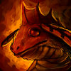
enjoy: It's too cartoonish. It looks like a snake, but that might be on purpose. Instead of using a black to outline the details, try defining them with shading instead. It will make it look more realistic. Also the dragon is really dark. The fire would reflect on the dragons scales, so I think it's too dark.
09:40, 21st Jun 2013
enjoy: The icon is way too dark now. But I saw you said you would remake it,
so I will set the status to 'awaiting update'. And Peekay doesn't want you to just take his icon and upload that, he wants you to look at his image and try to draw something like that on your own, and study the image so you can see what technique and lighting and so on, that he uses. No shame in that!
enjoy: It's too cartoonish. It looks like a snake, but that might be on purpose. Instead of using a black to outline the details, try defining them with shading instead. It will make it look more realistic. Also the dragon is really dark. The fire would reflect on the dragons scales, so I think it's too dark.
09:40, 21st Jun 2013
enjoy: The icon is way too dark now. But I saw you said you would remake it,
so I will set the status to 'awaiting update'. And Peekay doesn't want you to just take his icon and upload that, he wants you to look at his image and try to draw something like that on your own, and study the image so you can see what technique and lighting and so on, that he uses.


 Approved


 loving it


