• Listen to a special audio message from Bill Roper to the Hive Workshop community (Bill is a former Vice President of Blizzard Entertainment, Producer, Designer, Musician, Voice Actor) 🔗Click here to hear his message!
  • Read Evilhog's interview with Gregory Alper, the original composer of the music for WarCraft: Orcs & Humans 🔗Click here to read the full interview.

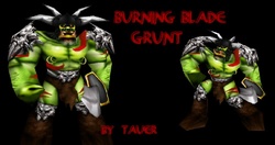
BTNBurningBladeGrunt

  • Like
Reactions: deepstrasz
Just Anotha' icon ...
for this model

models_6777_screenshot_tnb.jpg


Please give me credits when you use it :D
--------
UPDATED :)


Keywords:
Grunt, Warrior, Brute, Clan, Tribe, Barrens, Draenor, Burning Legion, Dark, Blade, Axe, Chaos, Barbarian.
Contents

BTNBurningBladeGrunt (Icon)

Reviews
17:13, 14th May 2014 Sin'dorei300: It's blurry, the helmet needs better definition, and the blood looks like ketchup. 12:47, 20th May 2014 Sin'dorei300: The nose is in another perspective than the face, the whole thing is blurry and the helmet...

Moderator

M

Moderator

17:13, 14th May 2014
Sin'dorei300: It's blurry, the helmet needs better definition, and the blood looks like ketchup.

12:47, 20th May 2014
Sin'dorei300: The nose is in another perspective than the face, the whole thing is blurry and the helmet looks like a black ''blob''.
Add proper highlights to the helm and define it better.

12:09, 30th May 2014
Sin'dorei300: Commented.

22:02, 22nd May 2015
Sin'dorei300: Commented.


11:49, 8th Sep 2015
Sin'dorei300: Approved.
 
The perspective in the first version was more interesting, but it's ur choice.:)
For the new one, the lower lip(kinda too much lines/creases on it), his chin & tusks(his lower jaw) are oddly shaded.
Also, the helm could use better shading/definition.
Shadows and highlights are added considering the position of the source/s of light.
I suggest u to improve the shading.
 
Top