Moderator
M
Moderator
15:18, 27th Nov 2011
enjoy: Very nice!
enjoy: Very nice!
(8 ratings)
 Approved

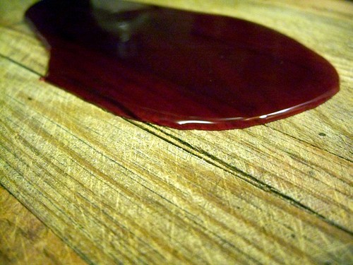
Because he's the icon moderator. Does that answer your question ?The metal looks pretty bad, you need to add much heavier shading to the top piece then add scratches to both pieces. After that fix the blood, it looks like blackberry jam right now.
Also, why aren't you the model moderator? That seems much more suitable.
Because he's the icon moderator. Does that answer your question ?
I mean it doesn't look right...everything else is worked on and that light is just so simple I can't describe it...
although the blood looks like jelly. mind darkening it? at least a little. that it can still grab attention through the background?
After that fix the blood, it looks like blackberry jam right now.
if you see my tutorial (which this icon comes out from) the glow is merely there to break up the flat black background. there isnt anything special about it. and it doesnt need to be anything special


It looks like you fixed the metal? Great work on it, it looks so much better now.
I just darkened the base colour which increase the contrast. and then i added some more scratches and what not. so it look better i think.
It appears purplish to me.Nice, although the dripping blood seems a little off, can't quite put my finger on why. Maybe the highlight is too grey?
Nice, although the dripping blood seems a little off, can't quite put my finger on why. Maybe the highlight is too grey?
It appears purplish to me.
No no, it's the shadow, it's waaaay too dark purplish like Apheraz said, even in the shadowed part of it, blood would still be relatively shiny.
I don't see any purple. And blood is pretty dark, not pretty shiny.

Blood becomes thick once it comes in contact with oxygen in time.Blood is very shiny, even in low light it reflects well because of its density. The problem with this blood is that the highlights are bright enough, and the lowlights aren't the right color, they should be deep red.
This is a very realistic attempt at blood, and good reference, it's not shiny enough, but the complexion and deepness of it is accurate. This picture also depicts it as much thicker than it actually is. Blood is quite thin contrary to popular belief, not that any of you have never seen blood.

Blood becomes thick once it comes in contact with oxygen in time.
the blood on the beatstick seems recent, which means it should not be thick and sticky.
grey glow removed. not too sure if i like it or not. now that i think about it, they are about the same, i think. but who knows. you guys prefered the no glow so. also. the blood. i really dont know what to do with it so. meh. it will have to do as is for now.
...hmmm there is prolly a way to remedy both problems at once. defeats the purpose of the original glow though but whatevers.
also. this is great to see a little discussion going on here. i hope you guys also carry this over to all the other icons in the section. it is good to critique each other and you should all do it more often in the future. mutual critiques are great way to improve upon your skills. i personally prefer valid critiques over flat praises.
keep the glow. or pyra would reject this icon for being homo.
grey glow removed. not too sure if i like it or not. now that i think about it, they are about the same, i think. but who knows. you guys prefered the no glow so. also. the blood. i really dont know what to do with it so. meh. it will have to do as is for now.
...hmmm there is prolly a way to remedy both problems at once. defeats the purpose of the original glow though but whatevers.
also. this is great to see a little discussion going on here. i hope you guys also carry this over to all the other icons in the section. it is good to critique each other and you should all do it more often in the future. mutual critiques are great way to improve upon your skills. i personally prefer valid critiques over flat praises.
Blood is very shiny, even in low light it reflects well because of its density. The problem with this blood is that the highlights are bright enough, and the lowlights aren't the right color, they should be deep red.
This is a very realistic attempt at blood, and good reference, it's not shiny enough, but the complexion and deepness of it is accurate. This picture also depicts it as much thicker than it actually is. Blood is quite thin contrary to popular belief, not that any of you have never seen blood.

Reflective rather than shiny. Gold is shiny, certain metals are shiny. Blood is reflective, pretty much like all liquids. Surfaces that are wet (read: eyes), are also, obviously, reflective. And (semi-) transparent, flat stuff is usually reflective as well (read: diamonds) - especially prominent with dark backgrounds. But the concentrated light on liquid surfaces is not shine, because it is hard and accurate, it is reflection - a direct relation to source and target, a mirror. As opposed to gold, where the light spreads across the surface, seemingly made stronger, and shine back at you - shiny. /rant
In that regard, fresh blood is pretty dark with concentrated spots of light reflection. Light reflection is most easily done with hard white, circular or square (with rounded sides according to the shape of the surface), shapes. In this icon, the shapes seem to be more grey than white, they're too large and they blend - shine. However, I do see the problem of making this look right in a tiny icon. I think it would be much better already if you use a darker red tone, even black will work, to be honest. It will better transmit the idea of it being semitransparent and reflective.
Anyway, this is a pretty neat icon. It seems a little empty, in my opinion, without the glow. Good job, nonetheless.
nope. too lazy. and too many different opinions everywhere.
 It is beautiful, too.

