Moderator
M
Moderator
15:20, 13th Apr 2015
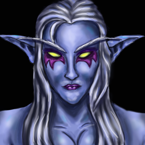
Apheraz Lucent: Perhaps try to slightly zoom out to display some of her body, it will give a better expression on her face due to zooming out hiding the little mistakes. Cheeks are a little too much overshaded, and they make her look like a drow or an undead rather than a Night elf. Lips are small and too tightly drawn, they should be bigger to be anatomically correct and also, who doesn't like a duckface female character? The chin should also be rounder to give her face a softer look (if you don't want her to be too "softy", you can always adjust her eyebrows to give her that famous slightly angry look). And at last, that strain of hair on her left side of her forehead should either be longer to cover up some of her face/eyes or removed - it doesn't look right on 64x64. Personally, I'd love to see the tattoo a little bigger as well.
Even tho this icon doesn't have a fitting resource, ladder or external, I'll approve this if you work a little more on it. For now, it's on "Needs Fix".


 Approved


