aha. you thought correctly. this needs some
serious work. Let me give you my first tip. If you are using MS Paint, stop now. Otherwise, it only looks like you are used paint to make this because of three things:
1. Really Jagged Edges
2. Not a Single bit of texture or detail
3. Solid colours. NO.
Never
ever leave a colour solid like you are doing now. It ends up making it look so cartooney and altogether, really bad. I know this may be your first try and all, but mods show absolutely no mercy on that topic. They wont care if its your 100th skin or your first. They judge on quality.
With that excuse out of the way, I would recommend that you try reading some of the
2D Art Tutorials we have on the site and trying to improve your skills from there.
But just as a firsthand tip, Try Shading and Highlights. This will give you less of a cartooney look and allow more realism to come from the skin. and second, A skin may be a flat square of pixels, but try to make it pop out more and make it look more 3D. It gives it more excitement and allows the viewer to be dazzled by what they see.
By taking a look at the tutorials and glancing through a bit of the skins a few experienced skinners, hopefully you can improve your skills and try again next time. Good Luck!
~Dentothor
 Approved
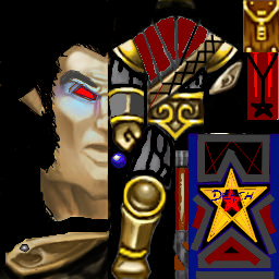


")