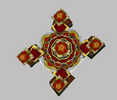
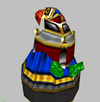
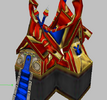
• 🏆 Texturing Contest #33 is OPEN! Contestants must re-texture a SD unit model found in-game (Warcraft 3 Classic), recreating the unit into a peaceful NPC version. 🔗Click here to enter!
  • ✅ The POLL for Hive's Texturing Contest #33 is OPEN! Vote for the TOP 3 SKINS! 🔗Click here to cast your vote!

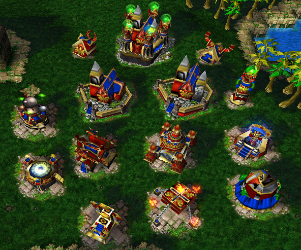
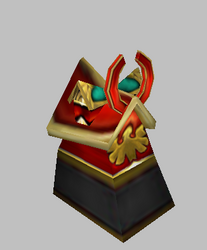
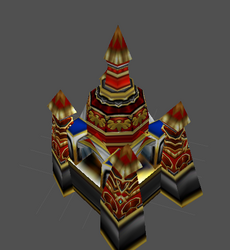
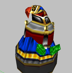
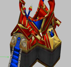
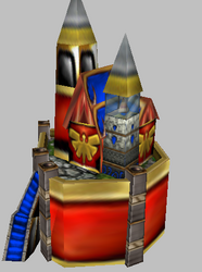
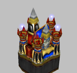
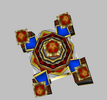
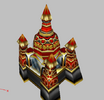
Blood Elf Building Package

This bundle is marked as awaiting update. A staff member has requested changes to it before it can be approved.
Based on:Tower (Elf) and Derivatives,Hunter's Hall and Derivatives,Aviary (Gryphon) and Derivatives,Town Hall, Keep, Castle, and Derivatives,Crypt and Derivatives,Farm (Elf) and Derivatives,Mage Tower and Derivatives,Arcane Vault and Derivatives by Ujimasa Hojo。Based on: ArcaneSanctum,Highaltar,MagicVault by SinisterX。
On July 6th, update:
BE HuntersHall has added doors and windows;
BE Altar keeps the Falun wheel behind the hero consistent, and the floor is also changed to light yellow;
The four pillars of BE Academy have been changed, and the top has also been slightly changed;
The white base of BE GryphonAviary has been changed, and the bird's back has also been changed;
The facade of BE TownHall has been changed, with a slight change in the exterior of the building.
Contents

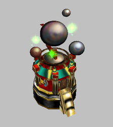
Blood Elf Academy (Model)

Blood Elf Altar (Model)

Blood Elf Building Package (Model)

Blood Elf Farm (Model)

Blood Elf Farm2(Night Elf Construction Action) (Model)

Blood Elf Griffin House (Model)

Blood Elf Sanctuary (Model)

Blood Elf Shop (Model)

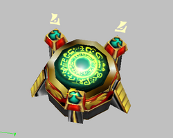
Blood Elf Small Sunwell (Model)

Blood Elf Temple (Model)

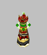
Blood Elf Tower (Model)

Blood Elf Weapon Vault (Model)

Reviews
ILH
ILH
Please redo most of the texture wrappings as they look too stretched and bland. Nyctaeus has done a good job pointing them out, so you might want to check it again. I'd suggest mixing in other textures as well such as the arcane observatory, high...
What in the heck am I looking at?! :eek:2
I'm sorry, but the way the models are textured look absolutely clownish and wrong on all levels.
I could barely comprehend all this, and it hurts my eyes just looking at it.
I'm sorry, and I offer you my help with controlling the colors better.
 
Last edited:
Level 25
Joined
Dec 3, 2020
Messages
741
What in the heck am I looking at?! :eek:2
I'm sorry, but the way the models are textured look absolutely clownish and wrong on all levels.
I could barely comprehend all this, and it hurts my eyes just looking at it.
I'm sorry, and I offer you my help with controlling the colors better.
That said, I do think the idea he had behing the Castle is actually good, just not executed in a great way.
The same goes for the sacrificial pit (at least I assume it's sacrificial pit (the building below the arcane sanctum)).
 
Level 20
Joined
Oct 16, 2021
Messages
236
This has the same problem as your other pack and I'm sorry to say, that this one looks even more bizarre.

So I'm gonna repeat what I said before: Look, there is no point in marrying two things that don't want to be married. Blood Elf Lieutenant texture was never made to be wrapped on buildings, so actual bitmap has no right to feature content that resembles building parts. There are no windows, no bricks, no doors, no roofs and nothing that feels "building" there. It's armor texture and there is no way around to convince armor texture to work as a building texture.

Your way of thinking is pretty much "close enough". You make an assumption that a piece of armor may work as a door, because the shape is "moreless triangular". I tell you this: It does not. And it won't look like a door no matter how much rewrapping you do. It does not carry appropiate visual language. Additionally content of the texture is scarce, because it was made for much smaller asset of much smaller geometry surface, so you reuse parts of it to cover much larger surfaces in improvised "tile" manner, but the result is noisy and does not form coherent and easily readable shapes.

I assume the whole point of this pack and the other is consistency with units. I tell you this: It does not to be so maniacally consistent.
Look at Alliance buildings and units of WC3. They do use different and appropriate textures that are stylistically and thematically consistent, but units textures feature armor parts and swords, while building textures feature all the bricks, windows and roofs that buildings need to look truly building.

Drop the "close enough" mentallity completely. Look for alternate textures that will actually convey a visual language that you need to compile effective assets. For example, take this [which is perfect for your purposes] and wrap onto your geometry to form coherent, easily readable shapes.
 
Last edited:
Level 20
Joined
Apr 17, 2021
Messages
204
A few of these have some weird textures (especially the Town hall and Gryphon Aviary), but the shop and Sunwell work really well in my opinion. I also quite like the Academy and Arcane Sanctum. The tower feels a bit too cluttered, but is serviceable.
 
What in the heck am I looking at?! :eek:2
I'm sorry, but the way the models are textured look absolutely clownish and wrong on all levels.
I could barely comprehend all this, and it hurts my eyes just looking at it.
I'm sorry, and I offer you my help with controlling the colors better.
That said, I do think the idea he had behing the Castle is actually good, just not executed in a great way.
The same goes for the sacrificial pit (at least I assume it's sacrificial pit (the building below the arcane sanctum)).
I just want to wrap them in the skin of a Blood Elf Lieutenant, hoping to highlight the red color of the Blood Elves. Of course, I also know that too many bright colors are not very suitable for architecture. Thank you very much for your kindness.Can you circle in the picture where the skin is not well wrapped? I will refer to your ideas for the next model modification.
This has the same problem as your other pack and I'm sorry to say, that this one looks even more bizarre.

So I'm gonna repeat what I said before: Look, there is no point in marrying two things that don't want to be married. Blood Elf Lieutenant texture was never made to be wrapped on buildings, so actual bitmap has no right to feature content that resembles building parts. There are no windows, no bricks, no doors, no roofs and nothing that feels "building" there. It's armor texture and there is no way around to convince armor texture to work as a building texture.

Your way of thinking is pretty much "close enough". You make an assumption that a piece of armor may work as a door, because the shape is "moreless triangular". I tell you this: It does not. And it won't look like a door no matter how much rewrapping you do. It does not carry appropiate visual language. Additionally content of the texture is scarce, because it was made for much smaller asset of much smaller geometry surface, so you reuse parts of it to cover much larger surfaces in improvised "tile" manner, but the result is noisy and does not form coherent and easily readable shapes.

I assume the whole point of this pack and the other is consistency with units. I tell you this: It does not to be so maniacally consistent.
Look at Alliance buildings and units of WC3. They do use different and appropriate textures that are stylistically and thematically consistent, but units textures feature armor parts and swords, while building textures feature all the bricks, windows and roofs that buildings need to look truly building.

Drop the "close enough" mentallity completely. Look for alternate textures that will actually convey a visual language that you need to compile effective assets. For example, take this [which is perfect for your purposes] and wrap onto your geometry to form coherend, easily readable shapes.
I'll try adding some other skins, hoping to match the Lieutenant's skin.
A few of these have some weird textures (especially the Town hall and Gryphon Aviary), but the shop and Sunwell work really well in my opinion. I also quite like the Academy and Arcane Sanctum. The tower feels a bit too cluttered, but is serviceable.
Thank you very much for your recognition. I also feel that the skin of the castle and the griffin house is a bit poorly wrapped. I will change it.
 
I just want to wrap them in the skin of a Blood Elf Lieutenant, hoping to highlight the red color of the Blood Elves. Of course, I also know that too many bright colors are not very suitable for architecture. Thank you very much for your kindness. Can you circle in the picture where the skin is not well wrapped? I will refer to your ideas for the next model modification.
Before I say it, I want to apologize for my reaction. I should not have used choice words such as "clownish and wrong." Looking at your buildings much more closely, I can see you've done better than when I first saw them, but there are some things where I want to offer my advices.

Trained artists such as myself tend to be careful with what we apply onto the canvas or paper. We don't stop improving until the artwork achieves desired results. Sure it'll take time and thinking things over, but we still accomplish things. So can you. :)

When you look at the typical High Elven building, it's either white or beige. Same thing in WoW. This is where the ArcaneObservatory.blp steps in.

Go for skins that have doorways too, specifically the ToweroftheSun.blp and ArcaneSanctum.blp.

I like what you did with the Academy's windows, though. If you want to add translucent windows onto your Farms and Town Hall, then use my Human Nations Tents pack per reference. All I did was create two different meshes so one is team colored and the other one is without TC. Even better, use my Abandoned Farm Skin (the one with the deer skulls and jawbones.) Sure looking back at the latter resource I did customize it heavily including removing the window, but it looks nicer.

Given how much you've accomplished using the Blood Elf Lieutenant skin, you may continue using it while taking advice. It just helps make things look nicer. :)
 
Last edited:
Level 20
Joined
Oct 16, 2021
Messages
236
BECryptFeedback.png

BETownhallFeedback.png
BEAltarFeedback.png
BEFarmFeedpack.png

GriphonNestFeedback.png

WeaponWaultFeedback.png


I assembled ye a couple illustrative sheets to highlight the most pressing concerns. I tried to pick the ones suffering from the most issues. Temple has no original issues on it's own, and rather repeats problems of the others. Shop, Sanctuary and Sunwell thingy are actually pretty good and aside some minor things they share with other ones, they are working quite well.
 
Before I say it, I want to apologize for my reaction. I should not have used choice words such as "clownish and wrong." Looking at your buildings much more closely, I can see you've done better than when I first saw them, but there are some things where I want to offer my advices.

Trained artists such as myself tend to be careful with what we apply onto the canvas or paper. We don't stop improving until the artwork achieves desired results. Sure it'll take time and thinking things over, but we still accomplish things. So can you. :)

When you look at the typical High Elven building, it's either white or beige. Same thing in WoW. This is where the ArcaneObservatory.blp steps in.

Go for skins that have doorways too, specifically the ToweroftheSun.blp and ArcaneSanctum.blp.

I like what you did with the Academy's windows, though. If you want to add translucent windows onto your Farms and Town Hall, then use my Human Nations Tents pack per reference. All I did was create two different meshes so one is team colored and the other one is without TC. Even better, use my Abandoned Farm Skin (the one with the deer skulls and jawbones.) Sure looking back at the latter resource I did customize it heavily including removing the window, but it looks nicer.

Given how much you've accomplished using the Blood Elf Lieutenant skin, you may continue using it while taking advice. It just helps make things look nicer. :)
I don't mind that expression. The blood elf observatory skin recommended by Nyctaeus is very in line with your aesthetic, and I also want to use this one. However, this skin is too blurry and not delicate enough. That skin needs to be exquisitely processed by a dermatologist. This way, I can use it on my building.
View attachment 477986
View attachment 477987View attachment 477988View attachment 477989
View attachment 477990
View attachment 477991

I assembled ye a couple illustrative sheets to highlight the most pressing concerns. I tried to pick the ones suffering from the most issues. Temple has no original issues on it's own, and rather repeats problems of the others. Shop, Sanctuary and Sunwell thingy are actually pretty good and aside some minor things they share with other ones, they are working quite well.
Time is limited, I only modified the model of the college. Modified the appearance of the column.These are two different images, which one looks better?
 

Attachments

  • Snipaste_2024-07-03_09-43-07.png
    Snipaste_2024-07-03_09-43-07.png
    127.5 KB · Views: 17
  • Snipaste_2024-07-03_10-02-08.png
    Snipaste_2024-07-03_10-02-08.png
    65 KB · Views: 19
  • Snipaste_2024-07-03_09-59-18.png
    Snipaste_2024-07-03_09-59-18.png
    134.1 KB · Views: 19
  • Snipaste_2024-07-03_10-02-27.png
    Snipaste_2024-07-03_10-02-27.png
    75.3 KB · Views: 18
Level 20
Joined
Oct 16, 2021
Messages
236
I don't mind that expression. The blood elf observatory skin recommended by Nyctaeus is very in line with your aesthetic, and I also want to use this one. However, this skin is too blurry and not delicate enough. That skin needs to be exquisitely processed by a dermatologist. This way, I can use it on my building.

Time is limited, I only modified the model of the college. Modified the appearance of the column.These are two different images, which one looks better?
Middle feels cleaner, yeah. I'd trim down one or two redundant trims more. There is no real difference to the corner pillars. This is the same texture, so problem of overabundance of shapes is still present.
 
Middle feels cleaner, yeah. I'd trim down one or two redundant trims more. There is no real difference to the corner pillars. This is the same texture, so problem of overabundance of shapes is still present.
Take a look, this is the base. I don't know if this will look better?There are also griffin cages, altars, and hunting halls.
 

Attachments

  • Snipaste_2024-07-04_15-29-54.png
    Snipaste_2024-07-04_15-29-54.png
    126.3 KB · Views: 19
  • Snipaste_2024-07-04_15-30-15.png
    Snipaste_2024-07-04_15-30-15.png
    79.2 KB · Views: 16
  • Snipaste_2024-07-04_06-57-02.png
    Snipaste_2024-07-04_06-57-02.png
    92.6 KB · Views: 16
  • Snipaste_2024-07-04_06-57-11.png
    Snipaste_2024-07-04_06-57-11.png
    51.8 KB · Views: 16
  • Snipaste_2024-07-04_07-40-48.png
    Snipaste_2024-07-04_07-40-48.png
    85.3 KB · Views: 18
  • Snipaste_2024-07-04_08-04-15.png
    Snipaste_2024-07-04_08-04-15.png
    87.9 KB · Views: 19
  • Snipaste_2024-07-04_09-11-18.png
    Snipaste_2024-07-04_09-11-18.png
    194.9 KB · Views: 22
Thank you for the feedback from StonemaulMidget, Raypack, Nycetaeus, and Naviy45. Enable me to better improve these models. As the old saying goes: Two heads are better than one. a group of people has more influence or power than one person。
It looks a bit strange.......
My personal abilities are limited, so I can only make changes like this now.
It is pretty flawed model. But I still like it
Thank you for your support. I have made some changes now, and I hope you will like it.
 

ILH

ILH

Model Reviewer
Level 32
Joined
May 8, 2012
Messages
1,462
Please redo most of the texture wrappings as they look too stretched and bland. Nyctaeus has done a good job pointing them out, so you might want to check it again.

I'd suggest mixing in other textures as well such as the arcane observatory, high elven farms or the elven tower for better results.

You also need to optimize the model from Sanity Issues.
 
Top