• Listen to a special audio message from Bill Roper to the Hive Workshop community (Bill is a former Vice President of Blizzard Entertainment, Producer, Designer, Musician, Voice Actor) 🔗Click here to hear his message!
  • Read Evilhog's interview with Gregory Alper, the original composer of the music for WarCraft: Orcs & Humans 🔗Click here to read the full interview.

B2M:The Land

Status
Not open for further replies.
Level 9
Joined
Nov 14, 2010
Messages
215
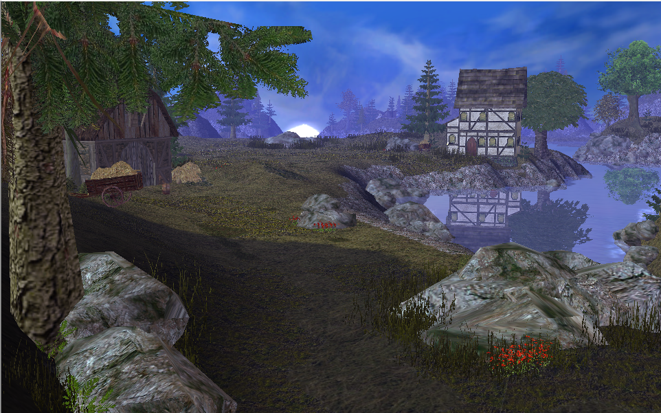
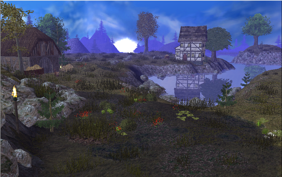
This is a terrain i made from using some modles from b2m packa nd from the utm. I would like to say thanks to tobyfat50 for the motavation and b2m for the models allso void for sun tutoiral and finally fladdermasken for the reflection tutorial.
199152-albums5143-picture53887.png

Hope you enjoy and please comment:ogre_haosis:
 
Last edited:
Level 34
Joined
Sep 6, 2006
Messages
8,873
I think the mountains in the back need work, and the fog. I also think you need to place the grass better. Instead of evenly throwing it everywhere, try cluttering it around rocks and doodads.

I like the composition quite a bit. The picture's well balanced, and the reflections are great.
 

fladdermasken

Off-Topic Moderator
Level 39
Joined
Dec 27, 2006
Messages
3,690
The rocks definitely need tending to. Felsen is a brilliant model, but you can't just wring them dry whenever you nose out a blank spot. You have to consider hue, scaling and placement.

First things first, try a natural brown undertone. Tiles make a great frame of reference, tint your rocks accordingly for a fluent transition. Secondly, scale.your.rocks.up - I know I'm being an incessant bitch about this, but since people can't seem to shake this nasty petite scaling practice I have to embrace my role as an antagonist in this play. To tie this bag of shit up, don't take the textures for granted when you squeeze rocks out in piles. If the textures don't blend well, it'll more likely look like chicken wire than authentic rock formations. Scaling helps greatly in this regard; scale your rocks up and you're far less likely to end up with rough geometrical noise.

Besides that, I second Gilles' pointers. To mend the background, try this (mainly chapter 2) and that.

EDIT: And what's up with that pine? It's way smaller than the torch.
 
Last edited:
Level 23
Joined
Dec 20, 2009
Messages
1,907
Just one more minor thing, because Gilles and fladdermasken did point out the main things perfectly - not surprise after all.
The Shore. It needs work. Especially right in front of the house there is just a tile - blank texture. Adding shrubs, rocks (in fladders way) and other creative aspects to this shore would enhance that part of the terrain immediately.
Also I am a big fan of hiding treestump - bases a bit, because in wc3 they always look "naked". Shrubs, grass or farns around them should work, but make sure to get the right amount. No spam :p
And for a last thing: I really need to underline what Gilles said, since if you manage to make the mountains in the back look good (this includes having more than one row of mountains[ ->several])than this whole terrain would be upgraded a lot already.
But listen to that fladdermasken guy aswell :p

Keep it up.
 
Level 36
Joined
Nov 24, 2007
Messages
4,404
Anyway nice terrain and i can't add anything which could make it better since Fladder and M0rbid already pointed everything out :p

... And Gilles >.>

Anyways, if I were to point out anything beyond what hasn't already been mentioned, I want to talk a bit about that sun of yours. As far as I'm concerned, it looks like a big flaming ball of fiery... Something very fiery.
- Point is, you make the same common mistake as I see many people do with suns, you make it large - you make it intense. My advice to you would be to take the scale of the sun down a fuckload, and then weaken the shine of it's light while doing so.

Personally, I find it easiest and best to make a sun with using glow models set to nearly no appearance at all, meaning I have it nearly entirely transparent, then I use layer upon layer and size upon size to make the sun appear in a good fashion. Basically - what I'm saying, is you should tint the glow model you're using for the sun so that it nearly has no colour at all, apart from the one you want. I'd also advice you work with more than one glow model, with various colouring schemes to them, white and orange, nearly yellow, is two, three-ish, great colours to work with in order to make a naturally looking sun :)
 
Last edited:
Level 34
Joined
Sep 6, 2006
Messages
8,873
Things don't reflect in water according to the sun. They reflect according to the viewers position.
 
Level 15
Joined
Jul 19, 2008
Messages
1,791
Oziris, the tree is behind the house. Look carefully.

A few more things to add to the list.

-The reflection of the house is backwards.
-The first tree is cutting through a rock.
-I get the feeling that the world ends after those mountains. It needs to give the appearance of 'fading off into the distance.' I recomend silhouetted mountains in the background.
-In the reflection, you should be able to at least see some of the leaves of that pine on the left side of the house.
-At this angle of view, you should be able to see a bit more of the shore in the reflection.

One more thing, is that supposed to be a shadow in the immediate foreground?
 
Level 34
Joined
Sep 6, 2006
Messages
8,873
Something I think would be good to keep in mind, not only for this terrain, but for anyone reading; the eye is drawn to the lightest area, in this case the sun. That is your focal point.

Not sure what concrete things you can do to improve the terrain. Since you have a really nice reflection made, I'd think about changing the angle completely, and get rid of the sky altogether. Make the focal point the water.

I could be totally wrong, but this terrain doesn't distinguish itself from so many others. The low angle looking at a rising/setting sun is overdone imo. Besides, playing around with your terrain is the best way to learn. Move the camera all around, crop the picture, etc.
 
Level 9
Joined
Nov 14, 2010
Messages
215
Thanks guys. the reason the house isabit weird is that when i do place it the right way it faces backwards but i thought reflections are oppasites of the thing its reflecting. Gilles i will do 2 angles and see if i like them and yea i think i will concerntrate on the reflection. :)
I still haven't tainted the rocks but i will do that soon i just don't have time due to school work.
 
Level 16
Joined
Sep 19, 2011
Messages
829
Hello dragonslarger! haven't talked to you in some time. You seem to be improving in making terrains and it's cool that you actualy tried to add reflection and shadows to it. However I have to agree with the others on some points of view and you seem to be making the same mistakes on shadow and lights, the shadow should be coming from the direction of the sun.
Also did you use calculate shadows or shadow props? There is also a sun model you can use instead of the glow.
I am glad that I motivate you, keep up the good work!
 
Status
Not open for further replies.
Top