- Joined
- Nov 28, 2006
- Messages
- 5,269


ANTI-NOOBISM TEXTURING
Don't be offended by the name. It just means the basics and following the rules.
RequirementsPrograms:
Adobe Photoshop - Suggested
GIMP - Does work but tutorial does not use this program.
Other Requirements:
Understanding of Texturing - Minimal knowledge of texturing.
Difficulty3/10 - Easy - May vary.
Why did I make this guide? When I first began texturing I didn't know what to do. There was no explanation on what CnP was or how to properly add shadows and highlights. So I decided to make a simple, easy to understand, tutorial for the new members of Wc3 Modding. Hopefully the result will end in more freehand work in the Hive Database.
I - The Rules
A quick review of the submission rules.A) Skin Rules
75% Modification
A skin must be modified at least 75% from its original form in order to to be approved.
Original Work
Textures created by other authors are not permitted unless permission to submit it, under their name, is given. If users design a texture inspired by another author's texture full credit must be given to the original author for the idea.
Shading
Proper shadows and highlights must be positioned in the appropriate position to correspond with the in game perspective.
Copy and Paste
Copy and Paste from other author's work is not permitted. A maximum of 25% Copy and Paste from default Blizzard textures may be acceptable, providing it is executed very well.
Recolors
A maximum of 25% recolour on a texture is appropriate, as long as the rest of the changes are freehanded. For example, you may not have 25% Copy and Paste and 25% recolor, resulting in a total of 50% non-freehanded changes.
I - Basics of Shadows and Highlights
Shadows and highlights are a mandatory part of any work of art. Whether it is a model, a texture, an icon, or even your ordinary piece of artwork, it needs shadows and highlights. In case you don’t know what shadows and highlights are here are the definitions.Shadows - The representation of the absence of light
Highlights - An area that is strongly illuminated.
A) How to Apply Shadows and Highlights
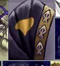
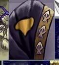
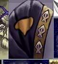
Cover the area you are texturing in your base colour. In this tutorial we will use red.

Find a spot where the light would normally hit the object. Light usually comes from above, unless of course there is some sort of light below them. Take a lighter shade of the base colour, red, and apply it where that light source hits. On the opposite side, where the light does not hit, apply a darker shade of the base colour. Sometimes, using soft brushes helps too. Scroll down through the different types of brushes and find the soft brush tool.

At this point it should still look fairly irregular. Use the eyedropper tool and click on the area where your highlights are. Now get a brighter shade of that colour and apply it to the point closest to the light source. Do the same with your shadows. It should look a bit more realistic now.

Now we have an object with proper shadows and highlights. Unfortunately, it’s still quite rough and the shadows and highlights are too sudden. Take a shade of your base colour that’s darker than the highlights but brighter than the base colour and apply it in between the two. Once again, do the same with the shadows. If you can’t get the different shades to blend well you can try smudging it a bit, but too much smudge can cause problems. I did not use any in this example.

Applying Shadows and Highlights to Pure White/Back Surfaces[/h3]
In some situations you may want to work with pure white colours or pure black colours. That will disable your ability to apply shadows and highlights, as shown above. This guide will show you how you can.
Instead of using the darkest black possible, to get a good pure colour, work with a dark gray. Cover the selected area with that colour.

Follow the guides above, and apply shadows and highlights.

You can do the same with whites as well.

C) Positioning of Shadows and Highlights
The light emits from above so you'll want to apply highlights on the open areas facing up, like the shoulders. You'll also want to apply highlights to areas facing away from the center of the body, like the center of the chest, the outer side of the arms, the center of the legs, etc. The reason we do need apply highlights to the side of the legs, for example, is because the arms block out the sun causing it to shadow that area.
Areas like under the arms, under the chin, the bottom of the feet, and areas facing toward the center of the body will have shadows.
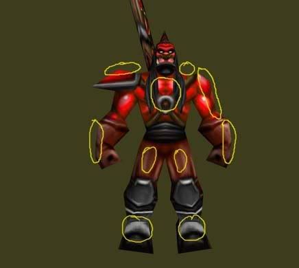
Some areas like the nose and feet should have highlights because they stick out farther than the rest of the body, causing the light to hit them.
Applying Shadows to Flat Surfaces
Open up your texture and draw the outline of the flat surface.
Apply the same shadows and highlights used on the area you covered, so it looks nicely placed onto that surface.
Apply highlights where the light should hit, usually the front side of the area you are modifying.
Take the burn tool and set it to 10% opacity. Make a small outline around the area you're modifying. I overdid mine, so try not to do the same.
If the colour is off use the Hue and Saturation tool to change it slightly.
III - Shadows and Definition
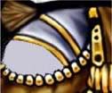
Definition is how definite, distinct, and clear the area around an object is. Sometimes when an object is too defined it can look ugly. But that can be fixed through shadowing.A) Removing that Nasty Definition
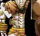
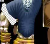
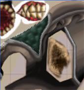
Open your ‘overly defined’ texture. In this tutorial we will use the Grunt skin. Notice how the lines around the breastplate are thick and very visible.
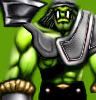
The outline is basically a very sudden shadow/highlight. You need to make it more gradual.
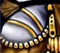
Now take the eyedropper tool


Double-click on the black square, the colour you just got from the eyedropper tool.
Select a slightly brighter shade of black. Now paint that overtop the closest point of the shadows towards the middle.
Repeat step 3, 4, and 5 with the highlights.

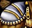
Your result should be a much less definition and more smooth shadows.
IV - Wrap and Unwrap
Textures have two different ‘forms’, a wrap and an unwrap. The unwrap is when you have your texture on a flat 2D Image. The wrap is where the texture is applied to the model, like wrapping paper the image is wrapped around a 3D Mesh to give it colours and better shadows and highlights.A) Dealing with Messy Wraps
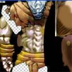
Blizzard is fairly known for creating poor model wraps causing our textures to become stretched and distorted. There is a way to fix this though. I’ve aligned the chest muscles in the breastplate on the unwrap but in the wrap it’s not aligned.

Lower the left chest muscle on the breastplate in the unwrap and it should align it on the wrap. I made this quickly so it’s still quite messy but hopefully the point gets through.
Take a long hard look at the right chest muscle and notice its shape. Try to repeat that on the left side as much as possible without ruining the wrap.
V - Keeping Below 26% Non-Freehand
The Hive Workshop, and other modding sites, have rules against recoloring, filters, and CnP. Here’s some ways to use them and continue to follow the rules.A) Filters for the Better
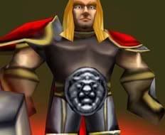
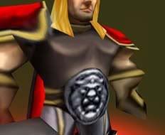
Open up your texture. In this guide we will be using the Knight texture. Apply a base colour the selected area.
Now add some detail, like shadows, highlights, and such.
Now use the polygonal lasso the select an area along the area you wish to use filters on. Try to use the least amount of room for the filtering; we have to stay under 25% filters. Now hit Ctrl+C followed by Ctrl+V. This will duplicate the selection onto a new layer. Now go to Filters > Texture > Craquelure, or whatever filter you wish to use.
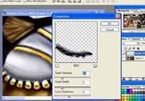
Toy around with the different fields until you’ve got what you want. Now click ‘Ok’.
If the filtered area dosen't blend well with the non-filtered area grab the eraser tool and put the opacity to 40%. Use of the eraser tool over top Layer 2 once, this will make the filter blend with the background better. Keep going over the upper side of the filtered area until you’ve got it blended nice and good.
Filters are still quite messy so you’ll need to play around with the shadows a bit. Take the smudge tool and smudge the edge of the filtered area to remove the ugly outline the filter gives you. Afterwards, use burn to increase the darkness at the point where the light should hit it the least.

This is just one of many ways that you can use filters for the better. As long as you avoid using them too much they can be very useful.
B) No Need for Freehand - Recolours For the Better
Open up a texture, we will be using ZombieA.blp. Now use the polygonal Lasso to select the area of the skin you wish to recolour. Once again make it small as possible because we have to follow the 75% freehand rule.
Press Ctrl+U or go to Image > Adjustments > Hue/Saturation. Adjust the hue until you get the colour you want.
Now add in freehand details around that recoloured area.
Keep in mind that recolours are frowned upon and should not be used regularly. Do not make a habit of this. If you can make the area you are recolouring yourself, without using recolours.
C) Adjusting the Hue - Recolours For the Better
Sometimes after freehanding a skin you get the incorrect shade or colour. With a quick recolour you can fix that.Use the polygonal lasso to select the area you are going to recolour.
Press Ctrl+U and mess around with the different fields until you have the desired shade/colour.
D) Copy and Paste, For a Better Effect
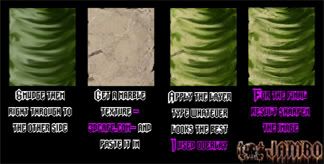
Sometimes copying photographs of different materials at a low opacity overtop your texture can help and give it a more realistic look. Much like in this tutorial by Zambo.
Check out Zambos' full tutorial at Wc3Campaigns - Skinning Techniques.
VI - Detailing
Follow these tutorials to add extra details to your texture.A) The Noise Effect
In order to make a noise effect we must first use the information we learned earlier and design the basic layout of the area we're editing. For example, apply a base colour, shadows, and then highlights.

Now take the brush tool and choose a brighter or darker shade of your base colour. Set the opacity of your brush to 40% and the size to 1 pixel. (May change depending on image size.) Paint on dots all over the area you're editing. Sometimes it looks nice if you mess up the shadowed and highlighted areas to give it a rough and rippled texture. Afterwards do the same with the opposite shade. (i.e. dark shade <-> light shade.)

The result may still be quite ugly, but keep going and it wont for much longer.
Take some miscellaneous colours and paint them all over the same area. Try not to do as many dots as you did with the previous colours or it will look odd.

Now take the smudge tool at a low opacity (10%-30%) and blend in the dots of paint. If you lose a lot of the misc colours you added in you can just reapply them and resmudge them. But be warned, if you smudge the image too much it will end in a very blurry appearance.

VII - Additional Texturing How-To's
Use these extra tips to help you before and after making your texture.A) Taking Screenshots
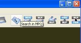
Open the Prophet's Wc3 Viewer.
Click on the Search button.
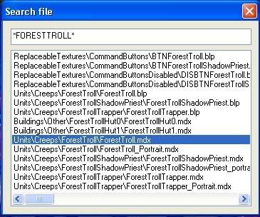
Enter the name of the model your texture uses.
Now press Current File > Revamp Textures.
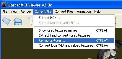
Find the texture you modified and select it (I have modified foresttroll.blp, so I will select that). Now press change and find your texture file.
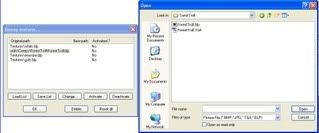
Once you found it double-click and press "Okay". Now return to the Viewer and use the Treeview window to set an animation, rotate the model so you have a good view of it and press Snapshot on the toolbar at the top.
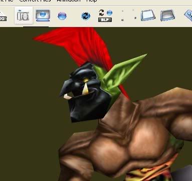
Save the file and you're done!
Texturing Index
Some phrases apply to Wc3 texturing only.Phrase | Meaning |
| Recolour | The use of the Hue/Saturation Tool or a low opacity brush to change the colour of a texture. |
CnP | Copying parts from other textures and pasting them onto yours. |
Filters | A pattern overlay used for detailing. |
Freehand | Designing part of a texture using only the brush tool. |
Alpha Channels | Alpha channels allow you to literally removing areas or applying Team Colour through the eraser tool. |
Team Colour | An area where the colour is dependant on the player's team colour. |
Last edited:


 .
.