• 🏆 Texturing Contest #33 is OPEN! Contestants must re-texture a SD unit model found in-game (Warcraft 3 Classic), recreating the unit into a peaceful NPC version. 🔗Click here to enter!
  • It's time for the first HD Modeling Contest of 2024. Join the theme discussion for Hive's HD Modeling Contest #6! Click here to post your idea!

BTNTurnip

Just a simple turnip. How harmful can it be? hahaha...

Well, I made some changes to this icon.
Editions:

1.
205128-albums7014-picture77675.png


2.
205128-albums7014-picture77676.png


3.
205128-albums7014-picture77684.png


4.
205128-albums7014-picture77833.png


I finally made changes for this icon I hope it looks good to you now.., :D

Keywords:
Turnip, Purple, Vegetable, Harvestmoon, Crop, Plant, Garden, Human, Food, Harvest, Farm, Eat, Gather, MISC.
Contents

BTNTurnip (Icon)

Reviews
23:42, 1st Jan 2014 Kimbo: To be honest I prefer the first 2 you had done, I like their style, the recent one is skewed, blurry and unusual. Maybe work from the first two? :) EDIT: MUCH BETTER!! I like the style, can be usefull in farm games...

Moderator

M

Moderator

23:42, 1st Jan 2014
Kimbo: To be honest I prefer the first 2 you had done, I like their style, the recent one is skewed, blurry and unusual. Maybe work from the first two? :)

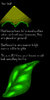
EDIT: MUCH BETTER!! I like the style, can be usefull in farm games. Although the icon shows as blurry, im very sure its the compression aswell as hives compression when previewing. Tested and works, approved :) Marked as useful.
 
Level 24
Joined
Jul 9, 2009
Messages
4,097
So you've clearly not put a lot of time into this icon and may I ask is it suppose to be glowing or have you coloured outside the border?
 
Level 9
Joined
Apr 22, 2011
Messages
51
To: Roland

Thank you so much sir.
Your praise is much encouraging the fact that this is my first icon.
I'll do more but with quality next time. :goblin_good_job:


To: Razosh

Hahaha. You have a sharp eye sir.
I made this icon while studying the tutorials about it.
Well, I cannot throw away my first icon creation
but it turned out to be good. hehehe.., :goblin_yeah:

It's not suppose to be glowing because for its not a rare item.

~~~~~~~~~~~~~~~~~~~~~~~~~~~~~~~~~~~~~~~~~~~~~

Thanks for giving time viewing my icons. :D
 
I'd advice for those who are uncertain whether their resources will get approval (not only you), to upload only one resrouce at a time. This makes it easy for one to improve, because you will be able to improve, and make better one next time! Meanwhile uploading all at once makes one prone to repeating the same mistake on their every resources.

Now, I like the fact you did not ignore people commenting on your resource, for that, I prepared something for you!

Short tutorial on shading

When making an image, texture, anything to picture related, you should always remember something: There is always a light source. Even if you draw someone dwelling in an underground tunnel, there is still light source, perhaps from a far distance lamp. If not, the whole picture would be just a big plain black square/rectangle!

Let's use this ball below as example.
attachment.php


Looks really flat and undefined, lets determine a light source and add some shadows.

attachment.php

What? I'm going too fast? Not sure how to apply?

Alright, let me slow it down. Of course, different shapes will have different patterns of shadow, so you'd have to imagine it.
attachment.php


Also remember that surfaces that are further back would get lesser light source.

So how do you apply it on your icon? Let me show you an example on applying it on the turnip's leaves.
attachment.php


Of course, this short tutorial won't be able to cover everything about icon making. Practicing a lot will defnitely help. Also try to use better image software such as GIMP or Photoshop, they have a lot of features that allow us to create better icons.

Another tip is that when making humans, fruits, animals or anything that exist in real life, you should always take reference from the real image of it for a more precise quality.


Hope it helps.
 

Attachments

  • 2.jpg
    2.jpg
    18.1 KB · Views: 317
  • 3.jpg
    3.jpg
    79 KB · Views: 383
  • 4.jpg
    4.jpg
    78.2 KB · Views: 388
  • 1.jpg
    1.jpg
    13.1 KB · Views: 304
Level 9
Joined
Apr 22, 2011
Messages
51
I'd advice for those who are uncertain whether their resources will get approval (not only you), to upload only one resrouce at a time. This makes it easy for one to improve, because you will be able to improve, and make better one next time! Meanwhile uploading all at once makes one prone to repeating the same mistake on their every resources.

Now, I like the fact you did not ignore people commenting on your resource, for that, I prepared something for you!

Hope it helps.

Oh! it really helped me out, alright. Thanks a bunch sir.
I edited my icons again and followed suggestion.
And yep.., I looks more better that the last time.
I hope this more acceptable.

I won't stop practicing!! Hahaha..,
 
I see that you updated it. However you are using too much outlines. What you should do is add shadings, not outline. Also try to google turnip pictures and see how they are coloured. (Purple-ish white on certain spots)

I don't know if you have read these tuts, but I'm giving them anyway.
http://www.hiveworkshop.com/forums/2d-art-tutorials-281/nfwars-tutorials-178780/
http://www.hiveworkshop.com/forums/2d-art-tutorials-281/basic-icons-tutorial-226943/

There are more, be sure to read them!

Also, NFWar has a gallery of big sized image of his icons, which is very useful for study purposes.
 
Level 9
Joined
Apr 22, 2011
Messages
51
I see.., Thank you so much.., My steps in drawing is wrong all along.., hahaha.., silly me.. My turnip is all white because I'm following the Harvestmoon picture of a turnip. I'll aplly the changes after the new year celebration. Got to spend some time with family.


Happy New Year to you all..,!!! :D
 
Top