🏆 Texturing Contest #33 is OPEN! Contestants must re-texture a SD unit model found in-game (Warcraft 3 Classic), recreating the unit into a peaceful NPC version. 🔗Click here to enter!
🏆 Hive's 6th HD Modeling Contest: Mechanical is now open! Design and model a mechanical creature, mechanized animal, a futuristic robotic being, or anything else your imagination can tinker with! 📅 Submissions close on June 30, 2024. Don't miss this opportunity to let your creativity shine! Enter now and show us your mechanical masterpiece! 🔗 Click here to enter!
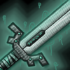
So I could either darken the whole blade except the edges that are on the sides where the light shines, or brighten those areas with little effect due to the glow which will make it blend. If you look at the full image you should be able to see it.
There's not much I can do about it other than say 'it's the style'
Edit: I realize what you're saying, don't get me wrong.
It's just that I tried to make a icon where the object I wanted to show had he same color as the background while still making it stand out. If I create a sharper blade it will probably ruin a bit of the softness it has right now.
Whether you and everyone else like it is up to you, it was merely an experiment
This site uses cookies to help personalise content, tailor your experience and to keep you logged in if you register.
By continuing to use this site, you are consenting to our use of cookies.


 Approved