• 🏆 Texturing Contest #33 is OPEN! Contestants must re-texture a SD unit model found in-game (Warcraft 3 Classic), recreating the unit into a peaceful NPC version. 🔗Click here to enter!
  • 🏆 Hive's 6th HD Modeling Contest: Mechanical is now open! Design and model a mechanical creature, mechanized animal, a futuristic robotic being, or anything else your imagination can tinker with! 📅 Submissions close on June 30, 2024. Don't miss this opportunity to let your creativity shine! Enter now and show us your mechanical masterpiece!🔗 Click here to enter!

BTNGreenViper

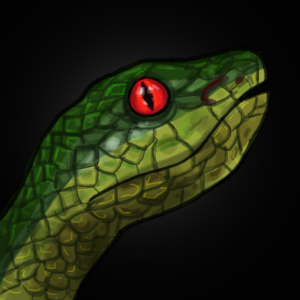
Just another "reptile" icon .

Because I need a viper icon on my map. I made this .
This icon can be used on snake model created by Domokun .

GreenViper , A kind of venomous snake .


Changelogs :

Old :
25hfnex.jpg

2mcd6ye.jpg

11150437_1077833648912726_4723638367351789605_n.jpg

-Smoothen the glow,
-Lighten the mouth and fixed the teeth

New :
icons_17227_btn.jpg


LARGE IMAGE .
226275-albums8083-picture97967.png


Keywords:
Snake, Viper, Bite, Venom, Poison, Reptile, Wild, Animal, Grass, Forest.
Contents

BTNGreenViper (Icon)

Reviews
08:53, 30th Mar 2014 Sin'dorei300: The inside of the mouth is too dark, the eye is too red, the fangs aren't visible and adding a glow wouldn't hurt, but choose a wise color. 13:40, 6th Apr 2014 Sin'dorei300: The fangs and the mouth need work...

Moderator

M

Moderator

08:53, 30th Mar 2014
Sin'dorei300: The inside of the mouth is too dark, the eye is too red, the fangs aren't visible and adding a glow wouldn't hurt, but choose a wise color.

13:40, 6th Apr 2014
Sin'dorei300: The fangs and the mouth need work.
Google up some snake pics.

08:36, 18th Apr 2014
Sin'dorei300: Awaiting update.


18:41, 20th May 2015
Sin'dorei300: Might be useful.
 
Looks pretty good, actually, even though the perspective on the snout seems wrong. The upper teeth and lower jaw are facing us somewhat, but the snout is drawn straight from the side.

I have to say though, the glows you put around the subjects of all your icons are really, really ugly. They're way too solid and way too saturated. In fact I think this icon might look better without any glow at all.
 
Top