 Approved
")
Moderator
M
Moderator
19:55, 4th Oct 2010
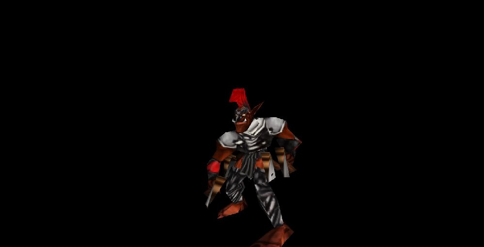
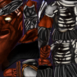
shiiK: Looks a lot better now, and I'm approving it. There's still a lot of room for improvement, though, and the wrap is far from perfect. Remember to always try your skin on the model before you start working in details so you won't have to redo hours of work just because you didn't check it out first. If you're unsure about how something should wrap, ask in chat or post your WIP in the Texturing forum. Your main problem is wrap and making your art obvious. You should want the average viewer to be able to guess what every piece of the skin is supposed to represent (is it metal, is it leather or is it a different material?) - use lots of reference images to get the fabrics right. Use the model (in it's Stand animation) to figure out where shadows should be and where highlights should be.
shiiK: Looks pretty cool in-game. There's a few things I'd like to see fixed before I approve this, have a look at the detailed review (linked below). Main concerns are the wrap and shading, but please try to do everything I suggest (as long as it doesn't go against your idea). Keep in mind that your goal should be to make it obvious to the average viewer what everything is - and of course, deliver that in an aesthetically pleasing manner.
Detailed Review


