- Joined
- Nov 26, 2006
- Messages
- 11,133


Minicraft
Contestants were tested on their abilities at making a fun, space effective game in Warcraft 3. It should be a unique idea, ie; not another Uther Party.

Concept | The general idea of knights racing was good. However i didn't understand the purpose of the knights racing, it was out of nowhere and why would knights race each other. Its just not a great choice of title or models i believe. A horse race would make more sense. Also starting out at half hp, and right away getting healing items was confusing since nothing happened for me to lose health. | 19/25 |
Enjoyability | I played it a few times, once i realized i wasn't going to beat the AI i didn't want to play anymore. Since this is a single player map i don't see this getting anymore fun then it is. It was a challenge since the AI knows a predetermined path and i had to learn which ways to go, that kept me coming a few times but really once i figured it out, and still couldn't beat the AI, i dint feel i wanted to play again. | 17/35 |
Going Green | Only about 1/4 of the terrain size you chose was used. | 6/20 |
Playability | For the most part this map is pretty bug free. One of the main issues is the controls are a little slow and the arc that he turns on inst good enough. Also when i approach an obstacle and almost pass it, it pulls me into the obstacle and then puts me back where i was showing the "jump" animation with the shadow knights. I believe that is not supposed to happen. Also from what i saw, the AI just runs it doesn't use the same controls as the players have to. I followed behind him and when i went to make the same turn, i made a wide turn and he kind of cut in. | 11/20 |
Aesthetics | There were a few good looking spots on this map, but some of the tiles you used look horrible with the other tiles. The dark desert tile doesn't look good on any tile other then other barren tiles. Also the grassy dirt doesn't look too great in random patches of dirt. And near the end is just a small grass wall with no doodads or anything really. Also some of the doodads used just look so randomly placed. You cant really interact with the environment without getting sent backward. | 8/20 |
| Total: | 61/120 |
Concept | A great concept i loved it. I hadn't played a game like that in forever and when i got to it it was just great. Great idea and game setup up. The only thing is i felt more could be done. | 23/25 |
Enjoyability | This game was really fun when i started playing it, in fact i played it for 20 minutes straight before judging. It was really fun but that was all there was too it. Coins + Coin collector. There was no X factor that could have made that game live for a few months in BNet. It was what it was, collect coins. | 29/35 |
Going Green | An amazing use of space, so much with so little. Great job. | 19/20 |
Playability | I love the game play, its fun and new. However if u play with arrow keys, there's a slight delay if u go far right, then left it stops for like 3 seconds. Also you can control the penguin just by clicking the ground and u can just patrol. It takes away from what u were trying to do with the arrow keys. | 14/20 |
Aesthetics | It looked okay... it didn't have much of anything to take away from the Aesthetics, but there wasn't much to add to it. Considering you could have made it better i deducted points. | 13/20 |
| Total: | 98/120 |
Concept | Its basicly whoever is faster so whoever picks the fastest wins? the elements of the game had no real relativity to itself since the point of the game was to use the portals but u can win just as easy without using them. | 9/25 |
Enjoyability | i didnt find it fun at all once you win thats it. The heroes arnt that balanced and the portals are almost completely useless. | 4/35 |
Going Green | you used your space pretty well. | 15/20 |
Playability | there was a slight delay between commands, when i right clicked my hero didnt want to move some times. | 14/20 |
Aesthetics | pretty okay looking, the random volcano threw it off. | 12/20 |
| Total: | 54/120 |
Concept | very good theme, however the name hot potato doesnt match the gameplay. | 21/25 |
Enjoyability | It isnt that fun tbh, i played with 3 other people and we all just left after the 4th round, it wasnt that fun really nothing there to keep you comming back. | 19/35 |
Going Green | It was blank space, not a great use of space. | 16/20 |
Playability | no lag and pretty fluid. | 18/20 |
Aesthetics | isnt the best looking map. | 14/20 |
| Total: | 88/120 |
Concept | It was pacman, with all different characters. The theme doesnt match the characters. | 22/25 |
Enjoyability | the pathing was bad, when you spawn, you automaticly run toward the enemy, and even though they are ranged, if they attack, they will get the hit no matter your distance. Quite unbalanced. | 23/35 |
Going Green | some emptey space. | 18/20 |
Playability | there wasnt any lag, however the pathing wasnt great so u cant go where u choose for the most part. | 18/20 |
Aesthetics | not the best looking map, pretty plain. | 17/20 |
| Total: | 98/120 |
Concept | Great concept, never seen this done before, it fit well together the only thing is that the gems dont fit very well in the concept. | 23/25 |
Enjoyability | Very fun, its interesting, and its a challenge. Much more fun when i played multiplayer but solo is still fun. Only thing is the difficulty was frustrating. | 30/35 |
Going Green | All space was used in a small dimension of terrain. | 20/20 |
Playability | I couldnt find any problems, no lag, overall very good. | 18/20 |
Aesthetics | A few random doodads but great nontheless | 18/20 |
| Total: | 109/120 |
Concept | the zombie collects gold for no reason, because gold isnt used. The human collects gold for no reason because gold isnt used. There is no way to really survive against a anslaught of skeleton workers, very bad concept has no relativity to its aspects. | 8/25 |
Enjoyability | I had no fun playing this, i start the game run around use up the very limited gold and kill the human no sweat and good game. Now when im human i sit there for 1000 seconds doing nothing because theres nothing to do and the zombie never attacks. I did not want to come back and play it. | 2/35 |
Going Green | All the space was used but its just trees nothing really. There was alot of emptey space, and the trees didnt really take away from the empty space. | 5/20 |
Playability | There was no lag, there was a bug in the leaderboard, the zombie is on the leader board but does nothing to gain points. The human gains points but its not clear what the points mean. | 9/20 |
Aesthetics | Just completely bare of anything. Trees and gold mines and nothing else. The tiles looked unatural, it looked like a patchwork of terrain. It had no enviromental feel and hurt me eyes. | 0/20 |
| Total: | 24/120 |
Concept | It fits in and is a good concept, take over colonies and beat the enemy. | 21/25 |
Enjoyability | It is fun to a point. But its very very hard to take over colonies since you cant keep 1 unit alive on the little green patch for 10 seconds because the colony attacks. I tried playing it but it was just too frustrating. | 10/35 |
Going Green | you didnt use all of the terrain, just substituted with water to fill it in. And there was alot of sandy area inbetween the colonies and its just a waste of space. | 12/20 |
Playability | Theres no lag, but the workers take too long to train, the colonies are too hard to take over, and theres no AI | 12/20 |
Aesthetics | It didnt have much enviromental feel, all it had was a battle field and nothing else really. | 6/20 |
| Total: | 61/120 |
Concept | great concept very original seems like it would be a hit on bnet | 25/25 |
Enjoyability | it was fun, and i enjoyed playing round after round, however if u win 2-3 rounds conseculativly its pretty much over for everyone else. The gold ruins it and if that were removed this might be a little more fun, since it would be balanced with everyone | 27/35 |
Going Green | Used up all your space however there were only 2 places that were really meaningful, next to the shop and the arena. The rest wasnt really used. | 18/20 |
Playability | No lag a few bugs, when u walk close to the wall the ball flys out. And you throw the ball when u dont want to. | 18/20 |
Aesthetics | looked great, the arena was set up really nicely, great idea, the balls looked good. | 20/20 |
| Total: | 105/120 |
Concept | its a good idea, however its very similar Azeroth Grand Prix so i took off points. | 22/25 |
Enjoyability | its fun but its a little too small and consistant. No suprises. | 29/35 |
Going Green | Uit had just straight lines and those potted plants in the corners. | 18/20 |
Playability | stuck on invisable walls, some of the spells arnt reliable, and the potted plants gets you stuck so easily | 16/20 |
Aesthetics | it was plain, no cool terrain, random potted plants, and the carts werent so special. | 15/20 |
| Total: | 100/120 |
Concept | So many zombie games out there, it has no story its just fighting zombies. | 22/25 |
Enjoyability | IF there was no lag this is your score. I didnt take into account the lag since it's its own preference. It is fun, however no bosses and no end. no time to choose perks and it leaves you in the skill page. | 29/35 |
Going Green | Alot of blank space of just plain terrain. | 12/20 |
Playability | The lag is unbearable, u die so easily from lagging, alot of leaks and too many actions at one time. The zombies get stuck at the top right bottom left and bottom right corners. | 0/20 |
Aesthetics | not a very good looking map, the tiles you chose werent too great. The trees in the corners threw it off and didnt look too great. | 1/20 |
| Total: | 64/120 |
Concept | very good theme nice wc3 spin to the actual game. | 23/25 |
Enjoyability | its fun but no directions, you die a few times in the beggining trying to figure it out. pretty fun otherwise. | 29/35 |
Going Green | good use of space as a whole | 19/20 |
Playability | no lag, reactions are on the spot, no bugs from what ive tested, very well made game. | 20/20 |
Aesthetics | it could have been better otherwise great job. | 19/20 |
| Total: | 110/120 |
Concept | very good theme, it all fit together. | 24/25 |
Enjoyability | Its pretty fun just a little too slow pace. | 31/35 |
Going Green | a few emptey spaces on the outside of the play area. | 18/20 |
Playability | no lag, pretty fluid. | 19/20 |
Aesthetics | not the best looking map, and random cliffs around the playing area. | 12/20 |
| Total: | 104/120 |
TDA's Knight Race
Concept: The concept in this game was not really intriguing. In the end, I had the feeling of time consumption for no apparent reason. The fog didn't let me see where the other knight was going and this lack of certainty drove me mad. I was running in a lane with several obstacles and the map had no life in it. I totally felt like I was playing all alone. I would like to see some sort of a crowd, to attach the missing “vitality”.
5 / 25
Enjoyability: I have to admit, I was not really attracted to this map. A unit with limited control options that was running by default and your only aim was to avoid the obstacles. Another issue that came up is that not all of the obstacles were... obstacles. I had no idea which destructibles I was allowed to come by. The lack of a fast turning rate was also a disaster, that prevented me from successfully avoiding the obstacles. I could play it once more, but not a game I'd be playing in my free time. It didn't offer dimensional options, it was really static instead. One aim accompanied by one type of gameplay.
13 / 35
Going Green: The map was larger than the piece of terrain in use. You could simply create a 96 x 128 map to place the game into. For a 2mb limit of a map, you could definitely make use of it and create a better environment.
13 / 20
Playability: Like I mentioned on the Enjoyability criterium, the control of your knight was rather clumsy to follow. The pathing blockers were also set in a disorganized way, that made the knight sometimes stuck on them and I had to manually click him and order him to move, as fast as I could, between the selection - deselection event. The existence of the turn near the world tree was a good addition, since it felt like the game's difficulty was gradually increasing. I didn't understand why the ground was brimmed with multiple mana and health coins/crosses respectively only on the first part of the route, I'd expect them to fulfill more parts of it.
A quick glance at your triggers made me realize that the controls were hard to use, since you were using multiple waits. The map didn't lag for me, since it is supposed to be a mini-game, which equals to short duration of playing, but you leaked a lot, points-wise, mostly. So, since leaks create lag, I'll keep that in mind.
For such a game, I'd expect you to make use of the resources, that work like “Lives left”. Once the Knight dies, decrease gold or lumber, up to the resource you manipulated.
The use of regions to define the death of the knight was rather misplaced; you could pick every destructible around the knight and increase an integer by 1. If that integer was > 1, kill the Knight. I emphasize this, since it was quite unpredictable to know which obstacle was fatal.
There were many problems with the playability and some parts felt blank, like you needed to add more stuff.
10 / 20
Aesthetics: For a knight themed map, you could build up a fantasy city, instead of a forest. Since it was a race, you could create a pile of fans on the left and the right side of the route. The terrain in general was a bit rushed, in the beginning you added many rock spires bunched up all together that would most likely fit a cave or some odd dungeon. Although the terrain has had a variety from area to area, it didn't look cohesive. A crater near the world tree or a couple of shrubs next to a fire pit, which doesn't affect them was weird. The dark desert tile didn't make sense either under the world tree (which is supposed to be rooted in the most vital place of the forest). The last part of the route was completely unfinished or so it seemed. It might have been a mini-game contest, but the aesthetics should be taken in mind way more. A good terrain always offers the foundation for a critically nice feeling toward a game, keep that in mind.
10 / 20
Total Score: 51 / 120
Egorman's Coin Mini-Game
Concept: Very common, we have seen tons of this kind of games, so I can't judge the concept as if it was yours. It was good to add a second “window” to view your enemy's progress, but still, nothing new.
5 / 25
Enjoyability: Although classic, it was fun and I would play it way more than once. The interface was poorly built and that was a drawback on this map. I would like to see extra stuff added as well, since a penguin chasing falling coins was offering a really passive role to the player. I would like to see some bigger coins, offering more points, because bigger awards always make the game more enjoyable. Not many problems with this factor, I admit.
20 / 35
Going green: Well, the play itself was limited to a specific region, which represented the whole map, so dimensions-wise, it has had a precise set up. For its concept, I don't think it needed much of stuff imported.
15 / 20
Playability: I could not follow up with the rate of the falling coins; it was as if I was playing in an “insane” mode. It would be better if the creation rate was slowed down. The mode of coins should be adjusted, so that the input should be at least 10 coins. I tested it with 1 and it was kind of silly. The game was placed within specified boundaries, so there couldn't be real problems here.
14 / 20
Aesthetics: You turned the sweet penguins into greedy stalkers. You could replace the coins with fish, because it would make more sense, if you were up to a childlike look. I'd also replace the cliffs with some black tinted doodads, cube shaped, and I'd also add some sort of a background, a sun, some sky and a sea (placed on the ground, with angled pitch); that would make it more appealing.
11 / 20
Total Score: 65 / 120
Ahimtar's Portal Run
Concept: The game was interesting, it introduces competitive gameplay and a good handling of your reflexes. I like the variety of the portals, some of which portal you back, while the others port you forward. I don't understand the neutral ones, they have the same role as the ground itself and its quite obvious that they will not be used as effectively as the other ones. It shares some new facts, a mini-game should have.
20 / 25
Enjoyability: Like I previously mentioned, it helps the player interact in an active way and not some passive use of the mouse and/or the keyboard. If active gameplay means enjoyability, then I could definitely credit it. The most annoying fact is that you have had the portals set up by the editor; although you knew that there was such a criterium, to make a game able of pulling you back to it, if I learn the spots to port to, the map becomes too predictable. I'd definitely suggest you created random portals in-game to create a more appealing result.
20 / 35
Going Green: It must have been the worst, that you didn't add new elements to graphically boost the game. You could have used more models and avoid using the classic Circles of Power that we have seen in most of the maps. A definite con, since the environment felt too intimate.
5 / 20
Playability: Although you have some leaks in the map, I didn't notice anything laggy and the map looked bug free, but the mechanisms themselves were too simple to create.
11 / 20
Aesthetics: You needed to work on the terrain lots more; the portals represented by the circles of power didn't look like portals at all and the color differentiation looked overused, a cheap trick almost every map uses. The map lacked an actual feeling, it was some plain rush in/out, with no supportive keys in the terrain.
7 / 20
Total Score: 63 / 120
KayS's Space Hunter
Concept: The map was another space attack, but I loved how you tried to overcome the interface limitations of Warcraft III. It was interesting, to a point that I wanted to finish it for sure.
18 / 25
Enjoyability: Although classic, as I previously mentioned, it was one of the few maps that got my nerves up to finish it. That means I enjoyed it a lot. It was well built and it had a nice interface, but I'm afraid it was way too short. You initiated the Checkpoint aspect, I'd advise you to add more levels, because there is no point in playing it over and over again, you'll know how to move after some point and keep your spaceship firing at the space to hit possible enemies/ground obstacles. I would also want to see some randomness in the creation of the enemies, to avoid predictability. That would make the player become more active and conscious of the dangers. I died thrice and then won the game, due to this reason, because I learned what and how to avoid it.
This was really important, along with multiple levels, because the game lasts for about 4 minutes, when the maximum an entry could last was 60 minutes.
26 / 35
Going Green: You have had a nice concept and tried to materialize your own interface, a 2-d one. You could download a spaceship model to enhance the graphics of the game and definitely replace the missile to some sort of laser and a laser sound to escort it. Poor filesize for the potential graphics of the game.
13 / 20
Playability: I insist on this, it needed more levels to make a whole game; in its current state, it feels unfinished or just some work in progress. I liked the fact that those rotating skulls could not be killed, because it added some variety to the dangers you were facing. There were not enough enemies though, I was not convinced I was in danger. I wouldn't want the enemies to be taken down by a single hit, I'd want at least two hits to kill them, because it would raise the difficulty a bit. You could also add a variety of weapons to use, as some bonuses that fly downwards, so that you interact with the terrain more (avoid enemies, while catching up to the bonuses). Although enjoyable at some point, quite flat gameplay-wise. The map looked lag and bug free.
14 / 20
Aesthetics: You tried to achieve a good result, and, if you didn't use the default font of the game and overwrote it with some space-type one, it would really make it look better. You could also use another terrain, with a stars on it, to depict the space atmosphere. The missile could be replaced as well, along with the spaceship, to boost the graphical output. The sounds were rather annoying, I had to decrease the volume of my headphone speakers. You could do lots more, considering the period of time you could work this out, because the concept itself was borrowed anyway.
14 / 20
Total Score: 85 / 120
Xiliger's Undead
Concept: This game didn't have a strong impact on me. You had to stand in random points in the map to ensure that you can beat up the most zombies possible. I in fact have seen lots of maps like this and none of them bore the label of “mini-game”, especially in your case, since you can play for an unlimited amount of time. Although you did change the interface icons for resources, it looked unfinished, you didn't change them to lives left. You should be more careful with the “mini-” prefix.
10 / 25
Enjoyability: This one reminded me of a Zombie attack map. Countless undead units running on you with the aim of destroying you. The only part I enjoyed were the various effects of the runes, other than that, the game offered two options: die or kill. I am not sure if I'd have the appetite to play with it again and that's because it's easy to build as a concept. It was fun to some point, but it became boring after some time. The tag “kill as many undead as you can” already prepares the player for a static gameplay. Most of the “perks” were cool I admit, especially the Telekinesis, that gave you a strategy place to kill from and pick the dropped runes. I can't say more, because it didn't feature a lot of things to argument for.
18 / 35
Going Green: A really small map with pretentious imports. The game was so specified, that it doesn't induce me that the use of imports could empower it. The game was map-size dependent, if the map was bigger, it would take more time for the zombies to reach you, which would add greater flexibility for the hunter and an easier gameplay. So, I believe that the map size was perfectly structured.
14 / 20
Playability: Extreme lag after some time, it needed 8 seconds, before the game was continued. The triggers have much of lag. Just because it's a mini-game, it doesn't mean that you are not supposed to take care of the leaks. You need to destroy your groups. When I died, another hunter spawned, was that supposed to be this way? It's like getting awarded for dying, because obviously, 2 > 1. I would also want to see some fixes on the runes/abilities:
- Unholy power: The bloodlust effect didn't make sense for the rune's name. I would instead make Player 12 (Brown) treat Player 1 (Red) as an ally, as if you suddenly possess the unholy power and you are considered as part of the undead race.
- Mana Rune: I don't see why you didn't have such a rune. You already have a protective barrier and a heal, but you lack a really important thing, mana, which is used to manipulate masses of undead runners.
- Telekinesis perk: You pick the dropped rune from distance, but the order of moving is still there. I suggest ordering the hunter to move to his position to prevent the order from being applied.
5 / 20
Aesthetics: I would like to see some dark scenery, instead of a desert kind of terrain. Generally, the terrain itself should be more interactive, to add that flare of creativity. I do have to underline the fact that you are focusing so much on the undead units, that you don't spend time taking look at the terrain and when you do notice it, you won't be impressed. It generally lacked the dark element, that would greatly fit with the title of the map.
7 / 20
Total Score: 54 / 120
wolfman's Dwarven Assault Arena
Concept: The concept was intriguing, to see such a game in Warcraft 3. It offered a good multiplayer counterpart for most mini-games out there. The arena itself felt really narrow, however this issue will be addressed in the “Going Green”.
19 / 25
Enjoyability: When I played the map with a friend of mine, I felt my adrenaline running through my veins. I wanted to win and if I was defeated, I was asking for a rematch. These sentences say a lot. I enjoyed the game, for sure.
30 / 35
Going Green: You certainly had to work on the terrain more, not only because it was too plain, but also because the arena was a bit awkward, the way it was built. For such a filesize, I expected more imported material that would affect the in-game feeling, not a huge loading screen that worked in a versatile role, both custom loading screen and a tutorial (however, I liked the fact that you added it, because I knew the rules, before I get to play, which was really nice, instead of browsing through the quests to learn).
12 / 20
Playability: The game flow was fine, I didn't spot anything wrong in-game. The weird thing was that the mines could harm its owner too, which was rather awkward. In game, you mentioned that the mine creation would occur every 10 seconds and the triggers create it every second (if mine madness mode is on).
14 / 20
Aesthetics: The terrain was aesthetically bad. The cliffs along with the ambiguous formation of the tile setup were really boring. I would prefer to see some clouds beneath, to get the feeling of flying in the sky -the angle of the camera doesn't help you conceive it as an aerial attack-. I also disliked the way the health was presented, you could use some floating text bars, there are many systems that get you familiar with the said effect. Generally, a really flat terrain; you obviously aimed for the gameplay more.
10 / 20
Total Score: 85 / 120
Deathchef's War Carts
Concept: Nice concept you have there, although it's a total imitation of the Blizzard's map, it was still a worthy competitor. I really found the pipes a neat idea and some gifts had really nice effects (e.g. fake gift and the pursuit bash). So, although unoriginal, I was left with a positive lean to it.
17 / 25
Enjoyability: One of the most fun maps; it has had some serious controlling issues, but the whole prank of picking items to destroy the enemies was enjoyable to say at least. It was a map that I would play, but definitely not passionately. It has some potential and an interesting environment to play into, but nothing serious, due to its concept limitation and the familiarity of the original Blizzard map.
25 / 35
Going green: You could use more imported material; the Warcraft preset terrain along with the gifts didn't really fit. The map size could be a bit bigger, but the pipes created the illusion that it was bigger than it already is. Good use of them.
16 / 20
Playability: It had some issues with movement control; first of all, since you use a custom movement system, you can remove the moving ability from the unit, so as to prevent mouse click orders. I liked the randomness of the gifts, it made the game unpredictable and I didn't detect any lag in game. Everything worked fine. The trick with the bridge was rather nice (I was disappointed to see it done this way, I thought you machinated something, to create the actual effect), but you could just change the height of the cart itself, not go for a new instance to represent the older one. Other than controlling, the map didn't host any problems, but that's because it didn't include variety, regarding the goals of the game.
16 / 20
Aesthetics: You needed to import material that would blend nicely with the figure of the gifts, which looked comic like. There are several cartoonish models on the Hive's database and you could use them. Along with a system that periodically moves a foundation-cart to the position of the character, it would look just right. Poor personalization for the general terrain concept.
12 / 20
Total Score: 86 / 120
Cokemonkey11's Hot Potato
Concept: I didn't get the whole concept, I have to say, not the way to play with it, but the reason you picked a supposedly “hot” potato to reflect itself on the head of the footmen, instead of getting squashed. My point is, why would someone want to rescue a potato and keep it in the mid-air? I think you didn't achieve the fun aspect you tried to, since, for a funny name like this, I expected a hyperactive gameplay. It was boring to wait until the potato landed on your head, mainly because its speed was really low. Although it was different, it doesn't make it valueless, I in fact want to award you for taking the risk to make such a concept.
18 / 25
Enjoyability: It needed some higher action to accompany the gameplay. Trying to perceive and calculate where the potato will land was not really fascinating. It was practically perfect, but theoretically dry. I would also like to see extra potatoes bursting out, one more per round, each of them attached on a team (they could be presented with different color) and each team, if they had saved their potato in the air for enough of time, they could also start disabling the enemies, to let theirs drop. They could also use disables to the enemy team, until one of the allied players reached out their falling potato. That could enhance the team play and serve as an interactive status to the current one. I liked the idea, but what I want to say is that it needed some rework. I am sorry if I become offensive, but it looked like some coding showcase, than an actual game.
17 / 35
Going Green: You could import more stuff to the map; I don't get why you kept the file size that low. This reason had some impact on the aesthetics, which I will describe below. The map itself was rather big for the potential maximum time the potato can spend in the mid-air. For the system it hosts though, it has an unbelievably low size (positive).
10 / 20
Playability: Everything worked more than fine, great realism attached to the potato's movement, you could make something for the footmen too, to interact better with the potato, instead of using their flat movement.
19 / 20
Aesthetics: It must have been the flattest terrain.
a) You should change the footmen, enough of this model, you could use some villagers (custom ones), yielding some plates on the top of their heads that would let the potato more realistically knock off their heads.
b) You could change the potato to something else; throwing a potato on the head of somebody will most likely let it land on the ground and not perform surreal throw offs.
c) You could add some sound, like screaming to make a statement that the villagers desperately chase the potato (using the sounds attached on each of the villagers would a create a more realistic environment, hell I would love it). When the potato falls, you could make them “cry” (sound effect).
d) You could change the terrain to a village. This way, it could have some interactive role, e.g. certain obstacles (hay carts and other) that would prevent the villagers from saving the potato.
e) The swirling lightning, before the potato was “fired” and the human tower didn't make sense.
f) Finally, you should change the tinting color of the rock to a more red and green orientation, to make it look like a potato, if you persisted on keep the object's concept.
5 / 20
Total Score: 69 / 120
XPQZ's Wall Ball
Concept: The concept was really plain and extremely confined. It's an arena type of terrain that forces you to pick items and follow specific coordinates to hit the enemies, which is still hard to achieve, if they are really motive. It's a game based on accuracy and although it's a factor highly inspired by the mini-games, as to what they stand for, it's hard to successfully aim. The shooting of the ball is restricted within pre-defined regions, something that requires logic involved, which is not what this game stands for. I didn't hate it, but its difficulty level raises up demanding standards.
12 / 25
Enjoyability: A game that requires you to take decisions for every shot and retain your survivability at the same time is anything but enjoyable. You need to play with it quite a lot to predict the enemy's position and gain a repertoire of any type of players you might face, the bored ones that move slowly or need enough of time to decide where they are going to shoot from and the skilled ones, that know where to stand in. I am not even sure if there's a player that can be that skilled to keep in mind every move of himself and the enemy's, while picking the right position, calculating the speed of the orbs and aim for the next ball to pick up. I might be drawn back to it, just because it gets frustrating to master, but not because I'm seeking joy out of it. Of course difficult games can become attractive, but the majority of the players, I can foresee, they will abandon it on the first defeat.
15 / 35
Going Green: The material used was not interesting, but the environment was more promising than the game itself. I think you used the space quite right.
16 / 20
Playability: I would like to see extra stuff loaded in, e.g. combination of the balls to create a master elemental bolt that would damage the enemy with excessive damage, so that would require rearrangement of the whole system. It was foolish, to only let a player pick one ball at a time, for it made it time-consuming. Other than that, I didn't spot much of an issue here.
14 / 20
Aesthetics: Pity, your terrain board was great, it could be a great game that could be like a chess with intuitive consideration. Yes, the aesthetics were far more interesting than the way to reach the goal of the game.
19 / 20
Total Score: 76 / 120
Zeatherann's Ahh, it's a Zombie!
Concept: The problem here is that it didn't make me exit the Warcraft III standards; pick resources, build an army and extend your current base. It didn't feel like a mini-game and that's because it shared most of the things Warcraft III is known for. I can't say I needed to build extra structures, it in fact felt pretentious. I could just drive my already built in army to the enemy's base and destroy their woodsman; I didn't even aim for the rest human units. That's some condition to an easy victory, why would just a woodsman constitute the victory condition? I didn't find it creative at all, just like I said, I thought I was playing a classic melee map.
6 / 25
Enjoyability: With the comments on the concept, I can't obviously award you here too. I can't say I enjoyed it, since we already have lots of experience in melee maps. The creation of another base, upon killing the enemies was the key to make it look like a mini-game. Other than that, the fact that everything was random in it was good on the first hand (not predictable), but confusing, when it came to the minimap. Apparently, the gold mines' location was still printed on the minimap. I would add a fade out effect and a short-time revealing of the map to the playing users, in order to reschedule the whole minimap. I didn't find any reason to play with it multiple times, the melee maps are more fun anyway. I keep comparing it to melee maps, because frankly, I didn't see anything changed, it needed fundamental changes and you kept the whole philosophy of the game you were editing.
7 / 35
Going Green: For the concept of the game, you didn't have to do anything about the imported material, because altering the models in a classic Warcraft 3 gameplay would be too pretentious. I liked the imported music, it added some atmosphere along with the fogged ground.
13 / 20
Playability: There were some problems with playability, actually one. After the third change of my base's location, the enemies were no longer enemies, they were neutral passive. That made the game unable of progressing and an ally with no army to control. Like I mentioned, I liked the randomness. The preset army was too much, you had to offer 1-2 warrior(s) on start, not more. Your triggers have had some leaks, considering the style of the game.
10 / 20
Aesthetics: Good atmosphere, but the terrain could be improved.
11 / 20
Total Score: 47 / 120
Elvendan's Sheephunt
Concept: I can't say I liked it. Flying sheep that are really hard to face and with a great AoE or a low health pool of the sniper are not my taste. Some of them could be countered but multiple ones to fly toward me was almost impossible to carry. I am not fond of it, I'm afraid, you really had to balance it. I liked the role of each area, to redeem you from certain debuffs, but it was hard to follow, the dps was really intense to coordinate yourself and aim for the appropriate area.
5 / 25
Enjoyability: Although difficult, I still wanted to play with it, it was as if I wanted to take new chances of unveiling the way to play effectively. So, I lived some contradiction here: although not attracted to it, it brought me the nerve to experience more of it. Its demanding aspect is what excited me, but ruined it at the same time. It could be aligned with a nice teamplay, but the thing is, as a solo map, it's a no win.
Since, I was left with this weird feeling, I will give half of points.
17 / 35
Going Green: The map size was fine and the file size was aiming for the loading screen more than the actual game. I don't think there should be some fancy import here, Warcraft III has had the appropriate models for this.
14 / 20
Playability: Hard, yes, I've said that before, but this is where I should emphasize it. You should take care of the leaks, because the map already has some lag after a while, especially when I played it with two of my friends. I would love to see some concept that each sheep type drops some specific item (that is automatically given to its killer), e.g. Cursed one would give a chance to spawn an illusion of your sniper upon killing of a new sheep, a Flame one could enhance you with a flaming buff that would set an attacked sheep on fire for 3 seconds. The buff would last for 7 seconds. I have a question, why were the sheep allied targeting? Shouldn't they be enemies to trigger automatic attack towards them?
I don't think that levels should be automated like this, with the elapsed game event. They should be increased, under certain circumstances, e.g. when you killed X sheep. This way, the player would be able of controlling the flow of the game and not comply with a standard timing.
11 / 20
Aesthetics: Obviously the terrain could be better; I am generally not impressed with the aesthetic aspect of the map.
8 / 20
Total Score: 55 / 120
-Kobas-'s Ultimate Pacman
Concept: An enhanced version of Pacman, yet interesting enough. Of course, the leveling didn't introduce anything new, other than boosting the enemies' power, but that was... expected. I liked the fleeing gold coins, but the main enemies were apparently hard to face; the whole game was too hard and the abilities your hero could level up didn't seem to offer effective strength and flexibility. I can't judge right a concept that has been made up so many years ago, but the enhanced edition certainly has potential.
16 / 25
Enjoyability: Losing so easy isn't the definition of enjoyable, but, I liked the speed boost and the way the gold ffss were running. It was generally fun and the key was the presence of those models. The ability of attacking the enemies and own an arsenal of abilities was another case that deviated from the classic pacman. It was one of the maps that I will be keeping in my folders to play it back, when browsing through my maps.
22 / 35
Going Green: I think that the map used the file size to a potentially decent extent and it had enough of imported material. What is more, the size of the map was set to the boundaries of the board itself, which is a perfect use of.
18 / 20
Playability: For a solo mapping, it was hard to come by. For a multiplayer, a spam of “an allied hero has fallen” message wasn't the best thing to handle. I disliked the choice of the abilities and the fact that the heroes were only different in appearance. Each of them should have their own playstyle, with a set of abilities that matched with them. The HP of the main enemies should be set to a lower value, they were kind of powerful. For an ultimate version, it could have greater variety.
14 / 20
Aesthetics: Everything fine, except for one thing; in a contest that you will be judged, don't use material that is so troll. Pick your hero: 1, 2, 3, Shit, .., .. The tooltips were as if they were typed by some ten year old, who recently learned how to swear and be ironic. I didn't see why the whole game has had this troll feeling, it was as if you were sabotaging your own map and frankly, I expected you to know that; as a map moderator, would you approve of a map that used the language that poorly?
10 / 20
Total Score: 80 / 120
.VTZ.'s Swarm Assault
Concept: Another melee map disguised in a mini-game. I personally liked it, because it looked like some conquering situation and it was as if you were unlocking new races. Its maximum potential appears on multiplayer, where you fight one vs. one, I don't think this concept is possibly nice for more players simultaneously. The first one to capture the first two colonies would most likely be declared as a winner, since he could control a greater variety of soldiers. The bad case is that you didn't leave a sign of explanation within the map, I had to play a lot to realize what I should do. Other than that, your concept is really really promising.
22 / 25
Enjoyability: A nice concept leads to an enjoyable game. Yes, if it was better organised. The map felt “dead”. I wanted to see some organisms here and there, no silent creeps that exploded themselves. You could also use some extra features, other than the unlocking part, e.g. a combination of warriors you have currently under your command, e.g. you have an ant soldier and a bee, it could add a new unit type in the colonies, a bee-ant-soldier, with some sort of attachments. The terrain was not very entertaining, it should be more interactive, we speak of insects and some of them is possible to dig themselves underground. You could make two halfs on the map, the ground and the underground version and limit the camera boundaries for the player. The underground could host some colonies there too of powerful units that are unfortunately unable of climbing up the surface, but a watching spot for the enemy.
23 / 35
Going Green: The map was too big and it was rather confusing as to what you had to do to win. It was good that you added imported material, you just didn't pick the right one. I would strongly advise to pick better models and/or textures in a smaller, horizontal map.
13 / 20
Playability: The map could be played just fine; some annoying feature is the fact that some capture points didn't fire exactly under the chunk and for someone that doesn't know what to do is fatal for his army that is constantly hit by the base of that point. I would also like to see some sort of superior existence, the “hero” of Warcraft 3, some creature that works as a leader and has a set of abilities. The worst hit in you triggering was that, in order to check when each main control point would have its ownership changed, you used a 0.01 event to do that. There is also the event “Unit – A unit changes owner”, that doesn't build up the lag two periodic triggers would create. Generally, the map leaked a lot.
12 / 20
Aesthetics: Nice butterflies, but you needed to add more stuff. The ground was not varying enough and it was disappointing.
6 / 20
Total Score: 76 / 120
((InfiniteAnswers' judging + Pharaoh_'s judging) * (70 / 240)) + ((Votes / Total votes) * 30) = Total score
TDA: ((61 + 51) * (70 / 240)) + ((0 / 41) * 30) = 32.6666667
Egorman: ((98 + 65) * (70 / 240)) + ((2 / 41) * 30) = 49.0050813
Ahimtar: ((54 + 63) * (70 / 240)) + ((0 / 41) * 30) = 34.12500
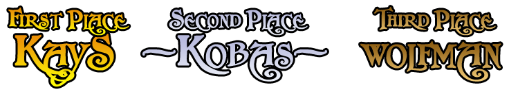
KayS: ((110 + 85) * (70 / 240)) + ((6 / 41) * 30) = 61.2652439
Xiliger: ((64 + 54) * (70 / 240)) + ((3 / 41) * 30) = 36.6117886
wolfman: ((104 + 85) * (70 / 240)) + ((5 / 41) * 30) = 58.7835366
Deathchef: ((100 + 86) * (70 / 240)) + ((1 / 41) * 30) = 54.9817073
Codemonkey11: ((88 + 69) * (70 / 240)) + ((6 / 41) * 30) = 50.1819106
XPQJ: ((105 + 76) * (70 / 240)) + ((1 / 41) * 30) = 53.523374
Zeatherann: ((24 + 47) * (70 / 240)) + ((3 / 41) * 30) = 22.9034553
Elvendan: ((109 + 55) * (70 / 240)) + ((2 / 41) * 30) = 49.296748
-Kobas-: ((98 + 80) * (70 / 240)) + ((10 / 41) * 30) = 59.2337398
.VTZ.: ((61 + 76) * (70 / 240)) + ((2 / 41) * 30) = 41.421748
4th - Deathchef
5th - XPQJ
6th - Codemonkey11
7th - Elvendan
8th - Egorman
9th - .VTZ.
10th - Xiliger
11th - Ahimtar
12th - TDA
13th - Zeatherann
5th - XPQJ
6th - Codemonkey11
7th - Elvendan
8th - Egorman
9th - .VTZ.
10th - Xiliger
11th - Ahimtar
12th - TDA
13th - Zeatherann
Contest | Poll


 - Third Place")


 - Second Place")


 Thanks Kobas!! It was a pleasure...
")
 "
" - Winner")


