 Approved
 .
.
Moderator
M
Moderator
18:10, 4th Jun 2010
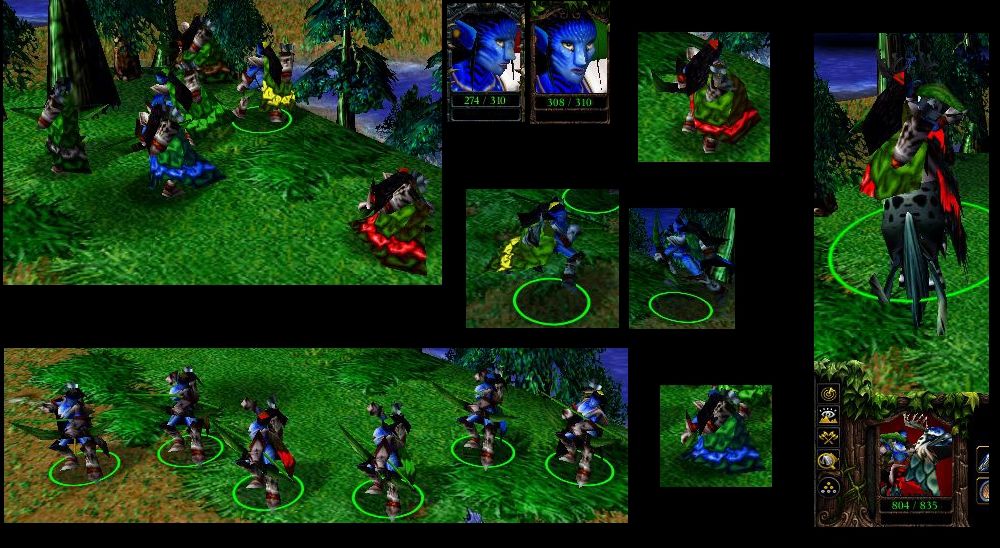
67chrome:The thick, black outlines around most of the details make this skin look incomplete and cartoonish, I'd strongly advise removing the outlines outright and use shading and highlights to create the distinction between various textures and materials on the skin, the black lines make the skin look rather flat.
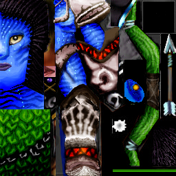
The smoothing that should be done with this skin is to combine layers of color/shading to remove any distinctive lines between them, and the details added should be added with small brushes to make things such as the clothing, jewelry, and hair look; well not like they are an island of solid color surrounded by thick, black lines.
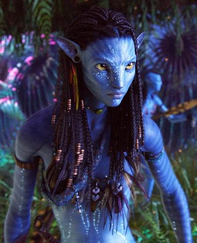
I'd recommend using the eyedropper tool on your reference picture as well to make your colors as close as possible, right now the shades of blue used on the skin seem to intensely blue to be any type of texture that isn't emitting light. At least mix in a little more gray/ desaturate the skin a bit (nothing drastic, but enough to notice the change).
Also use a brush that doesn't show clear pixel definition, check for things like feathering. Or check out the 2D art tutorials section here, I believe there are things you could pick up there. Anyways, this skin needs a significant amount of work to be approved, but you seem to be started in a good direction.
21:41, 12th Jun 2010
67chrome: This skin looks passable now, and shows significant improvement. The eyes wrap a little funky, I'd suggest tweaking them so they look more almond shaped rather than triangular. the skin tone still strikes me as overly saturated, I'd recommend toning it down to more of a blue-gray. Other than that nice work.
67chrome:
The smoothing that should be done with this skin is to combine layers of color/shading to remove any distinctive lines between them, and the details added should be added with small brushes to make things such as the clothing, jewelry, and hair look; well not like they are an island of solid color surrounded by thick, black lines.
I'd recommend using the eyedropper tool on your reference picture as well to make your colors as close as possible, right now the shades of blue used on the skin seem to intensely blue to be any type of texture that isn't emitting light. At least mix in a little more gray/ desaturate the skin a bit (nothing drastic, but enough to notice the change).
Also use a brush that doesn't show clear pixel definition, check for things like feathering. Or check out the 2D art tutorials section here, I believe there are things you could pick up there. Anyways, this skin needs a significant amount of work to be approved, but you seem to be started in a good direction.
21:41, 12th Jun 2010
67chrome: This skin looks passable now, and shows significant improvement. The eyes wrap a little funky, I'd suggest tweaking them so they look more almond shaped rather than triangular. the skin tone still strikes me as overly saturated, I'd recommend toning it down to more of a blue-gray. Other than that nice work.


