• 🏆 Texturing Contest #33 is OPEN! Contestants must re-texture a SD unit model found in-game (Warcraft 3 Classic), recreating the unit into a peaceful NPC version. 🔗Click here to enter!
  • It's time for the first HD Modeling Contest of 2024. Join the theme discussion for Hive's HD Modeling Contest #6! Click here to post your idea!

HeroChaosBladeMaster

This bundle is marked as useful / simple. Simplicity is bliss, low effort and/or may contain minor bugs.
Okay, This is my first skin ever.. Just thought i'd let you know that before you start flaming me away :/.

And i won't take full credit for this one since i took a bit of it from a tutorial. But still, i made most of it myself.

I just thought id submit it since it's (as stated above) my first ;).

Paths:

blp: Units\Demon\HeroChaosBladeMaster\HeroChaosBlademaster.blp

Keywords:
blademaster, orc, armored
Contents

HeroChaosBladeMaster (Texture)

Reviews
17:33, 14th Mar 2008 THE_END: Honestly, it's bad freehand, some color reversal and that's it. Nah B

Moderator

M

Moderator

17:33, 14th Mar 2008
THE_END: Honestly, it's bad freehand, some color reversal and that's it. Nah B
 
Level 3
Joined
Dec 30, 2004
Messages
29
Halo: Hmm, i wouldn't say stolen, since i just looked at what he did, and made my own verison of those parts :)

Stormrider: Ahem, well thats SUPPOSED to be some sort of chestplate ;) look at the unwrapped piece to see it, more detailed :roll:

Esuira: Thank You, and who's/what's CnP?... *sorry for asking

all: It'd be nice with some tip, to help me improve it ;)

- Sincerely, Xumbik
 
Level 5
Joined
Dec 19, 2004
Messages
141
@Xumbix: ah, if its supposed to be an armor like you stated, make its texture less rought! im the author of this armor http://www.wc3sear.ch/art/3017/armorfinal.jpg
i could say that it needs to be more shiny, less rought, unless he's wearing a rocky armor, hehe. try to smudge or clean it up. well, apart from that, it looks a bit dull, but keep working on skins!

@Eusira: there is no cnp, go gather yourself some experience.
 
Level 4
Joined
Mar 21, 2004
Messages
89
This skin looks very good, especially for a first one. There are only a few things that i dont like,
1- the edges of his helmet, it looks like its part of his skin.
2- the Nuclear sign, why?
3- you could have changed the armor on his hips to match with his chest armor.
 
Level 4
Joined
Nov 23, 2004
Messages
88
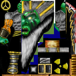
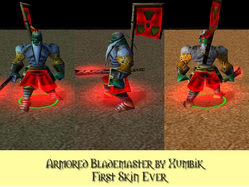
AThis is messy as hell. Armor looks like scribbly crap, and the leather shit on the arms is bland.

Also, im surprised nobody noticed, but the shading on the armor is incorrect. Its casting shadows upward...

FOr a first skin, im still gonna say bleh. No, its no disgusting, but its not good. Btw, blood on a blade is stupid, rarely ever should someone use that.

Heres some tips:
-Clean your work up, use a blending tool.
-Color your character correctly. Orange, grey, green and Team color dont mix.

IF this is all free hand like you say, this isnt so bad. You have potential, so try an idea of yours on your own.
 
Level 3
Joined
Dec 30, 2004
Messages
29
Okay, To clear things up -

Yes, this is freehand, all of it, all i used was the brush, dodge and burn tools.

I didn't "CnP" anything on this skin. :wink:

Thanks for the feedback, constructive critisism and everything else :)

- To ya'll, Xumbik.
 
Top