 Approved


Moderator
M
Moderator
17:56, 8th Mar 2011
shiiK: I don't know who you sent a PM to about this issue, but I didn't receive one.
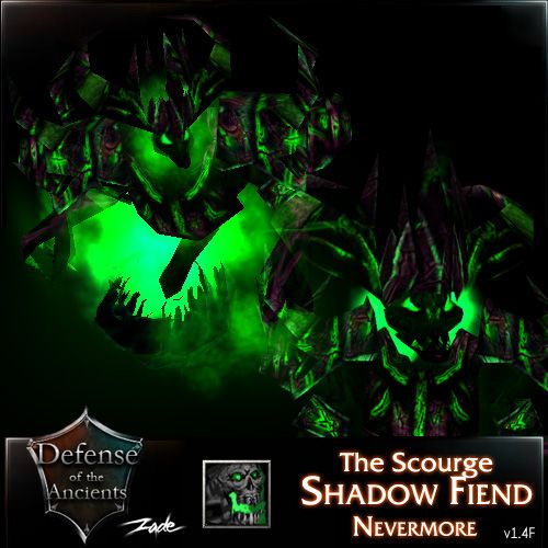
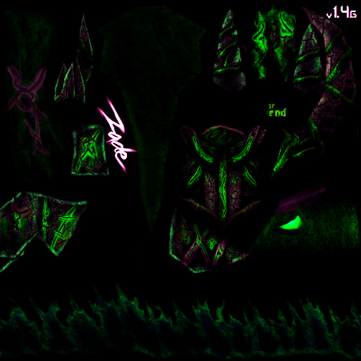
Either way, this looks pretty much exactly like the rejected version with the exception of higher contrast and the red shade applied to some parts. Yes, it makes it look better, but it's still too dark and grainy.
Rejected (until updated).
shiiK: I don't know who you sent a PM to about this issue, but I didn't receive one.
Either way, this looks pretty much exactly like the rejected version with the exception of higher contrast and the red shade applied to some parts. Yes, it makes it look better, but it's still too dark and grainy.
Kimberly said:: Hi, I think it needs alot more defintion on its structure/form and not the details. The firelord has a obscure model, and relies on distinct shapes and tones/colours to stand out. Atm, I think your additions are too detailed to be visible, and get lost ingame making it look merely like a tinted firelord with grainy effects. I suggest you define the form better so it stands out more ingame. I will send you a drawover/preview of what I mean.
Rejected (until updated).


