🏆 Texturing Contest #33 is OPEN! Contestants must re-texture a SD unit model found in-game (Warcraft 3 Classic), recreating the unit into a peaceful NPC version. 🔗Click here to enter!
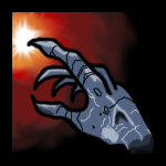
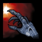
The hand looks somehow like pasted into, maily because of the thick black outline and the fact that it is not shaded at all. The Icon mixes two different styles: the painted style of the gradient and the comic like style of the hand. You should remove the outline (or at least make it thinner) and add highlights and shading and red lighting from the glow to the hand.
Okay i realy think it looks real awesome so i dont care if he had outlined it because it fits outlined it looks awesome, looks like you've pracitced alot since the other icons i've seen you uploading ! Keep On Delivering!
This site uses cookies to help personalise content, tailor your experience and to keep you logged in if you register.
By continuing to use this site, you are consenting to our use of cookies.


 Approved
")