• 🏆 Texturing Contest #33 is OPEN! Contestants must re-texture a SD unit model found in-game (Warcraft 3 Classic), recreating the unit into a peaceful NPC version. 🔗Click here to enter!
  • 🏆 Hive's 6th HD Modeling Contest: Mechanical is now open! Design and model a mechanical creature, mechanized animal, a futuristic robotic being, or anything else your imagination can tinker with! 📅 Submissions close on June 30, 2024. Don't miss this opportunity to let your creativity shine! Enter now and show us your mechanical masterpiece!🔗 Click here to enter!
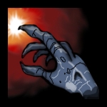
BTNUnholyTouch

next try to upload an icon ;)

I tried to make gradiations (which dont look like shit)

than i just added a hand and than this came out

"Big" picture (128²):
176505-albums3061-picture38133.png


//UPDATE:

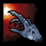
Made the outline thinner and added a bit of shading

176505-albums3061-picture38149.png


Keywords:
unholy, touch, demonic, undead, evil, wicked
Contents

BTNUnholyTouch (Icon)

Reviews
11:52, 22nd Nov 2010 enjoy: Useful.
The hand looks somehow like pasted into, maily because of the thick black outline and the fact that it is not shaded at all. The Icon mixes two different styles: the painted style of the gradient and the comic like style of the hand. You should remove the outline (or at least make it thinner) and add highlights and shading and red lighting from the glow to the hand.
 
Level 11
Joined
Feb 2, 2010
Messages
487
Okay i realy think it looks real awesome so i dont care if he had outlined it because it fits outlined :D it looks awesome, looks like you've pracitced alot since the other icons i've seen you uploading ! :) Keep On Delivering!
 
Top