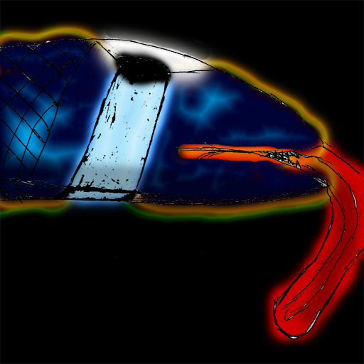
I honestly suggest not too draw out your icons on pencil and scan them in because how your doing it gives out a sketchy type icon that needs smoothing out because the lines are so choppy. But, the colors on this are confusing too me, they are also very dark and need highlights, I also suggest changing the name too something else because thats very confusing as well. So overall the whole icon needs defining.


 Approved