• 🏆 Texturing Contest #33 is OPEN! Contestants must re-texture a SD unit model found in-game (Warcraft 3 Classic), recreating the unit into a peaceful NPC version. 🔗Click here to enter!
  • It's time for the first HD Modeling Contest of 2024. Join the theme discussion for Hive's HD Modeling Contest #6! Click here to post your idea!

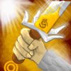
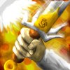
BTNPowerLight3

This bundle is marked as useful / simple. Simplicity is bliss, low effort and/or may contain minor bugs.
  • Like
Reactions: krisserz
well third icon :p
mhm well i dont know. old version was crappy but worked a bit on it :p (especially because of the post of StaberFire :p)
pls leave your opinion and give me some tips how to improve my work :p
pls give credit if u use it (om nom nom :3redit)

do not repost/distribute/modify without my permission :p

reworked it: changed some parts, may more light and shading. hope it doesnt sparkle to much :p
and reworked it again
and reworked the backround and fixed the blur

Keywords:
paladin, sword, light, holy, heal, strike, damage, dead, gold, god, bible, belief, sparkle, fire
Contents

BTNPowerLight3 (Icon)

Reviews
08:02, 2nd Aug 2009 zombie2279: Altogether quite good, but fix the blur and remove the mess. Also, I think the sun on the top left corner is entirely unnecessary. 8:23, 5th Aug 2009 zombie2279: The outlines still need more contrast. 8:59, 7th...

Moderator

M

Moderator

08:02, 2nd Aug 2009
zombie2279: Altogether quite good, but fix the blur and remove the mess. Also, I think the sun on the top left corner is entirely unnecessary.

8:23, 5th Aug 2009
zombie2279: The outlines still need more contrast.

8:59, 7th Aug 2009
zombie2279: Rejected until the outlines are given more contrast and the blur is removed.
 
Level 8
Joined
Jul 21, 2009
Messages
40
Looks way to 2D, doesnt it? and it needs more shading oO....
but pls leave your opinion here.
what do you think oO?

files attached as requested:
work in progress

and psd
 

Attachments

  • PowerLight2.psd
    827.6 KB · Views: 76
  • PowerLight.jpg
    PowerLight.jpg
    18.7 KB · Views: 68
  • PowerLight1.5.jpg
    PowerLight1.5.jpg
    68.9 KB · Views: 68
  • PowerLight2.jpg
    PowerLight2.jpg
    20 KB · Views: 78
Last edited:
Level 12
Joined
Jun 28, 2008
Messages
688
I'm going to hold my rating on this one because I know you can make it look alot better.

Yes, it needs shading. Lots. Just think realistically; the light source is right across from the sword, so there should be some small intense shadows on the opposite side. Makes sense, right? Just keep working on this one and it's sure to become a great icon.
 
Level 11
Joined
Mar 7, 2009
Messages
333
Looks a lot like my Holy Strike Remake...
I like it. :p

But the hand could use some higher contrast, and to be honest I think the background seems a little... Well, I dunno... Boring, perhaps, when there's a tiny sparkle-thingie in the corner and the rest is a solid colour. Could be my opinion, though. I would recommend making a little more variety in the background. The sun/star/light thingie in the corner is fine, but some different yellow tones rather than one solid colour would spice up the rest of the background, in my opinion. :)
Atm I'd say 4/5, but if you could do something about the background, and possibly the hand, you'd definitely receive a 5/5. :)
 
Top