Been thinking for days on how to give this icon a comment.
Okay, lets start. Shading is very crisp. I can see what's happening, and what objects are there.
But there's something bothering me... This one looks very.... wallpaper-ish than icon-ish. Now, that is not a bad point or a good point.
So let me elaborate on what I said about wallpaper-ish. From this image, everything is very clear. I do not have slight trouble identifying them. But it is missing something, something that an icon has, a focus. What do I mean from focus? I mean the icon has too much meaning. When I look at it, I can think of many things. For example, a raid in a night or a way of describing chaos, or the meteor itself. The image itself can tell a story, something that happened in a place. (And if you noticed the white lines you drew became rain when resized, dunno whether it is purposely or not, which adds more meaning to the image.)
But then again, it is not a criticism, or a compliment. I am just trying to describe it.
Whereas an icon, it mostly only have one focus. Yes, some icons have can be used on a lot of purposes. But that's not the "one" focus I meant. When I stated one focus, meaning it only has one thing going on, but whatever it is depends on the user's taste.
Oh I noticed another reason I said it looks very wallpaper-ish is because this icon lack the thin fading-black border. Check other icons and you will get what I mean.
Blergh.. You can ignore me. I dont really mind since Im no good artist myself. Its just the icon is attracting me to comment it. Its the comments section after all. Peace.


 Approved
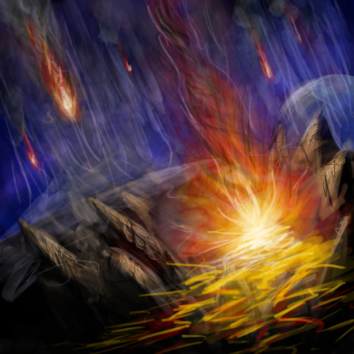

")


