• 🏆 Texturing Contest #33 is OPEN! Contestants must re-texture a SD unit model found in-game (Warcraft 3 Classic), recreating the unit into a peaceful NPC version. 🔗Click here to enter!
  • It's time for the first HD Modeling Contest of 2024. Join the theme discussion for Hive's HD Modeling Contest #6! Click here to post your idea!

BTNGrowthinthemagicalvegetation

This bundle is marked as useful / simple. Simplicity is bliss, low effort and/or may contain minor bugs.
Icon my Work.

Reserved.


icon


248482-albums8498-picture102775.png


Finaly the day.

Keywords:
Herbs, natural, magic, blu, growth, new
Contents

BTNGrowthinthemagicalvegetation (Icon)

Reviews
20:35, 21st Oct 2015 Sin'dorei300: Commented. Please, read the Icon Submission Rules.

Roland

R

Roland

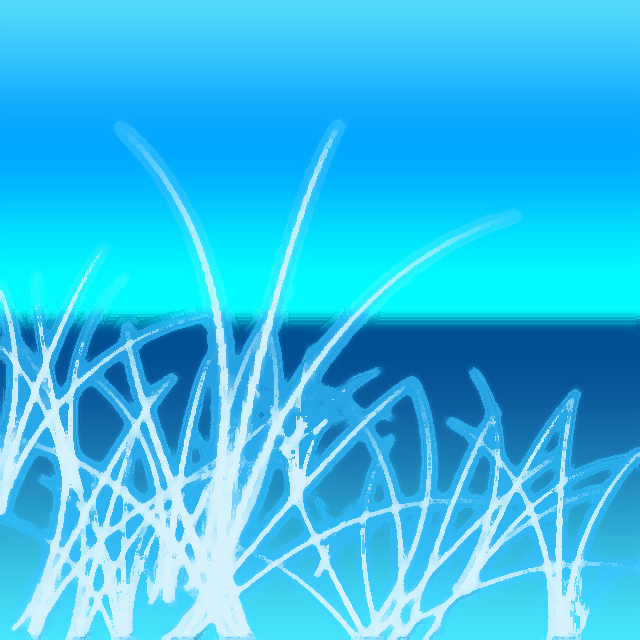
English, Mi amigo and show the mods what's the full large image of "your" newly uploaded icons.
 

Dr Super Good

Spell Reviewer
Level 64
Joined
Jan 18, 2005
Messages
27,201
I do not understand your question.
Image asset artist usually paint icons at a higher resolution (eg 256*256 or larger) and then down sample to the final 64*64 icons for use in game. Doing this allows higher productivity because it is easier to paint something at a higher resolution dealing with entire areas of pixels instead of individual pixels. He is asking for this larger resolution image.

Due to your grammar used and emphasis that they are "100%" created by you he is asking for proof that you did actually create them. This is because such writing style is usually used by scammers or fraud sites which all claim their products are "100% genuine".

Ultimately he has no evidence other than your writing style that you did not make them which is kind of a week argument in the first place.

What is more of a problem is your submission description as to what the icons are meant to be. The English in it is very bad with many phrases making no sense at all such as "Ultimo del dia XD" which I suspect is untranslated other languages (not allowed, this site is English only). You might want to describe some potential use cases for the icon or maybe detail the process of making it.

As far as I can tell it is some sort of grass on a cliff with a sea view.
 
Level 21
Joined
Jul 6, 2014
Messages
6,791
His description says it's 100% his work and the last of the day - probably meaning he won' t upload anymore for (yesterday). But yeah, all these icons look like really simple photoshop or gimp gradients with a white dot being smeared everywhere.
Well,we will never know since he won't show proof that it's his
 

Dr Super Good

Spell Reviewer
Level 64
Joined
Jan 18, 2005
Messages
27,201
Could people please stop interrogating him about if the icons are genuine or not?

The main problem with the icon is the style it is in. Most icons are some concept placed floating in a black background. This is a full screen picture so is immediately out of place.
 
Level 21
Joined
Jul 6, 2014
Messages
6,791
Could people please stop interrogating him about if the icons are genuine or not?

The main problem with the icon is the style it is in. Most icons are some concept placed floating in a black background. This is a full screen picture so is immediately out of place.
Rules are rules Dr.
 
Those icons are poor regarding color variation, shading, definition.
They look more like some tiles and not like icons.
"The submitted icons have to be at least 50% freehand work.
Filter works, recolors and copy-pasting are not considered freehand content. Drawing a complete artwork and then copying/rotating it around multiple times in a single icon is not considered freehand work.
All icons must include at least one invisible light source for highlights and a set of shadows to follow it.
Applying outlines over existing artwork layers; applying existing artwork over the complete icon and using filter effects and layer settings to enhance the icon's details, light sources or shadows; and drawing/coloring over existing artwork and using filters and layer settings to change the appearance of the former to make it look drawn - is not allowed.
All Icons must bear a fitting title."
All ur icons seems to be like filter-fests, and not freehand.
 

Dr Super Good

Spell Reviewer
Level 64
Joined
Jan 18, 2005
Messages
27,201
Filter works, recolors and copy-pasting are not considered freehand content. Drawing a complete artwork and then copying/rotating it around multiple times in a single icon is not considered freehand work.
This applies to only 50% of the image? The background is obviously block colored with filter but the grass in-front would appear manually painted to me, even if it was expanded with a filter for some reason and that it was rather poorly painted (no multiple strokes, seemed each blade was a single stroke).

Applying outlines over existing artwork layers; applying existing artwork over the complete icon and using filter effects and layer settings to enhance the icon's details, light sources or shadows; and drawing/coloring over existing artwork and using filters and layer settings to change the appearance of the former to make it look drawn - is not allowed.
How do you know he has done this? What icon or asset was it based on? Seems like I am missing something.

All Icons must bear a fitting title.
The title of the icon was the only thing fitting. It at least gave some hint as to what it was about.

I usually do not get involved with icon and other "assets" however after various people made such a fuss in the chatroom I feel obliged to.

My personal complaints with it were only as follows...
  • Bad icon style. Icons usually emphasize a concept and are not full screen paintings.
  • Bad colour palette. Too much blue to feel natural given the concept it was trying to portray.
  • Unclear icon concept. The submission/file name was all the hint we had as to what the icon was about.
 

Dr Super Good

Spell Reviewer
Level 64
Joined
Jan 18, 2005
Messages
27,201
I don't really agree,the name is too long and seems random
File name length does not really matter as long as it is within a small fraction of the Windows File System limit for paths (640 characters odd). It was long compared with most icons but so what?

It also said "growth in the magical vegetation" which seeing how it appeared to depict some kind of grass made sense. The ocean/sea behind it made less sense however and this was not emphasized in the description.
 
Top