Love the concept as it could be extremely useful.
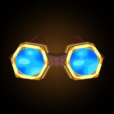
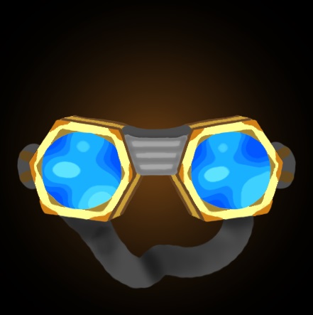
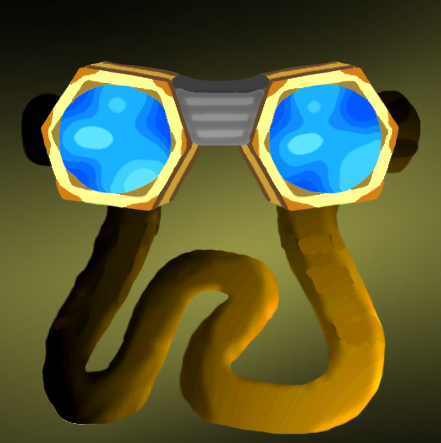
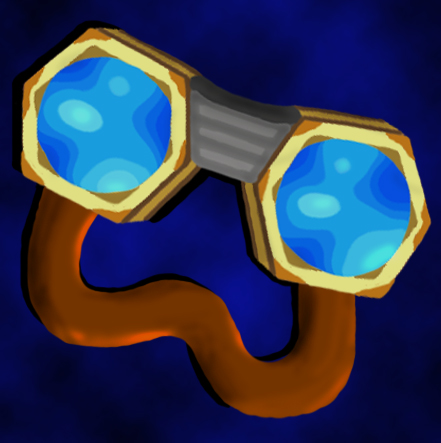
The angle you've used does no good for the object. If you take a look at it, it's not proportional in terms of width and height, meaning when placed fully centered like you did, a lot of space goes to waste. Now, if you take a look at any other icon that has the same issue, you'll notice several things: people will either make the object go diagonal, so it creates an illusion that fills up the space;
...or use strong effects, background and render to make it alive and eye-catching:
...or do both:
For the icon itself, I find the glass parts a little too much whitened up (always keep in mind that there's no surface which can benefit from light but can't from shadows, one never goes without the other one), and the whole icon is a little lacking in terms of shading. Feel free to use crisp, strong shadow transitions, you can't miss the Warcraft style. The bottom strap, the one that should go around the head, is a little off as it, on the other hand, has shadows but not a light source.
I really hope I haven't intimidated you with this wall of text, but I see you have a lot of potential and I've just wanted to point you out towards a good direction, and supply some reference images
")
Looking forward to your update!


 Approved