• 🏆 Texturing Contest #33 is OPEN! Contestants must re-texture a SD unit model found in-game (Warcraft 3 Classic), recreating the unit into a peaceful NPC version. 🔗Click here to enter!
  • It's time for the first HD Modeling Contest of 2024. Join the theme discussion for Hive's HD Modeling Contest #6! Click here to post your idea!

BTNBloodRune

This bundle is marked as useful / simple. Simplicity is bliss, low effort and/or may contain minor bugs.
My Note


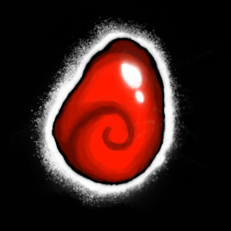
Hello, this is my 1st post for the icon that HiveWorkShop, and it is a Rune of Blood. This icon was made with a tablet (Trust) and two digital painting software.
If the icon name is not as think (BloodRune), please ignore the name. Additionally, if you use my icon (somehow), please give me credits. Oh, almost forgot: leave your comments.

Image


Well, I put the original image without resizing and edges to BTN icons, ATC, ATT, etc.


BloodRune.jpg


Keywords:
porta de pedra, icons, iten, rune , blood,
Contents

BTNBloodRune (Icon)

Reviews
09:57, 28th Jun 2014 Sin'dorei300: Too simple and too much black space. Make it bigger and add some details & effects.

Moderator

M

Moderator

09:57, 28th Jun 2014
Sin'dorei300: Too simple and too much black space.
Make it bigger and add some details & effects.
 
I forgot about suggestions:

1. Orbs tend to be spherical (am I wrong?) !
2. I'd either remove or redo that white glow. It makes it look like a cooked egg as Shadow Furry pointed out.
3. Make a proper outline that's not black or remake a lighter background.
4. It also needs volume/depth, it's a bit flat-ish right now.
5. You could also make it BLOODIER! It doesn't look like a blood orb to me:p
 

nGy

nGy

Level 11
Joined
Apr 15, 2011
Messages
123
There is not a whole lot of freehand involved here it seems :p
While I actually like the shape of the outline, it's not enough of a justification to upload. The orb of fire needs some polishing, since it doesn't really look optimal after the warp, the outline could use some colors and the section between the "orb" and the outline needs to be filled with something a bit more fitting than just black.
It's not a bad start, though [:
 
Level 2
Joined
Jun 24, 2014
Messages
4
So, the drawing was done by hand (100% by hand, even I used my tablet for that). Moreover, the Heinvers is not wrong if an orbit is a spherical figure, and I am soon going to update the icon because I made some drastic changes (the name too).
I appreciate the comments are critical and constructive. However, I do not know how to change the name of the icon once already posted, I believe that it is not necessary to delete it, and yes, I'm looking for an answer in the forums.

:fp: :goblin_good_job:
 
Top