• 🏆 Texturing Contest #33 is OPEN! Contestants must re-texture a SD unit model found in-game (Warcraft 3 Classic), recreating the unit into a peaceful NPC version. 🔗Click here to enter!
  • It's time for the first HD Modeling Contest of 2024. Join the theme discussion for Hive's HD Modeling Contest #6! Click here to post your idea!

Terraining Contest #19 - Aftermath

Status
Not open for further replies.
Level 19
Joined
Apr 21, 2013
Messages
1,194
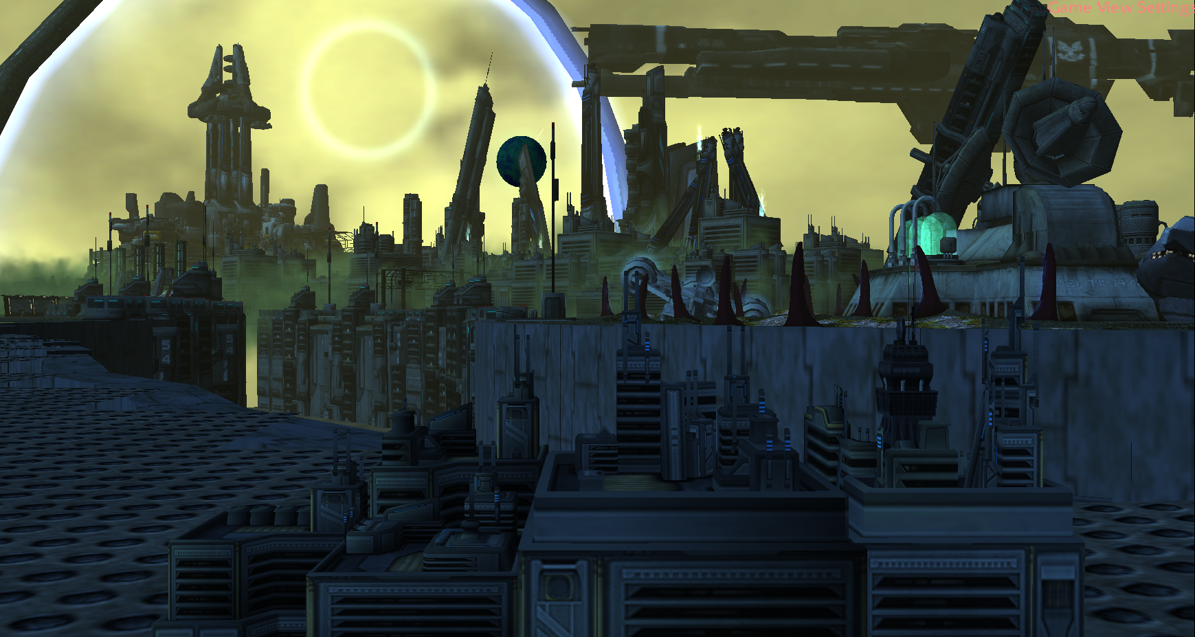
Cool! Looks like a landscape from the Mortal Engines movie.

Just checked what Mortal Engines was and I to be honest I can really use some inspiration from those machines! Thanks for the words.

Hey @NightStalker is that a StarGate? It reminded me of that. So far so good for a layout that is ^^

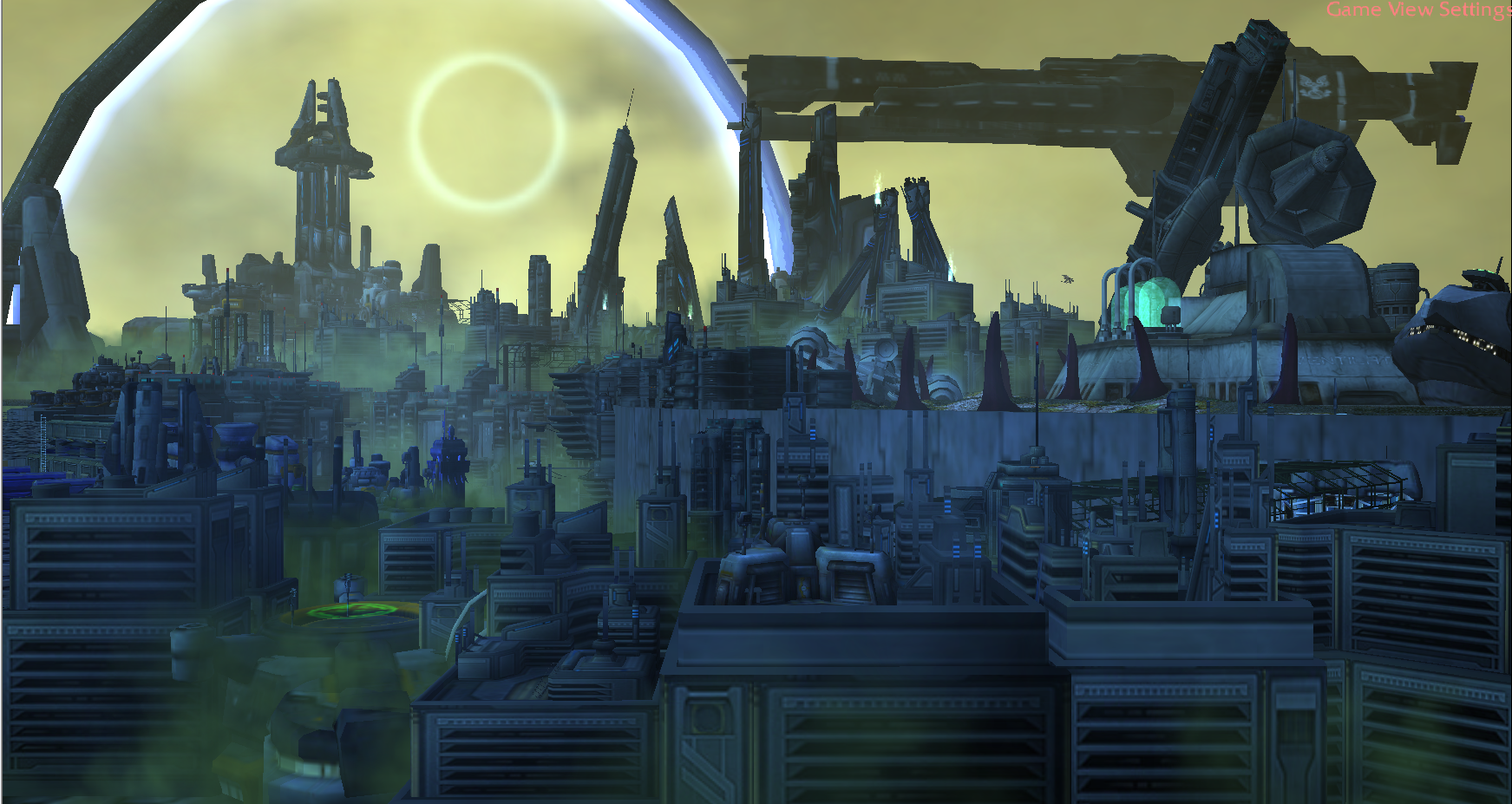
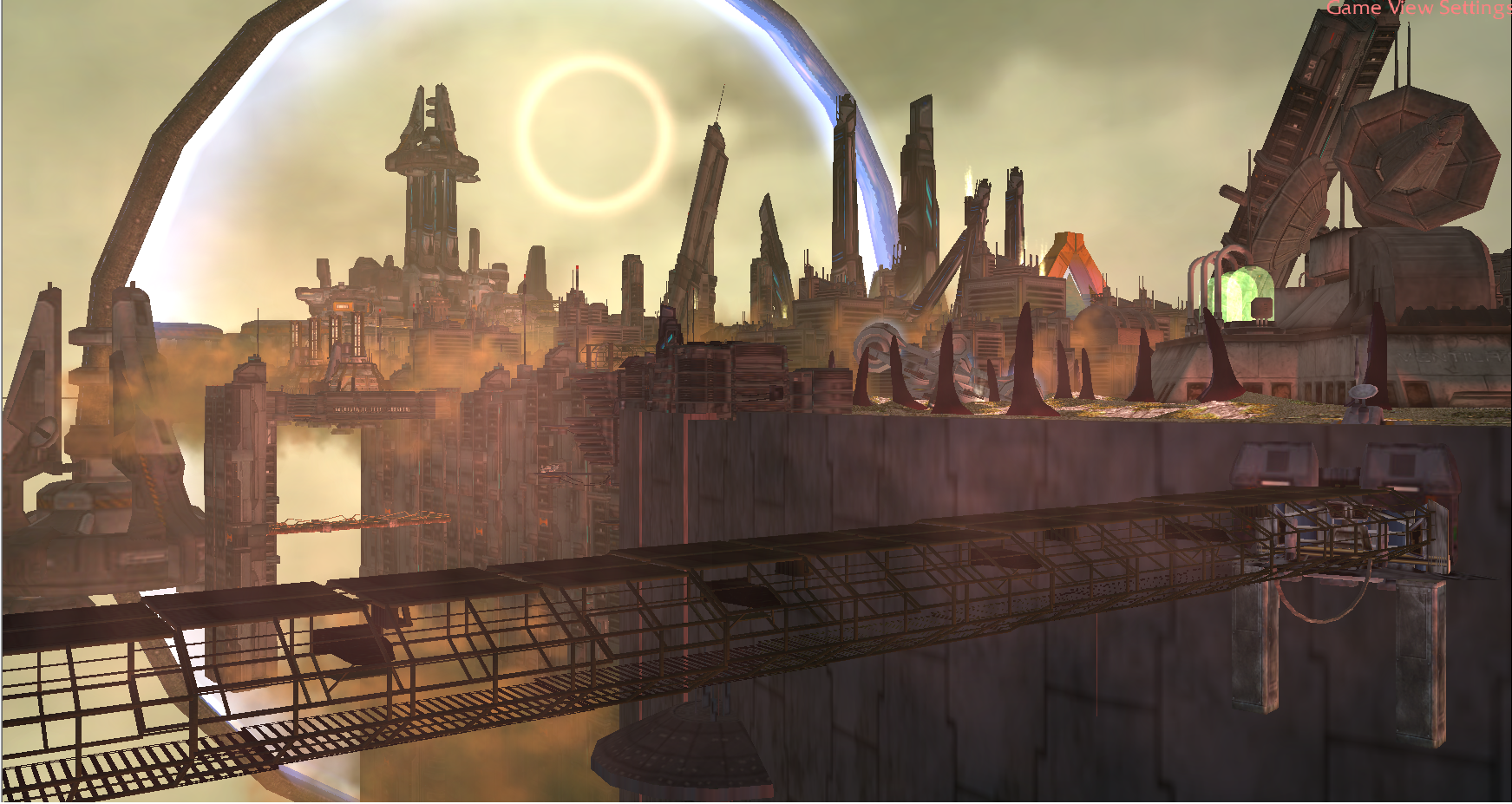
Hey Heinvy, it's supposed to be a shield thing as for my imagination, but it can be taken to anywhere you want! I'll add a short lore when I finish up the post, I need to put a lot more buildings to complete the city, and I'll have to put in many theoretical stuff in the city, then destroy some of them :p That's where the destruction will show its face! Thanks for the feedback, I'll probably post one or two more WIPs to get even further feedback in short notice :pp
 
Level 29
Joined
May 21, 2013
Messages
1,635
Alright, here I am with a new update, and a question. The game fog doesn't do a good job at all so I'm using clouds and other stuff, will it be good enough to fill everywhere? How should I thin it?

And how does this current composition look to an outsider? Any flaws sticking out? I have made a concept art using images from online to get myself a more solid image. And I'm trying to stick to it as much as I can.


aftermathwip4-png.311408


I like the sky
I like the composition

About the theme the Aftermath.
The crusier is intact, the city seems intact (dusty but intact),the nuclear radar station seems intact, the bunker I saw operating workshop looking far worst than that bunker,, so I think you should think to put something that fits the theme, that there was a battle of a violent episode
to me it looks peacefull.
If you look the others entries in overall people is doing buildings destroyed or corpses.

maybe you can put 1 or 2 ships and bury with rocks or that stuff.

https://i.pinimg.com/originals/50/be/03/50be03d91097f957aaf51042c8f701c6.jpg

I tell you this because, well I like to be honest I think...
 
Last edited by a moderator:
Level 19
Joined
Apr 21, 2013
Messages
1,194
I like the sky
I like the composition

About the theme the Aftermath.
The crusier is intact, the city seems intact,the nuclear radar station seems intact, the bunker I saw operating workshop looking far worst than that bunker,, so I think you should think to put something that fits the theme, that there was a battle of a violent episode
to me it looks peacefull.
If you look the others entries in overall people is doing buildings destroyed or corpses.

maybe you can put 1 or 2 ships and bury with rocks or that stuff.

https://i.pinimg.com/originals/50/be/03/50be03d91097f957aaf51042c8f701c6.jpg

I tell you this because, well I like to be honest I think...

Thanks for the detailed feedback! I loved that concept art you attached, but the story of my concept won't be a total destruction such as a war. I'm thinking of something else. I'll need some wreckage too that's what I've been searching for, for about an hour. The area will be filled soon enough tho. I'm not totally certain of where I'm headed to tho :p
 
Level 18
Joined
Mar 21, 2008
Messages
6,417
I added a Chrysalis because I wanted to use red stuff. But I'm unsure if I want it there, and the round things are not very round. So we'll see if I want to have it around after all.

EDIT: @Ragnaros17 Thank you for the nice words. I mainly took inspiration from Nier: Automata even though my doodad spam makes no justice whatsoever. But I can see how it makes you think they way you do.

And since you asked for feedback yourself, the first thing you could work on is perhaps making the horizons not seem like the end of the world, either making it seem like there are some mountains/rocks in the distance or anything, even simply making the ground go further could help with the aid of some fog.

sally22-png.311411
 

Attachments

  • Sally22.png
    Sally22.png
    1.9 MB · Views: 555
Last edited:
Level 29
Joined
May 21, 2013
Messages
1,635
Bern, I love it! ^_^

me too.

edit:

I added a Chrysalis because I wanted to use red stuff. But I'm unsure if I want it there, and the round things are not very round. So we'll see if I want to have it around after all.

EDIT: @Ragnaros17 Thank you for the nice words. I mainly took inspiration from Nier: Automata even though my doodad spam makes no justice whatsoever. But I can see how it makes you think they way you do.

And since you asked for feedback yourself, the first thing you could work on is perhaps making the horizons not seem like the end of the world, either making it seem like there are some mountains/rocks in the distance or anything, even simply making the ground go further could help with the aid of some fog.


thanks

yes I will try to do something with fog and clouds, and work more the horizon.
 
Last edited by a moderator:
Level 29
Joined
May 21, 2013
Messages
1,635
Here's a new update! I've finally found the destination I want to go.


aftermathwip5-png.311434


I can feel that you put the camara more near to have more city detail (a very clever decision)
I do really like the ship with angle like a crash (thats the cherry of the cake!)
Now the dust looks like some poison fumes (I like it even more). With the the fumes and the +++ detail it seems more like an abandoned / ruined city

WIP 4
 

Attachments

  • upload_2018-12-12_18-20-4.png
    upload_2018-12-12_18-20-4.png
    1.8 MB · Views: 360
Level 19
Joined
Apr 21, 2013
Messages
1,194
A new update!! Probably will be finished on Monday or Tuesday, I hope :p


full


I can feel that you put the camara more near to have more city detail (a very clever decision)
I do really like the ship with angle like a crash (thats the cherry of the cake!)
Now the dust looks like some poison fumes (I like it even more). With the the fumes and the +++ detail it seems more like an abandoned / ruined city

Thanks alot!! Yeah the camera should be able to get a wide shot of the city, I might even increase the FOV of the camera. Actually your suggestion made me add it tbh :p I really liked that Star Wars concept art.
The dust is meant to come both from the ruined city buildings and the alien planet's wind. It is not the Earth I'm depicting, it's a new planet! You might think of Mars, since the colors can be thought of similar color ranges, actually not haha, but I thought about a planet like Mars, with dust storms and stuff. I will add the lore in the final post!


Looking good! The only suggestion I could say would be the hill's angle kinda looks a bit steep. You might try smoothing a lil bit imo. The fog actually looks good btw!
 
Level 29
Joined
May 21, 2013
Messages
1,635
Almost done, I'll need a few hours to add many tiny details, as if it's a playable map haha :D Hoping that the final version would be interesting enough!

every wip imroves a lot!! much more detail!

I miss the bunker, nah just kiiding, I really like the camara and the city that has some kind of U shape.

If you reduce the size of the teal nuclear radar station allias starcraft psi distuptor from the right you can add more stuff.
 
Level 19
Joined
Apr 21, 2013
Messages
1,194
every wip imroves a lot!! much more detail!

I miss the bunker, nah just kiiding, I really like the camara and the city that has some kind of U shape.

If you reduce the size of the teal nuclear radar station allias starcraft psi distuptor from the right you can add more stuff.


Yeah!! I'm getting lots of ideas and starting to work more freely, instead of keeping myself in my comfort zone :p

I don't miss that bunker too, it was supposed to have a dramatic effect but I'd rather go with a more subtle approach in story telling.

I probably wouldn't decrease its size, i want it to look huge, I might add more props on it so it looks more detailed tho. Right now it drags some attention since it sits obviously on the right side of the image.
 
Level 29
Joined
May 21, 2013
Messages
1,635

looks great


Couldn't keep myself away from it, so here's one more. I'll need feedback for the lighting and fogging especially. All feedback are welcome!


full


WOW!! so is finished looks great
maybe , a very subjetive opinion, try to have the sky different to have contrast with the city fumes., because the fumes are green and the sky seems a bit green.
but is very subjetive.

These look so fine guys. Keep up the good terrains coming around :]

thanks for cheering up!!

Sadly I didn´t make progress with my terraining (hope to do it soon). I am also in the 4v4 melee contest (hard to be in the 2 at the same time), my map was played yesterday and I am doing fixing so maybe it can be tested again.

Voting will be hard, all your works are great , like of others games, (mine is just to much wc3 blizzlike but it is fun doing it).
 
Level 18
Joined
Mar 21, 2008
Messages
6,417
Alright! I might have gone a bit crazy with the lights, but I don't care because I like it and that's the point. Not to mention that I have never played around with fogs like this. All for the sake of my bipedal babies.

Special thanks to @Heinvers for forcing me to participate.

Final Entry: Bern's Bipedal Babies

It's finished! I'm not doing anything! You can't tell me what to do! Lalalalaalala!

My only regret is not doing anything about the railgun, but I kept forgetting.
 

Attachments

  • Final.png
    Final.png
    1.8 MB · Views: 866
Level 29
Joined
May 21, 2013
Messages
1,635
Alright! I might have gone a bit crazy with the lights, but I don't care because I like it and that's the point. Not to mention that I have never played around with fogs like this. All for the sake of my bipedal babies.

Special thanks to @Heinvers for forcing me to participate.

final-png.311738

It's finished! I'm not doing anything! You can't tell me what to do! Lalalalaalala!

My only regret is not doing anything about the railgun, but I kept forgetting.


the first strike didnt destroy completely the factory target so we decided to launch a nuke to the hole area.
 
Alright! I might have gone a bit crazy with the lights, but I don't care because I like it and that's the point. Not to mention that I have never played around with fogs like this. All for the sake of my bipedal babies.

Special thanks to @Heinvers for forcing me to participate.

final-png.311738

It's finished! I'm not doing anything! You can't tell me what to do! Lalalalaalala!

My only regret is not doing anything about the railgun, but I kept forgetting.


Could you give it a proper entry name? e.g. Glassing etc

@Ragnaros17 no problem. It happens :]
 
I can feel that you put the camara more near to have more city detail (a very clever decision)
I do really like the ship with angle like a crash (thats the cherry of the cake!)
Now the dust looks like some poison fumes (I like it even more). With the the fumes and the +++ detail it seems more like an abandoned / ruined city

WIP 4

This looks classic, but well, waiting for the final version when you'd do the lighting and fog and fix the damn end of the world as being said by Bern (mostly the left part of the piece looks much end-of-the-world-y xD)!
Couldn't keep myself away from it, so here's one more. I'll need feedback for the lighting and fogging especially. All feedback are welcome!


full

Dunno why, but the looks of this leads too much distraction to my eyes (maybe that's just me), perhaps because of much details (and perhaps being close to the camera)! You may wanna look at APproject's Terraining Contest #16 entry, there is too much details there but very well managed, all in one area, which look pretty good at the distance.

And about the fog, I'm not sure if clouds work properly for it (they're used most often for skies), the WE's fog might be cooler than what you have here right now, in my opinion, as it gives some depth to the terrain; but if you used to manage a good fog with those clouds, so be it. : )
Alright! I might have gone a bit crazy with the lights, but I don't care because I like it and that's the point. Not to mention that I have never played around with fogs like this. All for the sake of my bipedal babies.

Special thanks to @Heinvers for forcing me to participate.

final-png.311738

It's finished! I'm not doing anything! You can't tell me what to do! Lalalalaalala!

My only regret is not doing anything about the railgun, but I kept forgetting.
Just damn!! It is a huge lighting piece but cool at the moment, gives me a forgotten-sands feelings!
 
Either you put your little grey cells to work, or it's called Bern's Bipedal Babies.

Entry linked and marked as final with that title <3

Dunno why, but the looks of this leads too much distraction to my eyes (maybe that's just me), perhaps because of much details (and perhaps being close to the camera).

And about the fog, I'm not sure if clouds work properly for it (they're used most often for skies), the WE's fog might be cooler than what you have here right now, in my opinion, as it gives some depth to the terrain; but if you used to manage a good fog with those clouds, so be it. : )

I agree on one thing said; the distraction. You need the central point of focus to pop out more, to be more recognizable to the eye. That way the terrain's story should be clearer to the viewer.

No to the clouds mentioned Yaser. I think those are rather alright-ish; given that he aims at a post-apocalyptic city and all that stuff.
The clouds can be used for so much more than just the sky you know. It's just that you haven't reached that stage yet and still have a long way to go until that point.

@NightStalker I think that you lack more depth, in therms of fog. Also what is that white glare in the middle of the shield meant to be? :]
It seems pretty random with no discernible use whatsoever.

This tutorial will greatly help you if you look carefully.
 
Level 29
Joined
May 21, 2013
Messages
1,635
This looks classic, but well, waiting for the final version when you'd do the lighting and fog and fix the damn end of the world as being said by Bern (mostly the left part of the piece looks much end-of-the-world-y xD)!

Dunno why, but the looks of this leads too much distraction to my eyes (maybe that's just me), perhaps because of much details (and perhaps being close to the camera)! You may wanna look at APproject's Terraining Contest #16 entry, there is too much details there but very well managed, all in one area, which look pretty good at the distance.

And about the fog, I'm not sure if clouds work properly for it (they're used most often for skies), the WE's fog might be cooler than what you have here right now, in my opinion, as it gives some depth to the terrain; but if you used to manage a good fog with those clouds, so be it. : )

Just damn!! It is a huge lighting piece but cool at the moment, gives me a forgotten-sands feelings!


"when you'd do the lighting and fog"

I understand nothing about those and the clouds (just reading magic formulas with numbers wich doesn´t even give me what I want).

"and fix the damn end of the world"

is not that damn easy for me (I stated that I was very newby/amateur with this kind of stuff)
 

Attachments

  • upload_2018-12-16_11-38-55.png
    upload_2018-12-16_11-38-55.png
    916.7 KB · Views: 187
No to the clouds mentioned Yaser. I think those are rather alright-ish; given that he aims at a post-apocalyptic city and all that stuff.
The clouds can be used for so much more than just the sky you know. It's just that you haven't reached that stage yet and still have a long way to go until that point.
Understood! Yep, I personally have a long way yet.. but just brought up my opinion at this stage. xd
"when you'd do the lighting and fog"

I understand nothing about those and the clouds (just reading magic formulas with numbers wich doesn´t even give me what I want).

"and fix the damn end of the world"

is not that damn easy for me (I stated that I was very newby/amateur with this kind of stuff)
Well yeah, as Bern said, you can increase them and enable the fog; this way the end of the map will be covered by the fog or whatever method you will be using to cover it.

Good luck guys, damn cool pieces so far! Hope we can all make it.
 
Last edited:
Level 29
Joined
May 21, 2013
Messages
1,635
@Heinvers <3

@Ragnaros17 Increase the map boundaries, makes it much easier to make it not seem like the world ends there!

thanks, that helped a lot.

Understood! Yep, I personally have a long way yet.. but just brought up my opinion at this stage. xd

Well yeah, as Bern said, you can increase them and enable the fog; this way the end of the map will be covered by the fog or whatever method you will be using to cover it.

Good luck guys, damn cool pieces so far! Hope we can all make it.

thanks


edit

wip 4 or 5 or 6 lost count, still wip.
 

Attachments

  • upload_2018-12-16_13-0-3.png
    upload_2018-12-16_13-0-3.png
    1.8 MB · Views: 168
Lovely. As @Bernkastel said, you can increase to default max size and just use the central size for the scene itself. That way you can have endless horizon if doodads and glows are used correctly.

There is no need to put the images in [Hidden_] tags btw. Merely attaching them is enough since we can view them separately in a tab that way ^_^

Keep on working :]
 
Level 19
Joined
Apr 21, 2013
Messages
1,194
Dunno why, but the looks of this leads too much distraction to my eyes (maybe that's just me), perhaps because of much details (and perhaps being close to the camera)! You may wanna look at APproject's Terraining Contest #16 entry, there is too much details there but very well managed, all in one area, which look pretty good at the distance.

And about the fog, I'm not sure if clouds work properly for it (they're used most often for skies), the WE's fog might be cooler than what you have here right now, in my opinion, as it gives some depth to the terrain; but if you used to manage a good fog with those clouds, so be it. : )

You are right about the distraction. It tires even my eyes when looking at it. It doesn't just focus on one point which is the problem here. I must have those stinky clouds in the city. They represent the abandoned feeling.
But I need tweaking with the fogging and the clouds to get a better view as well.


Entry linked and marked as final with that title <3


I agree on one thing said; the distraction. You need the central point of focus to pop out more, to be more recognizable to the eye. That way the terrain's story should be clearer to the viewer.

No to the clouds mentioned Yaser. I think those are rather alright-ish; given that he aims at a post-apocalyptic city and all that stuff.
The clouds can be used for so much more than just the sky you know. It's just that you haven't reached that stage yet and still have a long way to go until that point.

@NightStalker I think that you lack more depth, in therms of fog. Also what is that white glare in the middle of the shield meant to be? :]
It seems pretty random with no discernible use whatsoever.

This tutorial will greatly help you if you look carefully.

I agree on that focus point but what should I do? I mean, the foreground is way too detailed as well. What I observed from other terrains is, they usually leave the space empty just in front of the camera then detail the focal point. My main focus should be the huge towering futuristic castle in the leftmost area but it stays way too foggy when "in in game view settings". How can I make it pop out? and would you recommend opening some space in the very fore ground so the audience can get a fresh breathe?

That ring thing on the sky? It is depicting an eclipse. It blends in well with the sky being very cloudy and dusty by being very dim. The problem is, there are too many things in that particular area. The main focus tower, the stargate thing and this eclipse. I'm not sure how I'd manage that.

I followed that tutorial again since you put it here and I tweaked with the clouds and sky a bit, hopefully they are better now :/

@Bernkastel btw how do you do those light beams o_O
 
Last edited:
Level 18
Joined
Mar 21, 2008
Messages
6,417
Maybe this'll do some justice to the eyes of the viewers :p


aftermathwip7-4-png.311843


I prefer this approach actually. Perhaps you could try making the crack or whatever in the middle deeper, so that you couldn't see the ground. But that's just an idea, not necessarily the right approach.
You could also try playing around with fog models. Fog models are the best, after stuff that you can build babies from.
 
Level 19
Joined
Apr 21, 2013
Messages
1,194
I prefer this approach actually. Perhaps you could try making the crack or whatever in the middle deeper, so that you couldn't see the ground. But that's just an idea, not necessarily the right approach.
You could also try playing around with fog models. Fog models are the best, after stuff that you can build babies from.

Thanks a lot! Hey that's a good idea, there's no need to be afraid of making things bigger. I might try to add a lot more interesting stuff too.
 
Level 29
Joined
May 21, 2013
Messages
1,635
Maybe this'll do some justice to the eyes of the viewers :p


I like it in red/orange and I llike that bridge , maybe reduce ship size?? since now the camare is more near.


upload_2018-12-16_19-55-54.png


I am reaching the point of saturation, I mean hard to add more major things (there is room for minors, like the skulls or barrels). (I put some clouds, the fog is just an imitation of what I found in the tutorial that linked @Heinvers. I put some ligthinings to enhance the NE buildings.

so guys do you think is filled enough?? more barrells above the Juggernaught deck??

I think there are two major ways of play this
1) like @NightStalker, make the thing complete and then choose the camara ( wich is great).
2) The cheap way (mine): choose the camara and terrain with that camara, but can´t change the camara because it will be incomplete (the juggernaugth is just without walls on the other side).

I will upload my final entry the 21 for shure.
 
Last edited by a moderator:
Level 18
Joined
Mar 21, 2008
Messages
6,417
@Ragnaros17 The right side horizon is definitely starting to look better! I like the hut in the distance. Maybe you could consider adding some even more distant mountains or hills to make it seem like it keeps on going forever!

And you should always make sure that your terrain looks great from all camera angles! Trust me on this!
camera-png.311876
 

Attachments

  • Camera.png
    Camera.png
    1.3 MB · Views: 330
Level 19
Joined
Apr 21, 2013
Messages
1,194
I like it in red/orange and I llike that bridge , maybe reduce ship size?? since now the camare is more near.


I am reaching the point of saturation, I mean hard to add more major things (there is room for minors, like the skulls or barrels). (I put some clouds, the fog is just an imitation of what I found in the tutorial that linked @Heinvers. I put some ligthinings to enhance the NE buildings.

so guys do you think is filled enough?? more barrells above the Juggernaught deck??

I think there are two major ways of play this
1) like @NightStalker, make the thing complete and then choose the camara ( wich is great).
2) The cheap way (mine): choose the camara and terrain with that camara, but can´t change the camara because it will be incomplete (the juggernaugth is just without walls on the other side).

I will upload my final entry the 21 for shure.
I know right I like the new colors as well! About the ship, I might just delete it you know? It drags a lot of attention and divides it to half although I want it to be at the left side. It was good for lore purposes but it won't make much difference when deleted too. I'll need to remove some of the crowded areas.

Actually the map isn't totally complete there are some big flaws when looked at a different angle. But as a challenge I wanted to complete the city almost fully.


What I'd sugegst to yours would be still the same issue and that is called "the end of the world" feeling. The further hills get cut suddenly.


@Ragnaros17 The right side horizon is definitely starting to look better! I like the hut in the distance. Maybe you could consider adding some even more distant mountains or hills to make it seem like it keeps on going forever!

And you should always make sure that your terrain looks great from all camera angles! Trust me on this!
camera-png.311876


Ahahaha! I have a bit of this too :p It's cool that you shared this tho ^^
 
Level 29
Joined
May 21, 2013
Messages
1,635
@Ragnaros17 The right side horizon is definitely starting to look better! I like the hut in the distance. Maybe you could consider adding some even more distant mountains or hills to make it seem like it keeps on going forever!

And you should always make sure that your terrain looks great from all camera angles! Trust me on this!

On one side I can do that, mountains, but on the other I will loose sky (and took me some time to make that red/blue clouds look natural. (also I dont have much sky)

about the looking good from all sides, a bit late now, It was the cheap and fast solution to have something.
 
Last edited by a moderator:
Level 18
Joined
Mar 21, 2008
Messages
6,417
You're right, there's really no room for mountains on the left. The things I say are just suggestions after all, no need to do exactly as I say!
And I was just joking about the camera, that's why I posted a picture of my terrain from the side.

You've improved it a lot so far, just keep doing what you consider to be for the best. That's what I do!
 
wip06-png.311972

Oh my god, @Bernkastel. That's amazing!
 

Attachments

  • Wip06.png
    Wip06.png
    206.7 KB · Views: 788
  • GlowFlat.mdx
    1.4 KB · Views: 185
  • BlackMask.mdx
    1.4 KB · Views: 189
  • Black_Glow_Heightless.mdx
    1.3 KB · Views: 182
  • BoulderHeightless.mdx
    3.3 KB · Views: 188
  • WaveStatic.mdx
    3 KB · Views: 200
  • WhiteMask.mdx
    1.4 KB · Views: 189
Last edited:
Level 29
Joined
May 21, 2013
Messages
1,635
Presenting my Final Entry.


I want to present my Final Entry. I give thanks to everybody who agreed with the extention, thanks to that I could present this (because I joined very late). I also give thanks to those users who helped me and ecouraged me with my entry.

My mind is pretty much dry, I just added some barrels, skulls and jars. One barrel more, one corpse more, to me this is pretty much filled and got bored of thinking what to add or look all the doodads for the 9th time to see what more can I add. Also I am in the 4v4 contest, and I have to continue with that.

It was fun to do it. Good luck to everybody.


upload_2018-12-18_16-30-36.png


I added a fast black border, and in the top rigth of the screen, where it seems the black border miss, it was just to hide the game settings view (since I don´t know how to remove it even I searched it).

Name Entry: Grol´dom Juggernaut


Link with attached screen:

https://www.hiveworkshop.com/attach...1/?temp_hash=25c31944588ff7e4c51712235ebac738

Location: Barrens Northwestern border.

Grol'dom Farm
(I just liked the name Grol´dom)

Juggernaut - Wikipedia, la enciclopedia libre
(Definition of Juggernaut).


Mor`shan Rampart is a small orc outpost placed in the limit between Ashenvale and the Northern Barrens.

In my present screen I represent the orcs after destroying a fictional Night elf wall.

After the battle the orcs left the siege engines and a small force to guard them.

Night elf corpses takes very long time to decay unless you burn them. Orcs left the corpses as proof of their victory. They even beheaded some as they normally do.

One month has passed since the battle and the orcs are starting to settle and build a base.

Grol´dom Juggernaut is the first of the class V Orc Juggernauts. Only six were build, the Alliance called them as “Dreadfull Mobile Fortress”. Grol´ dom was used to storm Ashenvale first line of defense and then it was stationed there to avoid furthers attacks. It was used in the Northern Barrens for testing and practice manouvers.

Grol´dom is an important farm in Ogrimmar in WOW Universe. Since the Juggernaut was used to protect the new established farms near Ashenvale border, The Juggernaut was also nicknamed Grol´dom.


Some Features:

- Grol´dom Orc Wooden Juggernaut.

- Siege tower.

- Orc small camp.

- Night elf destroyed wall

-Night elf Aszune altar.

-Night elf army corpses.

-Nigth elf destroyed buildings.


Map has been done with the Ultimate Terraining Map 4.0 (not other models have been added or used).
Terraining Contest #19 - Aftermath
 
Last edited by a moderator:
Level 19
Joined
Apr 21, 2013
Messages
1,194
I want to put here another WIP. Sorry if I'm posting a lot of WIPs, I'm just not that great with terraining, and I'm trying to keep it relevant to the contest by posting frequently.

-removed some clutters(A few skyscrapers, big spaceship)
-added a few more new buildings(and more will be coming)

full

 
  • Like
Reactions: San
Level 19
Joined
Apr 21, 2013
Messages
1,194
Aw, I liked the spaceship. It was defining.

I liked it a lot too! But it made a big crowd on the right side with that collapsed tower on the radar. And it told the story in a very obvious manner, which id not prefer and go for the subtle version ^^ :p

The left side's going to have pretty much complexion anyways(the bottom streets of the city :p)

Fun quote: "do you get to the cloud district very often? Oh what am i saying Of course you dont... ill have you know that there's no pussiiesss!"

Credit:


Hey its looking great already, i like the vibe here. I might suggest a small thing if not thought of already; adding a bit more detail on the bridge itself. The model alone is a bit less detailed when up close. Just a personal opinion.
 
Status
Not open for further replies.
Top