+100 REP Team Contest - Hive Member - Poll

Which Hive Hero was created the best?


  • Total voters
    61
  • Poll closed .
Status
Not open for further replies.
PollPromotionBanner01.png


<< Download All Entries Here! >>
AND
<< Have a look at all Hero Presentations! >>


(It's not guaranteed that the demo with all entries works 100% the same like maybe the stand alone demos.
If there's a flaw towards a hero, please tell!
)

  • Trying to manipulate the poll in any form is not allowed.
    If you're aware of ip-sharing with any voter, for any reason, you should contact the staff.
  • Harassment towards others to influence the result will lead to punishment.
    A neutral recommendation to take part at the poll isn't problematic, though.
  • Voting for yourself is not allowed, and will lead to a malus by 5%.
  • Participating in the poll does not explicitly safe one from being disqualified.
You are very welcome to make a short statement what you like the most, so contestants get a bit of public feedback!


prizes.png

  • First Place: 100 reputation points + Special Rank Icon on the hive
  • Second Place: 65 reputation points
  • Third Place: 40 reputation points
  • Remaining entries: 10 reputation points
  • Judge: 10 reputation points
All winning teams will receive an award icon, representing the winning entry.​

===============================================

:fp: Contest | Results
 

Attachments

  • Team Contest - Hive Member - ALL ENTRIES.7z
    4.4 MB · Views: 575
Last edited:
Level 46
Joined
Jul 29, 2008
Messages
9,622
Sure, all is seriously. What's your problem exactly?
I've not exactly been quiet about my attempts to enhance & revolutionize Voting here at the Hive, especially for Contests. My attempts (even when supported by popular vote from contestants, in fact) have not always been respected by the administration, so I'm not entirely surprised by your response...

However, having written much on the subject over the years, in short I'll just point out that Single-Vote Polls are incredibly limited & not conducive to good, accurate & ethical Polling. There's a lot of study & science that goes into ideal Voting methods; it's a fascinating subject.

Really anything short of ranked/preferential voting (such as the excellent Schulze method or the easier-to-implement (Modified) Borda Count) actually serves to disincentivize some of the most likely & knowledgeable Voters (i.e. the contestants themselves) from Voting in the first place; this is because any non-ranked Vote they make directly contributes to their losing.

However, even though a Multi-Vote system (which the Hive has had since v2.0, at least) doesn't fix that glaring problem, it at least allows for a greater spread of points which more accurately reflects the perspectives, preferences & opinions of the Polling masses; sort of a Top 3 kind of thing that helps decentralize the Votes, helping to resolve the issues of "popularity Contests", "tactical voting", and "throwaway votes" (not to mention "not being able to decide (so I won't vote at all)").

This is all setting aside some of the Voting reforms I & others have clamored for for many years, including "Votes must have a reason", i.e. a post giving some kind of justification, which helps to alleviate anonymous/troll Voting, "popularity Contests", and thoughtless Poll results.

So much for a TL;DR...

Anyway, it's not too late. There have only been a few Votes.

Wait so, if I can't vote for myself, can I not vote for Stefan.K's team?
It should say "Voters cannot vote for their own Team/Entry", of course.
 
Level 46
Joined
Jul 29, 2008
Messages
9,622
It's okay and already written correctly.
I'm... Sorry, but it's simply not?
Poll Rules said:
  • Voting for yourself is not allowed, and will lead to a malus by 5%.
"Yourself" is not quite as straightforward this time around, because #1 this is a Team Contest, and #2 Users (such as Direfury) might be represented in the Poll as an entry.

Now, it's silly & disingenuous of him to make #2 a real issue, but it does point out that it's technically ambiguous. A simple rewrite solves both problems.

IcemanBo said:
You just alwys make impossible to debate, even there's maybe sense in some points. You're welcome not to vote, if you don't want.
I'm sorry, what?

"I" make it "impossible" to debate? I can respect the fact that not everyone has the time to get into discussions about these things, but you are the Host of the Contest, and a Moderator at that! It's up to you to understand the complexities of these issues & be willing to engage them, at least on some level.

I never make a post that says "this is the absolute truth: you must listen & do what I say!" I always try to open things up for conversation, discussion, and yes even debate. If you are feeling, consistently, that it is "impossible" to debate me, and my posts do nothing to 'shut down' conversation as aforementioned, I cannot understand how this is anything but a personal issue for you (and/or a personal contention with me). It might help if you posted more than a sentence or two at a time, or quoted & responded to my points specifically. Feel free to break down my arguments; I welcome it! It's a far cry better than simply copping out.

I will, time & motivation willing, be Voting in this, because I feel it's important (even if the unfortunate choice in Voting method punishes me for doing so). I'm trying to reason with you about the many others who are less altruistic than me, who see that punishment & decide (not unwisely) to avoid Voting at all; many of them the exact people you as a Host want to Vote.

~~~

If necessary, I'd be glad to move this to PMs.
 
I'm... Sorry, but it's simply not?
Ok, you obviously refer to Direfury's fun post if he can vote for the other team who based their hero on Direfury.
So this is the rule that is "wrong" is:
Voting for yourself is not allowed
First, what does it mean:
  • You are allowed to vote for others.
  • You are not allowed to vote for yourself.
So your "arguments" now are that you might confused if you can vote for your team as you are only a part of the team, and you also might be confused if you can vote for an other team's entry if they name it "Direfury", and oh shit, I realize my username is "Direfury", too.

Instead you say it must be changed to:
Voters cannot vote for their own Team/Entry

Now I have a question.
  • What is if someone called his entry "their own Team/Entry"? Can I still vote for it? Because there's an entry with that name, but rules say I can't. It's tO0 vague, plz fix.
Do you realize it? It's the same style how you argued about the defined deadline that "makes no sense". Just a retarded discussions for nothing.


About the other one.

I believe you have a very wrong idea how it works with suggesting improvements for hive. We've currently have a single, and a multiple vote poll system. Here for example (because we've not too many entries) you can cast 1 vote to pick your favorite hero out of 7. You can't 100% balance your opinion with only 1 vote, but one also can not argue it's unacceptable voting conditions. It's okay-good for me. It's not about dead or alive afterall.

Now you come with how to combine the best perfect poll method, start with introducing vote rankings, new methods, links to Wikipedia articles to get the idea behing your intention. You must realize this is fucking not realistic. People have already big problems to understand and to follow very basic instructions and rules when it's about public contests and polls. Do you realize how hard it is to run through more complicate methods, and what this would mean what effort you need debating with every random guy? Do you think Ralle, or Staff has time to work this all out and to implement it? Or maybe the idea is even to use some other site's features to organize polling and ranking and everything to make it more complicated?

The benefit would by far not be enough to replace current vote system, you just don't understand this and only see that there also exists a better poll method in the universe that could be used.


Such troll/retard discussions, like explained first, when you want just to debate the shit out of nonsense, or just unrealistic ideas that you find would be a bit more fair, like explained second makes me say things that "you make it impossible for me to debate", because it might be I absolutly don't see sense in putting effort into it.
 
Last edited:
Level 52
Joined
Dec 8, 2008
Messages
4,371
Not happy with the single vote system either, but Kyrbi0 got that discussion covered.

I've got no concern with not reviewing other entries, people have done that in every contest before and I do not see a reason why we should not. I might go a bit more into the model entries obviously but I'll try to provide some review/critism for the whole entry :)

Lady Hive:
Love the idea, although I find it a bit sad that it does not deviate from the sorceress model that much. I guess it fits pretty well though and somehow links it to back to Wc3, so that's okay :) Animations are done nicely, they do lack a bit of fluidness. The model does fit very well into wc3. Spell idea is really awesome and fits her theme and is executed pretty cool. Love the effect. Icons are pretty cool to and fit pretty nicely. I would have loved to see a bit more intense colours and a bit more contrast in there.

Moose General:
I would have loved to see the result of this would there have been more time. The model does it's job, that moonwalk animation made me laugh so hard but it's also kinda cool (I know it was by accident) and somehow adds to it's charm. The spell idea itself is really nice but it bugged out like so many times in the test map I kinda gave up after a while trying to control it (although seeing Ralle sliding backwards into the enemy base and routing them was somewhat satisfiyng to watch). The icons are sufficient and especially the portrait icon looks kinda weird but it does have it's charm.

Dark Paladin:
The one model that probably fits best into wc3. Love the details and usage of ingame textures. I just wish you would have created some nice little extra animations or somewhat edited the paladin ones (but what can I say, I've 65% used the BM's too :p). Fits Direfury very well and that chain mal arm is like so metal. Icons are really nicely made and fit very well. Spell effects might look a bit like an overkill but it's just sooo satisfying to watch that spell. A bit more epic animation for the model would have perfected it, but it's really awesome as it stands.

Goblin Artist:
Ah yes. I love and hate this one. It fits Mr. Goblin so well (and his real appearance too, so kudos for that). It links together his look, his position in the communtity/his role as texturer & icon creator and even his name and obsession with goblins. The model itself is really well done but I feel like the texture lacks shadows and shading, making it look a bit bland (especially in the portrait). Animations are as awesome as you can expect from Direfury and there's even an additional model (paint goblin). Love the spell ideas, although it might seem like a bit of an overkill. Nonetheless very creative. Only thing that bugged me was that I had to check the name in the buff bar on the heroes portrait to find out what paint I was on currently. Effects of the spells are really cool too. Icons are probably the best part of the entry. I just love their feel and they fit so nicely into wc3.

Fabricator Tank:
Like the design, although it is pretty basic and very similar to franks tank. would have loved a bit more of an creative design. Spell idea is cool and executed very well. I don't like the fact that you used one of franks model for the tanks. While it makes sense design wise, it kind of has a bad taste to it (see discord for more). The model execution itself is really cool and the animations are nice. I'm not a huge fan of the icons but that's more of an personal taste.

Fel Spider:
I honor the effort you put into this. I could not test the map however as it always would bug out for me. The model is... well it was a good try. The wrap is really bad and fucked up though. I do like the design however and the thoughts you put into it. The icons are very cool but I can't say anything for the spell sadly.

---

Don't know who to vote for yet, but I'll decide that soon.
 
I've looked over older Hive contests before, especially since they usually provide good ideas and models for maps/spells. But I have to say, I especially liked the entries this time around.

After going through my top 3 entries twice, I think I'm ready to cast my vote, but overall it was a pretty close competition.

1. Goblin Artist


In the end, I have to give this model my vote, because it has so much personality. Everything about this model contributes to the idea it wishes to convey, and that is not as simple a thing to do as it may seem. If I would have any criticism, it would be that the goblin's skin (I mean, his actual green skin) seems to be lacking in shading, but I'm not an artist and am colorblind, so I can't really say much about that. His provided ability is so much fun to use, though if I were to implement it in a game like DOTA, I would provide an Icon in the hero's button panel itself, instead of just having a small effect go off in his brush when he changes paints.

2. Troll Phariah


First off, I'd like to say that it was a good idea to provide a melee map to test how the hero would feel in a vanilla Warcraft III setting. Of the provided models, this and the Dark Paladin are the ones I liked the most. His ability and appearence also convey his idea/theme pretty nicely. This entry only came second because I found the Goblin Artist more unique, and I liked Paint Bomb ability more. I guess it's more of a subjective thing, the Goblin Artist simply resonated more with me.

3. Lady Hive


While I liked her model, I think it could benefit from having a more unique appearce, the generic sorceress face doesn't do her much justice. Still, I liked the edited lich body and her palette and paint brush. Artistic Mind is a pretty creative ability, and it's my favorite one after Paint Bomb. I just think it would be better if the created units were not owned by neutral hostile, but by the owner of the casting unit. Still, that would require a considerably more time-consuming code to work smoothly, so I can understand the choice of using neutral hostile units.


Even though I did not mention the other entries, I really liked most of them, and I thought each had it's own charm. As Proxy said, "seeing Ralle sliding backwards into the enemy base and routing them was somewhat satisfiyng to watch".
 
Level 14
Joined
Jan 16, 2009
Messages
716
All the entries were really good! Well done.
It's so nice to have so many participation. I am amazed by the work done here.

After some thinking, my vote goes to the Goblin Artist.
I think it's the most creative one made but it had some tough competition. To be honest, I want to see more resources from all of you guys :) !

Here is the notes I took while testing all the entries :
DireFury
This submission was nice.
The model is good but lack a bit of harmony in my opinion.
The hero icon is awesome. I don't really like the one used for the spell but the one used for the research seems to be better.
The spell is the weakest point. It's just a damage over time with a effects spammed at high rate.

Frank Tank
This one played it safe but was quite fun.
The model is interesting and in Frank fashion though I think the panda should be present more to make it feel more like a hero unit.
The spell is fun and fits the theme. Everything seems to work about it and the textags are a good idea.

HiveLady
This submission was good but lacked something to make it really unique.
The model is simple but nice. Artistic Mind is fun and quite pretty. The only complaint I would have is that the creations are hostile to you (can be targeted), but that can be intended.
The icons are sweet. The hero icon isn't to my taste but it's well made.

Goblin Artist
This one was for me the best.
The models are just spectacular. The attention to details is really good. The spell was made very interesting by the paint color system! The icons are top notch. Congratulations.

Deol'rinn
This submission was strong and played nicely. The model is really good. The icons are
stylized (the spell icon has not DISTBTN though). The spell itself is nice but to me, it didn't fit to the model vibe.
It had the best testing map to be honest.

Darkfang
This submission had some issues.
The model isn't that good. The icons are okay. The spell is quite nice though. Only issue I have found is that the circles drawn are not quite accurate. I have used the same technique to draw circles, you need to correct it by scaling is a bit more compared to actual ranges. Also I think spell description should be a bit better.

Moose Charge
I guess the whole thing is a joke :D
Not really that great but quite funny to play with a bit. A fun entry!
 
I love how you're all praising our/my test map; all I did was add the hero to the standard Blizzard map (Turtle Rock). ; )

Unless you're talking about the quest-log/test-item thingie. Then yes, I take all the credit. :D

The nice thing about the test map is that it allows people to easily test the hero in a Warcraft III vanilla setting, while other testmaps only really allow you to test the abilities. Basically it's not because of complexity, but because of usefulness/creativity xD (the item thing is pretty cool too, though I only noticed it when I tested the map a second time hehe)

Though I guess that woudln't really work for the other submissions, since you group's is the only one that features a hero with 4 abilities, like normal wc3 heroes.
 
Decided to drop my quick reviews here!

Alliance - Lady Hive

The combination of the Sorceress & Lich was clever, and Misha executed it pretty damn well. However, the only real deviation other than that is the big paint brush and the color palette :( The animations are pretty cool, and I love the "wind up" effect you added for her attack animation. For the art, the 2nd variation of the ability is probably my favorite, while the portrait and the 1st variation does its job depicting what it belongs to. Although the spell is simple, the concept is pretty unique, and the effects made for it are eye-pleasing.
Best tem 10 - Moose General

Not much to say about the model :p I'm excited to see you finish it off with more time. Other than that, it's definitely a moose. I liked RED BARON's depiction on the portrait and abilities when they were full size, but when they got compressed, a lot of the definitions got lost :( the ability is really fun to play with, but the moonwalking and lack of effects sort of killed it for me. Despite it lacking effects, the gem models you guys have look really awesome.
CHAMPIONS - Dark Paladin

Awesome use of the Paladin model here. However, there's not a lot of deviation of it other than that :/ the textures you chose blend well together, and the animations you added give it that custom feel. The art is pretty spectacular here. I really love the portrait, and the ability icons really scream San for me haha. For the ability, I'm not entirely surprised with the spell concept given Daffa is working on it :p I really like the effects, but the concept is preeetty darn simple, but as I mentioned, not surprised given Daffa is into that kind of stuff.

JustAZBound - Fabricator Tank

This model is awesome. As I mentioned in the thread, the alternate animations are sick, and they go PERFECT with the spell concept. With that in mind, I really love the spell concept. With Spellbound working on it, it's no surprise that it feels like a system rather than an ability when I look at the code xD still awesome though. For the model, I would have loved to see a Panda somewhere other than the panda logo on the Warglaives. The art style of Just_Spectating is great as well. Despite it having different "shades" than normal WC3 icons, it still fits pretty well with everything else (I'm not an artist by no means, so what I said probably makes no sense). However, it does feel that you rushed the 2nd variation.
Scourge - Fel Spider

The model has a lot of potential, but as of right now, it's pretty lacking. The "thing" you guys added on the butt looks pretty cool though haha. The portrait is probably my favorite icon of the three, and the icons do their job of depicting the spell concept. Good job on the spell concept though; it's probably my favorite part about this Hero, and it feels awesomly disgusting to watch the egg blow up with the "mother" coming out of it. I would love to see a full kit on this Hero!​

Zul'Aman was an Inside Job - Troll Pariah

Fantastic job on the model! It really fits the WarCraft atmosphere, and all the color choices are great (especially the blue glow around the sword). The only thing that bothers me is the flag on his back :p it just feels awkward and shouldn't be there. For the icons, not much to say about ~Nightmare's style other than it's absolutely perfect for WC and the vibrant colors really pop out and speak to me xD the spell concept is pretty cool, but it would have been great to see a better "fear" effect (the skulls rotating around the custom Ward would have been perfect). The spamming blue effect feels disruptive, and doesn't really tell you what's happening with the unit.
With all of that in mind, my vote goes for JustAZBound - Fabricator Tank. This entry was pretty damn solid, and I really enjoyed the work from all three team members.

Love the spell ideas, although it might seem like a bit of an overkill.
How so?

Only thing that bugged me was that I had to check the name in the buff bar on the heroes portrait to find out what paint I was on currently.
Yeah I was EXTREMELY conflicted on this one. I spent a while deciding on how we can visually show what color the Hero is on. The thought of using an extra command card slot was out of the question because I didn't want to clutter it, so it was between a buff or SFX indicator. I wanted to do both, but Mr.Goblin was out of town during the final week of the contest, which was when I started our entry, so "we" had no choice but to just stick with an SFX indicator. Direfury mentioned this already, and you can actually see it in action from here :D

though if I were to implement it in a game like DOTA, I would provide an Icon in the hero's button panel itself, instead of just having a small effect go off in his brush when he changes paints.
Like I told Proxy, I was pretty conflicted on this one :p I didn't want to use up a command card slot for the indicator, so decided on just a visual SFX and buff icon. It would have been great to have different icons for the buff indicator, but as I mentioned, Mr.Goblin was out of town while I was working on the submission.
 
I created a demo map with all Hive Heroes imported. It's added in the "Download All Entries.7z" file attached at first post. Sorry if not every feature from demos was added in this demo, too, it's just too much work. Instead just all models, etc are imported and a very simple fight scenario is provided.

Sadly there's bad news for Best tem 10/10, because our Sir, the Moose General did not make it into the demo. The rest of the demo is written with non-wurst, which is in the way how it's written currently not compatible with the Wurst submission. It seems not possible to have them in same map because of how Wurst works. @Frotty , maybe you can have a talk with @HappyTauren, he was the one who looked at the problem.

Anyways, I hope the demo helps someone, cheers and happy testing!
 
Last edited:
Level 30
Joined
Jan 31, 2010
Messages
3,552
I'm not too experienced neither in coding or modeling so it'd be obsolete of me to comment on either in-depth, but I do wish you guys (team who did me, regardless of how wrong it sounds) had more time up your sleeves to polish up the entry. Locust and zero collision on "attackers" would do wonders on it's own feat. Custom skin would detach the model and make it fresh regardless of model wrap. Model could use different animations to convey my character/attitude (and boy, we all know I got one).

Nonetheless, I love it, and I'd like to thank you once again for making me feel loved and appreciated!
What you did took some giant balls to delve into transcribing a respected member into something as simple as few hundred dots and a set of 56x56 pixel icons. I bow down to the effort, and applaud thee.

Out of courtesy, I won't cast a vote on the poll, but we all know where it'd go.
 
Level 35
Joined
Oct 9, 2006
Messages
6,394
Haha yea, finally the poll is up. Damn it is fun to read comments, of course mostly those on the Moose itself. It is a result of lacking time and partly always meant to be somewhat of a joke. Still lots of ideas was pondered and we tried to be fairly on theme with it, especially in regards to the spell that, comedy value aside, I am somewhat sad not to present together with a more finished final product.

Haha, and that poll image, where you can't even see the moose with how tiny it is haha :wgrin: Damn that's funny. But at least it is there.

I haven't gone over the others entries in detail yet, so will be casting my vote after. At the moment I am leaning towards Goblin, but need to test them ingame first (so briefly in regards to voting discussion: I don't really care if its multi or single vote, as long as there is a comment about the entry to argue for it. We have that for ratings to ressources, so to have it as standard for votes makes sense).

Then onwards to this:

Best tem 10 - Moose General

Not much to say about the model :p I'm excited to see you finish it off with more time. Other than that, it's definitely a moose. I liked RED BARON's depiction on the portrait and abilities when they were full size, but when they got compressed, a lot of the definitions got lost :( the ability is really fun to play with, but the moonwalking and lack of effects sort of killed it for me. Despite it lacking effects, the gem models you guys have look really awesome.​

Sadly I must admit as the spell credit also states, that the gems aren't our production; I was about to make them, when we discovered that Pyritie already had. So at least what we didn't make looks good haha :wwink:

But in regards to the icons, I am glad someone noticed the details. I had a tough time working in all of the effects from the spell and even when I did the simplest way of it, it still didn't work. Just for fun here is some other versions (In various WIP states and sizes) I attempted (I will likely use elements of this in future icons):
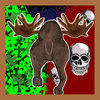
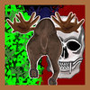
Icon third attempt small.jpg Icon third attempt.jpg The Charge Back Icon alternate.jpg The Charge Back Icon enlarged.jpg (And yes, I did get way way too hooked on the idea of making it a model seen from behind, which just didn't work)

And if you are curious, the full version of the portrait icon (Thumbnail - click for the full 1150x1150):
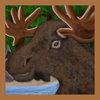
TheTopMooseFullSize.jpg

And the charge icon, larger so you can see just how this very much last minute icon looks - in larger size you can see how ugly it is and in smaller size you can't actually see it:
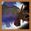
ChargeSpellHeroFocusLarger.jpg

EDIT: Review for vote - And using the unified test map in case of any bugs that I mention here without knowing it.

Fabricator Tank:
It it's a very effective hero, with a fitting model and a lovely transformation to match the spell (Always loved those for any unit - hence a tendency to lose as nightelf when I tried to use only buildings as attack units), the icons make sense for a portrait - but honestly I am not seeing much of the ability in them and while I guess it makes sense to change to portrait to fit his "mode", the ability really should reflect the effect, and not the portrait. The tank production icon appear dull, more so when compared to the colorful portrait/spell icon. The spell itself feels simple, and just reminds me of an existing Warcraft ability, just with tanks instead of goblins. Cute with the panda texture on hatches.

Fel Spider:
The model isn't very unique - a basic creep with some minor edits. The icons on the other hand are unique and I feel the abstract horror from them - even if I don't really make an immediate association with the ravage Hive and its actual use. The ability description sounds very interesting, but using it is disappointing. An enlarged egg, made immortal with spiders around it, again just feels like the fabricator or other existing Warcraft abilities. So to differentiate it, it has the teleport, the drain and the intelligence effect on attack dmg. However you never see the damage they do, you have no idea what they have drained and when I am using it it doesn't appear to even work, healing zero and regenerating zero. The description also does a poor job of defining that the hero is the overmind, as nothing on the hero itself makes that name clear.

Troll Pariah:
A fine looking model (even if I could wish for him to be more troll like in his animations), with some great icons to match. My biggest concern with this entry is the spell itself. The mention of soul ripping made me have certain expectations that an instantly vaporized unit replaced with a ward didn't meet. I don't see any souls on the spell, and every unit hit by the effect do not get a status effect, so units will just run randomly into their doom, without you being able to tell why. Same with those that get stuck. All in all the impact of the spell isn't conveyed well and lack the "ooempf" that the icon and model gives.

Lady Hive:
The model looks great on the battlefield, but the portrait removes much of this epic feeling and I wish it stood out from its sorceress origin, to feel more like the epic hero. The portrait icon works, but is some creepy, with the long face and heavy makeup, that I don't really feel match the model nor the intended beauty in the piece. I am also rather unsure why the portrait is the icon for the spell? The bash spell icon in all its brilliant simplicity is a good example of how the model could have set of abilities based upon brushes and art work and I feel that the main ability really should have had an epic icon to convey its use. The ability itself sounds interesting, but from the description of fantasies and creations, I kinda expected monsters, more than clones - but it still works and it has a good clear effect from target to summon. Sadly them being hostile to everyone means that both allies and enemies alike will target them and that somewhat ruins the fantasm aspect of it and make the spell feel odd for lack of better words.

Dark Paladin:
I love the interpretation of a Dark Paladin on this model (even if it in-game is called a Dark Knight) and the spell icon is truly epic, showing a perfect image of how nasty the ability actually is. The portrait works well and matches the epic feel of the hero, even if the helmet on the model for some reason is purple? The ability goes well over the top, with lots of flash which is great. The only thing I am missing is the link to the caster, as the description mentions a drain effect. A status effect on targeted unit would also be welcome and I am somewhat confused by the last sentence where it talks about health under 30% and mana drain. I assume that it means that first it deals 100dmg (max), then checks if unit is under 30% life, if not it drains mana (of an unknown amount) and if it is, it deals double of an unknown amount of damage. But it could use some work to clarify.

Goblin Artist:
I saved this for last, as I had the impression that it was amazing and damn. Everything in this entry is well thought out and fit. The model is truly unique and matches the "source material". The portrait icon is a perfect fit for the model and the model portrait is humorous and interesting to look at. The ability icon's matches the various effects of the ability and I am so happy to see how each ability effect is supported by the visuals, adding the bubble of red paint, the puddle of yellow and the blue goblins with again a blue puddle end. It matches the description and I was not in doubt for a second about the effects (even though I have so far failed to see the bonus for the blue goblins work). There are also a much appreciated use of status effects and even the messages for use have been themed. Such as an attempt to use the blue paint again, while the blue goblins are still alive, will create an error message about not being able to use the same puddle. The yellow paint will show both slow and the ensnared, the latter being linked directly to the paint ability with the icon. My only minor complaint is that the status effect that shows the color you are currently using, aren't colored to match, forcing a mouse over for certainty.

All in all this is the most convincing and complete package out of all of the entries, and as such get my vote.

Just for fun: Our own entry.
Moose General:
The model has the shape of a moose, and that's about it. The animations are broken and the texture non-existent. It has no team-color or hero glow. It is however very unique :wgrin:. The icons support the model in so far as making the theme, however the thematic aspect of reputation being part of the ability is lost, as the icons focus on the effect of the ability and only on two aspects of the spell (healing and damage). The spell description also forgets to mention that an enemy unit hit repeatedly by negative rep (aka dmg) will get banned (aka silenced). The ability is by far the most unique and matching for the inspirational source material in this entry, while the portrait goes more in line with the humorous entry this was meant to be (smug look). The ability icon could use some work, and I would say with some more work on model and with time taken to compare icons with spell effect, this could have been a more unique and useful entry. As it stand now most of the fun is had from being able to charge the moose backwards from one end of the map to the other, felling trees and pushing away any in the way.
 
Last edited:
I will clarify spell portion of my team's entry to make things clearer.

Spell effects might look a bit like an overkill but it's just sooo satisfying to watch that spell.
Thank you. It uses a quick 0.03 tick, so there's the source of it's overkill.

The spell is the weakest point. It's just a damage over time with a effects spammed at high rate.
Sorry if it's not pretty amazing. We were thinking of making it more complex, but kind of afraid it's an overkill rather than it already is.

For the ability, I'm not entirely surprised with the spell concept given Daffa is working on it :p I really like the effects, but the concept is preeetty darn simple, but as I mentioned, not surprised given Daffa is into that kind of stuff.
Ah you :)
It's not that simple actually, the concept sure is, but when you count the mechanic there's a twist into it. It can be made more complicated, but I rather not.

The ability goes well over the top, with lots of flash which is great. The only thing I am missing is the link to the caster, as the description mentions a drain effect. A status effect on targeted unit would also be welcome and I am somewhat confused by the last sentence where it talks about health under 30% and mana drain. I assume that it means that first it deals 100dmg (max), then checks if unit is under 30% life, if not it drains mana (of an unknown amount) and if it is, it deals double of an unknown amount of damage. But it could use some work to clarify.
Maybe I need to rework that description. The spell deals 100 dps (at level 3), and while the damage effect takes place, it also counts whether it's above or below 30% HP. If health is higher than that it doubles that dps, else it drains enemy mana.
 
I'm not too experienced neither in coding or modeling so it'd be obsolete of me to comment on either in-depth, but I do wish you guys (team who did me, regardless of how wrong it sounds) had more time up your sleeves to polish up the entry. Locust and zero collision on "attackers" would do wonders on it's own feat. Custom skin would detach the model and make it fresh regardless of model wrap. Model could use different animations to convey my character/attitude (and boy, we all know I got one).

Nonetheless, I love it, and I'd like to thank you once again for making me feel loved and appreciated!
What you did took some giant balls to delve into transcribing a respected member into something as simple as few hundred dots and a set of 56x56 pixel icons. I bow down to the effort, and applaud thee.

Out of courtesy, I won't cast a vote on the poll, but we all know where it'd go.

well, there's always the post-contest model, where we can all re-tweak this model and make it even more cool x3 custom texture, anims by someone other than me.. everything X3
 
I very enjoyed to see all heroes together. They're all so differently and it's very nice to see those combined with the respective hive member.

I most liked deolrin's model, but I'm also not sure I like the flag on his back. Also nice there were some extras for testing the hero in demo.

Frabricator Tank's concept I found very nice, to switch between unit and factory dynamically. I'm mssing a bit of a bit more panda feature or Frank on the tank itself.

Dark Paladin is a very solid entry in all categories. I liked it, but it seemed that the spell is kind of too powerful. He was too strong. ;D

Moose General. Lol, I really had to smile when testing. Bashing his enemies away with his ass is just hilarious when spinning around. Great stuff. ;D

Lady Hive's model is really great. I also very like the icon. The spell concept has very nice potential, but I think at cases it can look the concept can look a bit of unfinished. It looks a bit weird when my units attack those created images, or the images just do nothing anymore in case the origin unit dies right after creation.

The Goblin Artist is a great piece of teamwork. All is matching each other very good, and is good quality. The spell concept seems though a bit of an overkill for a normal spell (not ultimate), but it's still designed very good.

Fel Spider. The model was maybe missing a bot of something that reminds of a hero. But I very like the spell effect and its process.

I'm not very sure, yet, for who to vote. Maybe for Fabricator Tank.
 
It seems a lot of people think the Goblin Artist's ability is overkill :p do keep in mind that I put no cooldown on it so that people can test it to their heart's desires and all the numbers (damage, duration, etc) were completely arbitrary. Unlike Hero Contest 8 where balance was a part of our score, I spent very little time on working with the numbers xD I just tweaked the numbers to make the testing more smooth.
 
So it drains mana instead of dmg, or does it do both?
On low health, it deals damage and drains mana. On high health, it deals 2x damage.

Dark Paladin is a very solid entry in all categories. I liked it, but it seemed that the spell is kind of too powerful. He was too strong. ;D
NOOOOOOO
And here I thought those numbers are done well :( still, a single target ability after all.
 
Level 8
Joined
Mar 23, 2014
Messages
165
Dark Paladin is a very solid entry in all categories. I liked it, but it seemed that the spell is kind of too powerful. He was too strong. ;D
Actually that spell was supposed be a reversed version of Lay on Hands. Yeah it was not an AOE spell so we thought it would be nice to go with a Minas Morgul looking light using a powerful strength.. lol i mean come on man Frank Tank can form tanks faster than our hero's footsteps (i like it though)
 
Moose Charge

I found the model is nice, though it seems that it has quite an issue with selection circle and the way it attack is quite... interesting. The icon's fine. The spell is nice, but I get the 1024 group utils warning for some reason after several casts. It also arcs randomly after hitting something, making it quite difficult to navigate. I like the idea though.

Goblin Artist

Liked the model and the icons, though the bucket ability is somewhat not natural with it's splash, but that may be just me. The spell is interesting, though a bit complicated. I can easily understand Red and Yellow and when to use them, but the Blue one is quite difficult to maximize, since the paint relies on it's mini-goblins. That yellow entangle is super dangerous though :D

Lady Hive

I like the model. The icons are amazing too, though the hero icon felt a bit over-effect in my opinion. The spell is pretty interesting, and dangerous. The simplicity of using it making it do wonders.

Fabricator Tank

Amazing model, and icon are great too. I just can't find the panda represented by the icon in the model, else it would be perfect. For the spell, must say it reminds me of Pocket Factory in some way, but still unique.

Fel Spider

Spiders are not my taste sadly, but I like the model but not so much for the hero and main ability icon. Liked the secondary spell icon though. The spell has an issue saying I get 0 health and mana (tested from merged entries though). It took a while for me to understand fully how the spell function too, especially the spider attack part. Not so important anyway, just me not being sharp with tooltips.

Troll Pariah

Liked the model, not so much for the icon sadly. The ability is simple, yet it's pretty interesting, though I manage to glitch the creeps to get stuck with it's fear effect in the merged entries test map.

---

Kind of hard to decide where my vote goes. Too many amazing entries to consider here, and each has it's plus.
 
Scourge - Fel Spider

The model has a lot of potential, but as of right now, it's pretty lacking. The "thing" you guys added on the butt looks pretty cool though haha. The portrait is probably my favorite icon of the three, and the icons do their job of depicting the spell concept. Good job on the spell concept though; it's probably my favorite part about this Hero, and it feels awesomly disgusting to watch the egg blow up with the "mother" coming out of it. I would love to see a full kit on this Hero!​

I actually equipped her with two more abilities, which had been disabled as of the submission of the demo. I originally wanted to see her as a he, thus the conflicting description.

Fel Spider

Spiders are not my taste sadly, but I like the model but not so much for the hero and main ability icon. Liked the secondary spell icon though. The spell has an issue saying I get 0 health and mana (tested from merged entries though). It took a while for me to understand fully how the spell function too, especially the spider attack part. Not so important anyway, just me not being sharp with tooltips.

I forgot to add a proper conditional check for the text tag display so when the mana of surrounding enemies is burnt, it gets stored into the hive and displays the text tag. Taken into perspective, if it drains 5 mana, then the amount of health and mana to be restored would be 0.8 and 1.0 respectively, but it will be displayed as an integer, resulting into 0 and 1.

To see what I mean, try adding priests into the test map.

Anyway, I cast my vote on:

Goblin Artist

The team really did a great job at displaying Goblin Artist at what he does best, painting. Given the high quality art assets, and almost seamless spell casting, DREAM-TEAM surely deserves the name. To be able to create such an intricate balance between spell mechanics and visual eye candy and with nothing falling short of excellent (even using just GUI, for the spell!), I would find this to be the best.
 
Last edited:
Level 46
Joined
Jul 29, 2008
Messages
9,622
Who says it wasn't meant to be an ultimate in the first place?
Well, was it? If it only had one level & was accessed at Level 6, it's an Ultimate.
(full disclosure: haven't tested anyone's entry yet, lol)

@KILLCIDE

When they say overkill, they don't mean that the effects are too strong. Balance isn't one of judging categories. What they mean is that the spell is too complex in it's own feat to be a one-point wonder.
Sometimes, less is more.
It's interesting you should say that; for the purposes of the standard game & fitting in to it, I agree. However, since in this Contest we could only make 1 ability, I realized pretty quickly that we would all have to work pretty hard & make it relatively complex to have any hope of winning (e.g. something interesting & useful like Mirror Image or Blink or Death&Decay are great, but not nearly interesting enough to stand up on their own).

Daffa the Mage said:
Liked the model, not so much for the icon sadly. The ability is simple, yet it's pretty interesting, though I manage to glitch the creeps to get stuck with it's fear effect in the merged entries test map.
Can't really speak for what might have happened in the merged entries test map... But if you read the description (& even the Tooltip), you'll know that "being stuck with fear" is exactly what the spell says it does. ; ) No 'bug' there... *cough*

IcemanBo said:
I most liked deolrin's model, but I'm also not sure I like the flag on his back. Also nice there were some extras for testing the hero in demo.
Well thanks. Yeah, 'testing functionalities' have been a part of Hero Contests for as long as I can remember. : )

RED BARON said:
A fine looking model (even if I could wish for him to be more troll like in his animations), with some great icons to match. My biggest concern with this entry is the spell itself. The mention of soul ripping made me have certain expectations that an instantly vaporized unit replaced with a ward didn't meet. I don't see any souls on the spell, and every unit hit by the effect do not get a status effect, so units will just run randomly into their doom, without you being able to tell why. Same with those that get stuck. All in all the impact of the spell isn't conveyed well and lack the "ooempf" that the icon and model gives.
Yeah... I forgot/failed to do that. I really wanted to either get more SFX in there, or potentially put a 'spirit' floating above it, but the Grim Ward model came back to me right near the end & I didn't think we had time to make many changes; didn't want to throw a monkey wrench in things ("HEY MODELER MAKE THIS DIFFERENT IN .3 MINUTES!", y'know), and I had no time to do it myself. C'est la vie.

No status effect? Meh, didn't really think of it. Probably not a bad idea.
 
Level 30
Joined
Jan 31, 2010
Messages
3,552
@Kyrbi0

You're confusing complex and new, which are not mutually exclusive, but far different.
A new spell would be "cutting" through the targeted enemy, appearing symmetrically on the other side of it and dealing damage to all enemies you cut through.
A complex spell would add a bleeding and slowing effect to it, an option to re-cast the spell in next two seconds to cut through the unit again if it's in range, and a chance to proc any on-attack effects like Critical Strike and Bash on all targets you hit, all while proc-ing status attack modifiers such as Orb effects or Vampiric Aura.

While a system has to be new, there's a fine line between making it unique to ladder Warcraft 3 universe, and making it too complex to fit in. If you have to read the tooltip more than once to understand the spell, chances are it's complicity is getting out of hand.
 
Level 46
Joined
Jul 29, 2008
Messages
9,622
@Kyrbi0

You're confusing complex and new, which are not mutually exclusive, but far different.
A new spell would be "cutting" through the targeted enemy, appearing symmetrically on the other side of it and dealing damage to all enemies you cut through.
A complex spell would add a bleeding and slowing effect to it, an option to re-cast the spell in next two seconds to cut through the unit again if it's in range, and a chance to proc any on-attack effects like Critical Strike and Bash on all targets you hit, all while proc-ing status attack modifiers such as Orb effects or Vampiric Aura.

While a system has to be new, there's a fine line between making it unique to ladder Warcraft 3 universe, and making it too complex to fit in. If you have to read the tooltip more than once to understand the spell, chances are it's complicity is getting out of hand.
I agree.

However, what I'm saying is that not only did this Contest (like all Contests, ostensibly) want the spells to be New... They *also*, implicitly, encouraged them to be *Complex* (due to the constraints). I wasn't a fan of it, I just observed it.
 
Level 46
Joined
Jul 29, 2008
Messages
9,622
Is that so? I myself always preferred clean entries over overthought ones.
Oh I do too; again, don't misunderstand me. : ) I'm simply talking about what I perceived this Contest to be looking for.

Cokemonkey's criteria grades on uniqueness and "creativity w/ context of contest theme".
Well, aside from that being a bit confusing (how is 'uniqueness' defined separately from 'creativity w/ context of contest theme'; seems kinda redundant)... The big question is what does "[w.r.t.] context of [the] Contest['s] theme" mean?

I've realized just how meaningful it must be, defining that idea of "creativity/uniqueness/originality" for each & every Contest, because *my* definition of "c/u/o" is different from others. It's essential that we know what that word means, in what context.

For example, say I coded up a Knockback spell (literally just "hits target with a wall of force, knocking them backwards"). That's pretty creative!... for Warcraft. No knockback spells exist in standard Wc3, so it's unique (technically unique, the best kind of unique! :p). Same for a Jump Strike spell, or a whole host of others.

Problem is, such a spell would be one of the single-most common things you could find in our Resource section; in the context of the Hive's resources, or just 'the modding universe in general', those are pretty *un*-original.

Going personal, my spell is pretty much nothing but a super-Death Pact/Dark Ritual + the 'disabling cyclone' effect of the Tornado (in fact, if I wasn't so bent on doing it my way, it would have been better to simply reuse that effect, lol). (I would argue) Technically, sufficiently unique for Warcraft 3, but not really much of anything for the Spell section IMO.

~

KILLCIDE said:
I don't see him explicitly or implicitly stating complex.
Well you wouldn't see an "implicit" statement, silly. ; )

Seriously, though, I'm just looking at the writing on the wall. If someone had implemented a simple 'charge' spell or 'knockback' or 'jump strike', how well would it do in the Judging? Even assuming it's perfectly coded, it's just not very "creative" to most people (for Warcraft/me, sure, but not necessarily the rest of the Hive).

I'll ask you: why did you decide to make what can literally be described as "3 spells in one", with a 'form-changer' ability to enable it? I'm not knocking it, I'm just saying you probably perceived the same thing implicitly that I did; that the spell needed to be sufficiently complex to be worth Judging (for a number of reasons).
 
Status
Not open for further replies.
Top