 Approved
Moderator
M
Moderator
20:03, 14th Jun 2008
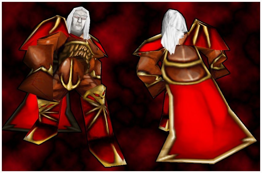
Werewulf: A very lovely art job you did on this skin, it really deserves to be approved, approved.
Werewulf: A very lovely art job you did on this skin, it really deserves to be approved, approved.


 o a bit of a buffy vampires thing with his forehead like this


